![project_image]()
THE BRAND CREATION
The new focus needs a vibrant, new interpretation as well as a strong and confident projection. The strategic thought is built around 'Basic can be interesting' - all about creating exceptional experiences around the basic activity of cycling. Basic shapes thus come together to build the brand identity and the black and white play of colours gives it a serious, focussed orientation.
![project_image]()
from being functional to going beyond.
![project_image]()
the positioning has to bring alive the emotion of the experience - we are in the business of creating experiences, which for the consumer is an extension of their inner self. 'LIve the Ride' articulates this very aspect and celebrates the individuality of the experience seeker.
![project_image]()
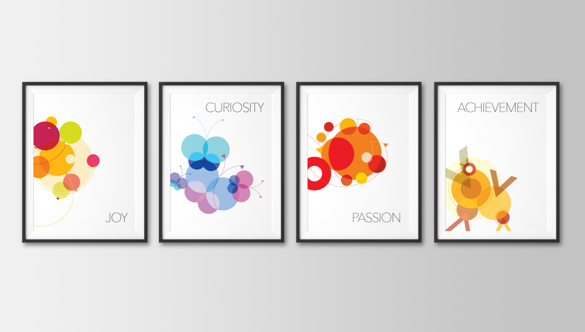
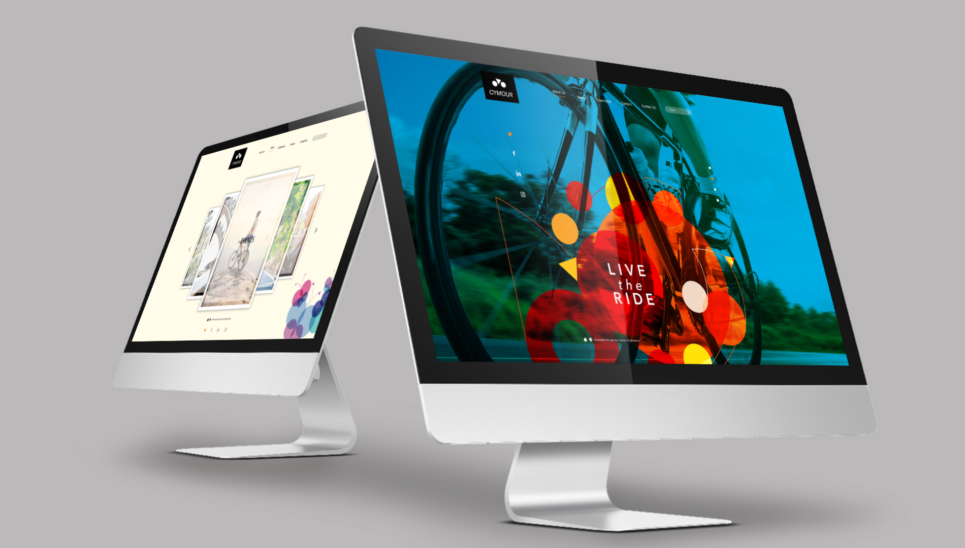
the design language is fluid and can be used to communicate every aspect of the ride experience. It brings in the colour and vibrance associated with the experience, the intangible takeaway that remains with the customer even after the ride is over. It is varied, it is personal and it is a celebration in itself.
![project_image]()
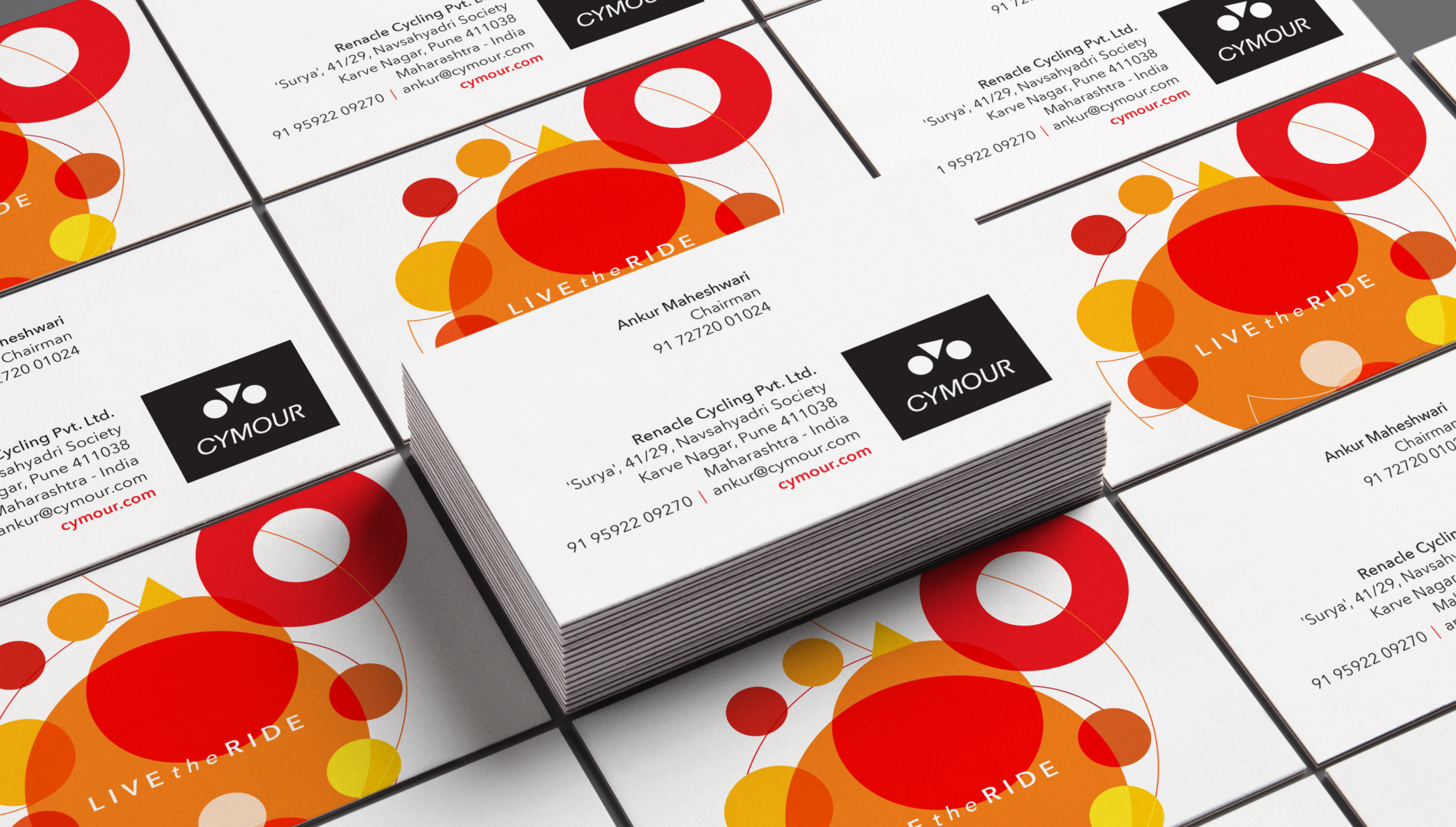
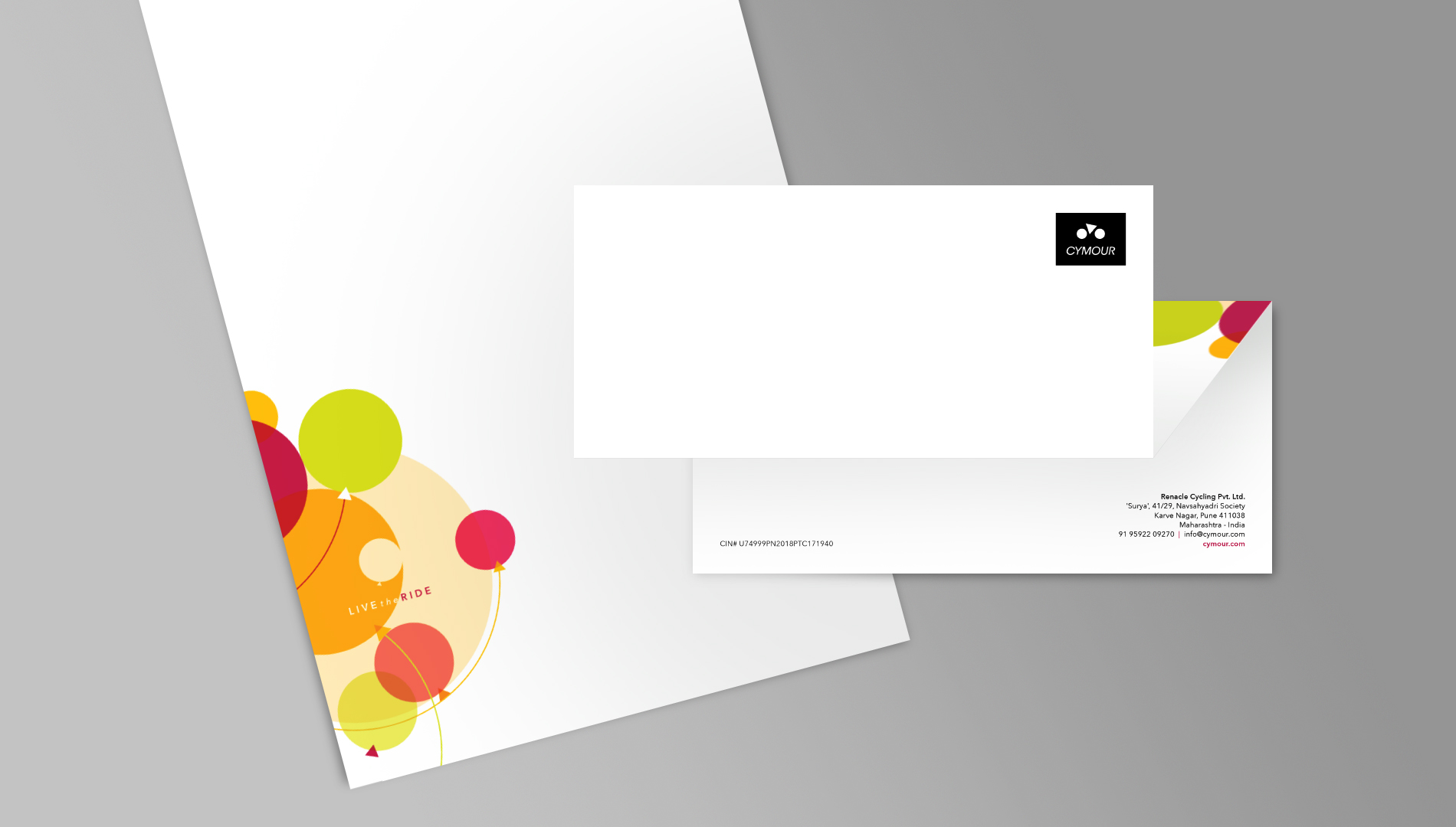
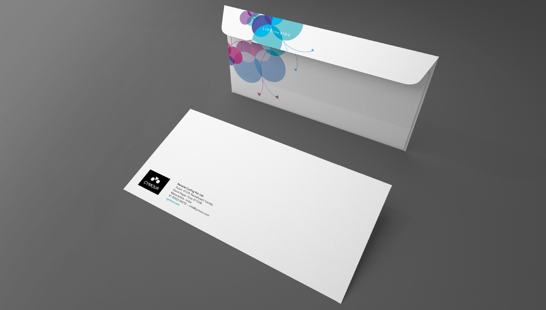
the corporate stationary remains in sync with the brand language to act as a continuous reinforcement of the vision.
![project_image]()
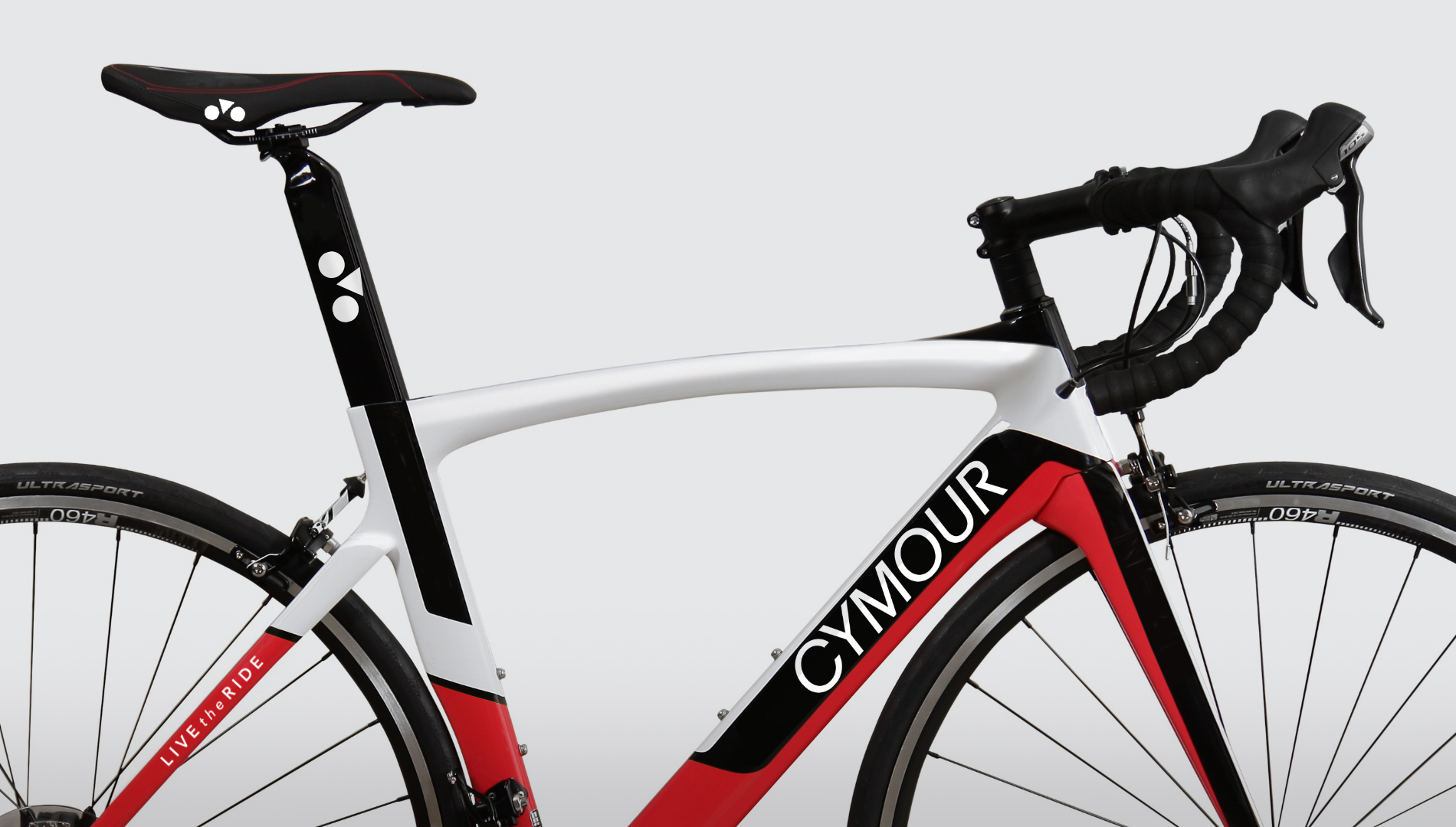
though premium bikes come in different makes and specifications, the company branding allows it to put its singular claim on an experience that will follow.
![project_image]()
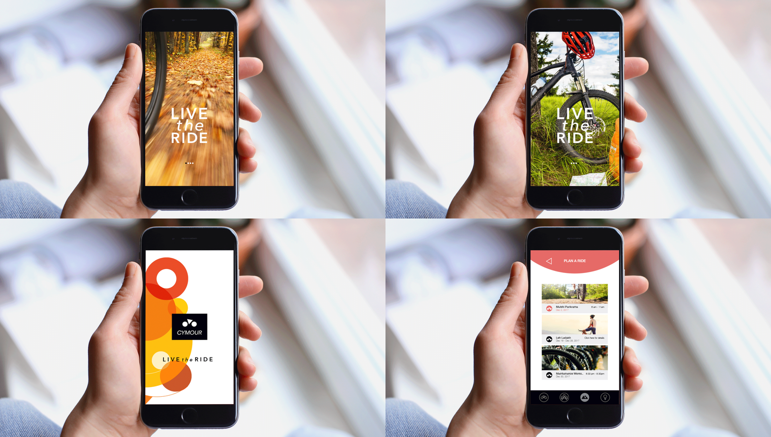
the app is the tech intervention, one which facilitates the locking and unlocking of the bikes. It is the vital link connecting the user to the brand and is imperative that it remains consistent to the projection.
![project_image]()
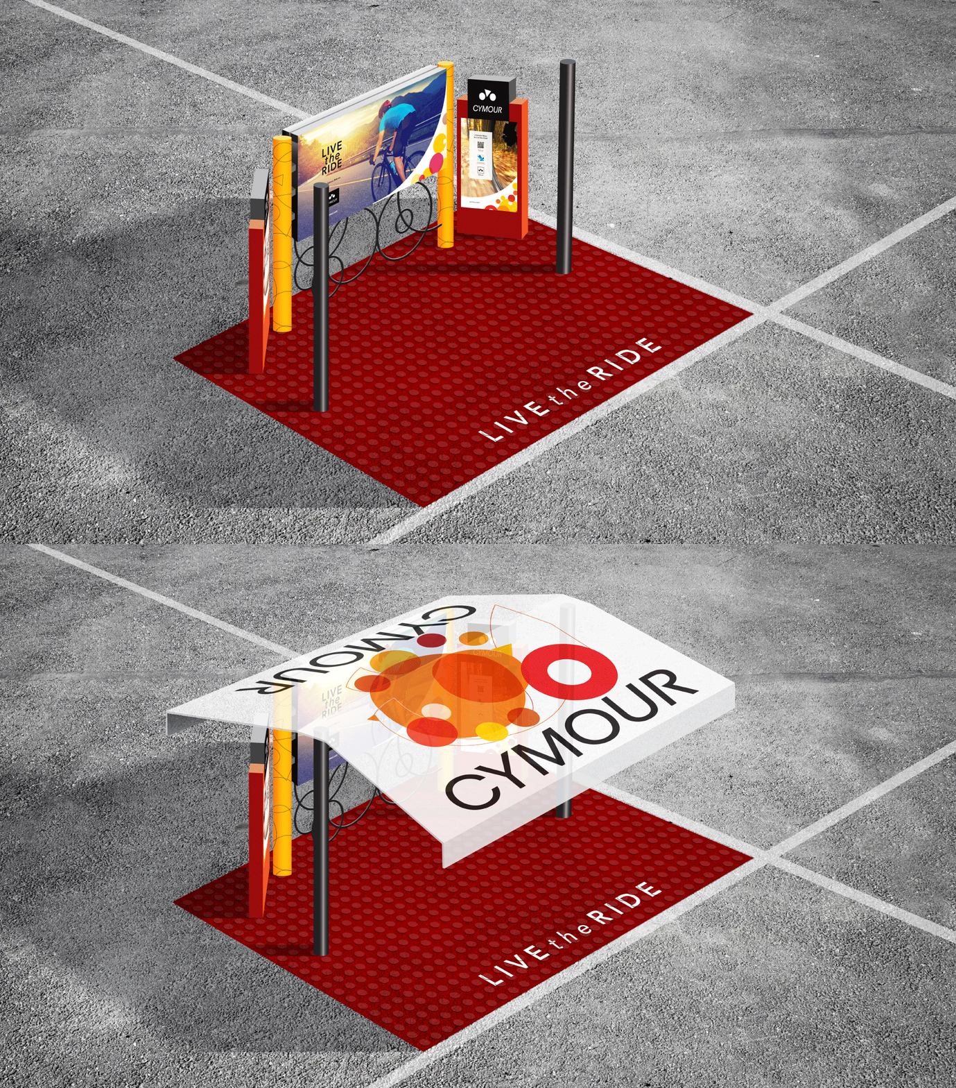
the bike stations are key interaction spaces which act as a 24x7 advertising medium for the brand, demanding it to be more than just physical space. It has to make one curious and still communicate the key aspects of the brand in an engaging manner.


