

When it’s a perspective and not just a product line
A young organic cosmetic startup wanted to build a brand that celebrated the relationship that we share with Nature. A relationship that would see the company bring products made from cent percent natural ingredients. The exclusive products would be made available online through its e-comm partners and eventually the company would set up their own exclusive retail outlets.
INTERPRETING THE BRAND
The name had to connote an experience, an escape into a moment of pure indulgence. It had to be rhythmic and represent a company that was much more than its products. It had to represent its spirit.
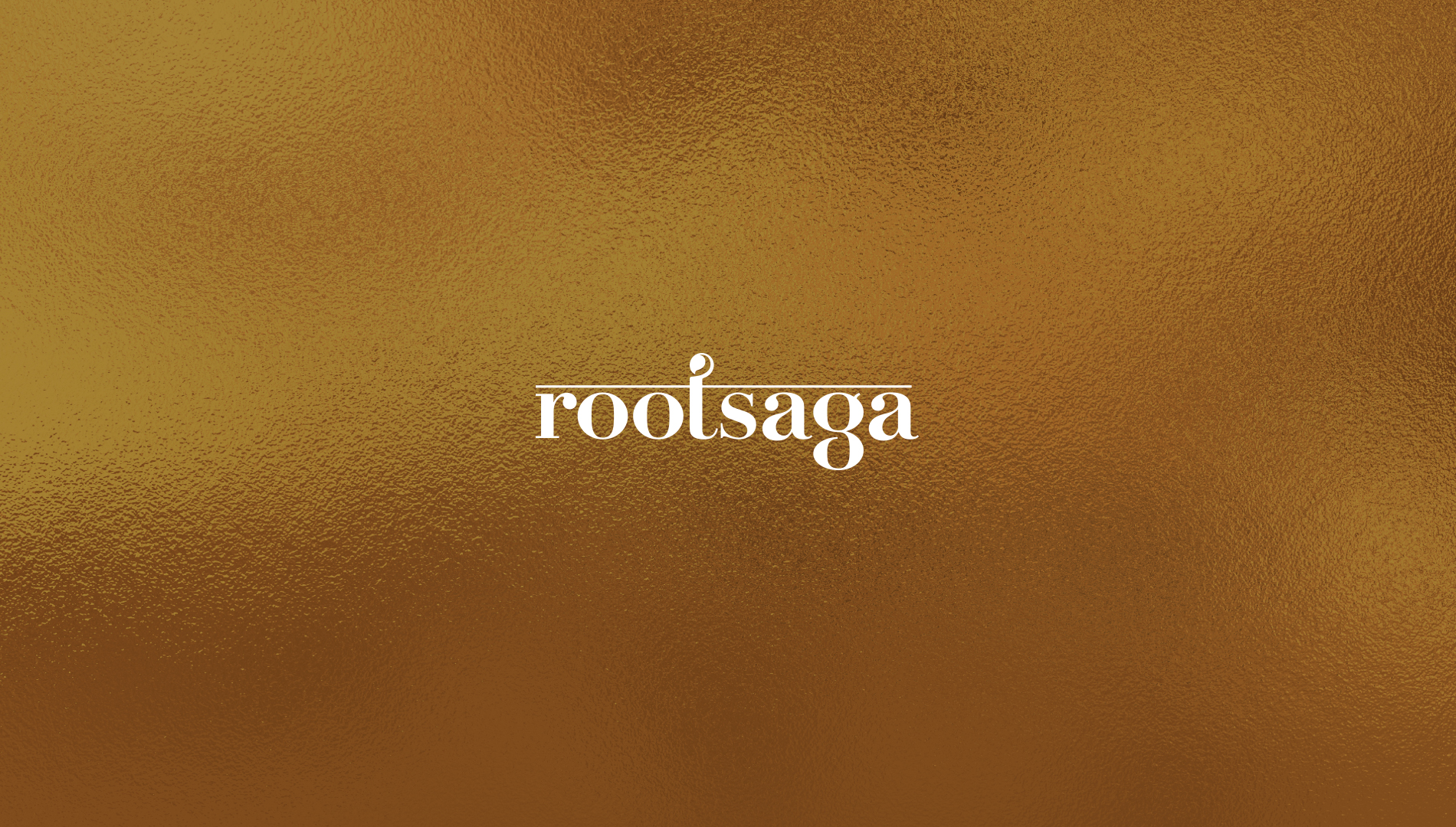
'Rootsaga' was found to be an appropriate articulation for the name as it was indicative of a story to connect back to the roots i.e. Nature.
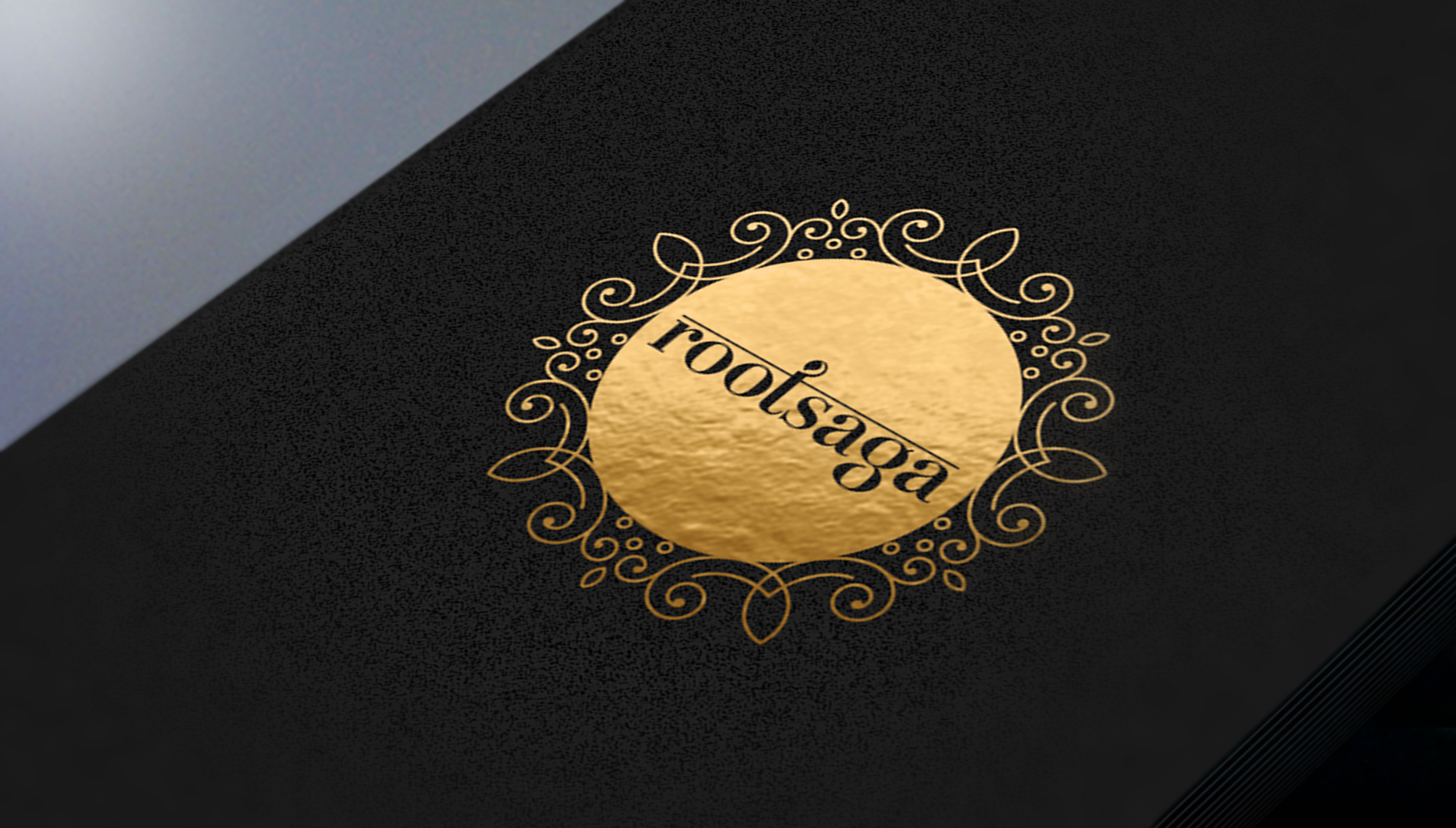
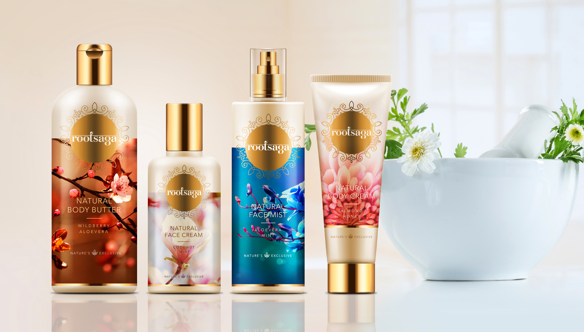
The use of gold and the intricate details of the identity suggested a premium offering. The play in the typeface reinforced the name further.
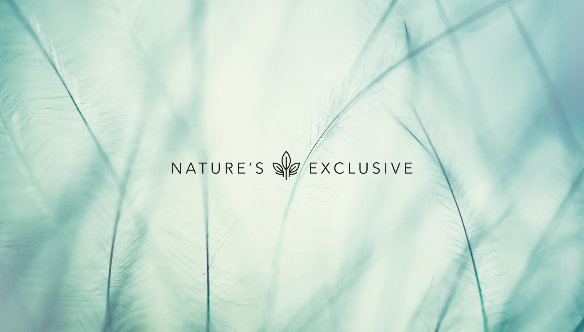
'Nature's Exclusive' as a positioning line was strongly recommended to reinforce the facts that the product line was indeed a gift from Nature.
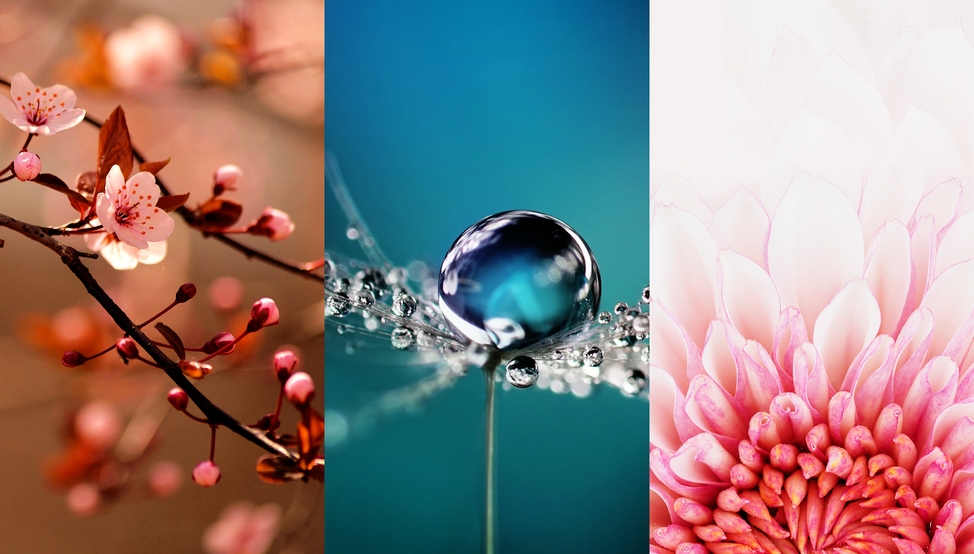
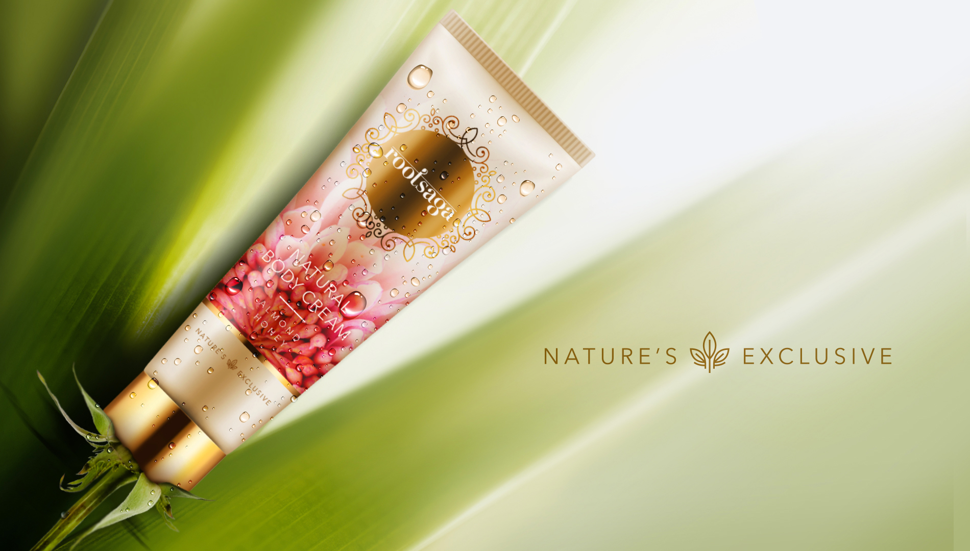
A distinct design language was created for the brand. The idea was to project an undiluted and real portrayal of Nature, which would be indicative of the exclusiveness and high quality of the products.
LIMITLESS PACKAGING
The packaging soon translated itself into an effective communication exercise by virtue of its ability to crowd source unique Nature images. Shot by amateur wildlife photographers, this rich library of selective Nature images was then incorporated into the packaging.
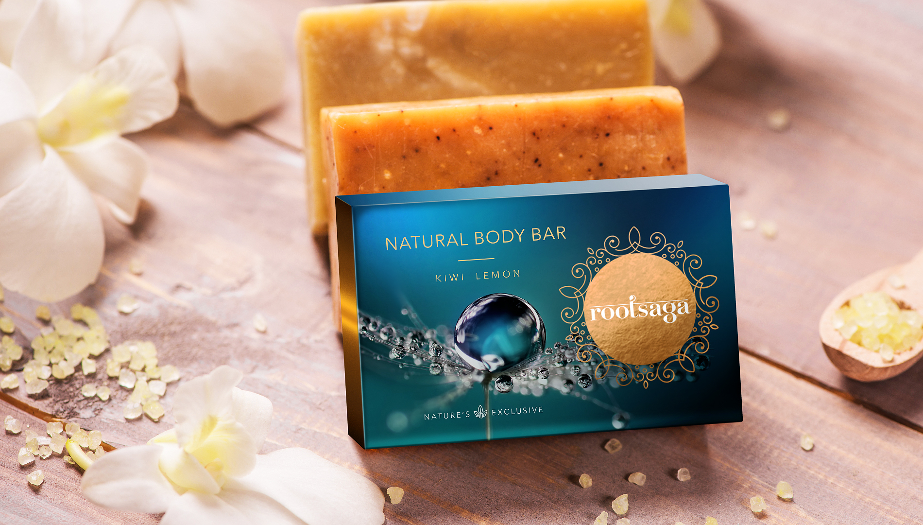
Packaging would thus become a dynamic communication tool, wearing a different expression every time and therefore be limitless just like Nature.