When being colourful is a great business idea!
Patang is an apparel brand, which produces quality basic wear. The products are focused on comfort, detail and quality. While these are the key features of the products, they cannot be highlighted as the exclusive brand USP in a very competitive market. The requirement was to give them a distinct identity and personality. So we looked at the brand objectively, taking into account their loyal customers and identified its uniqueness.
BRAND LANGUAGE
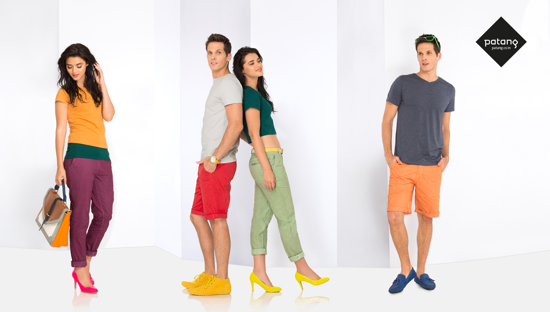
It all came down to colour!
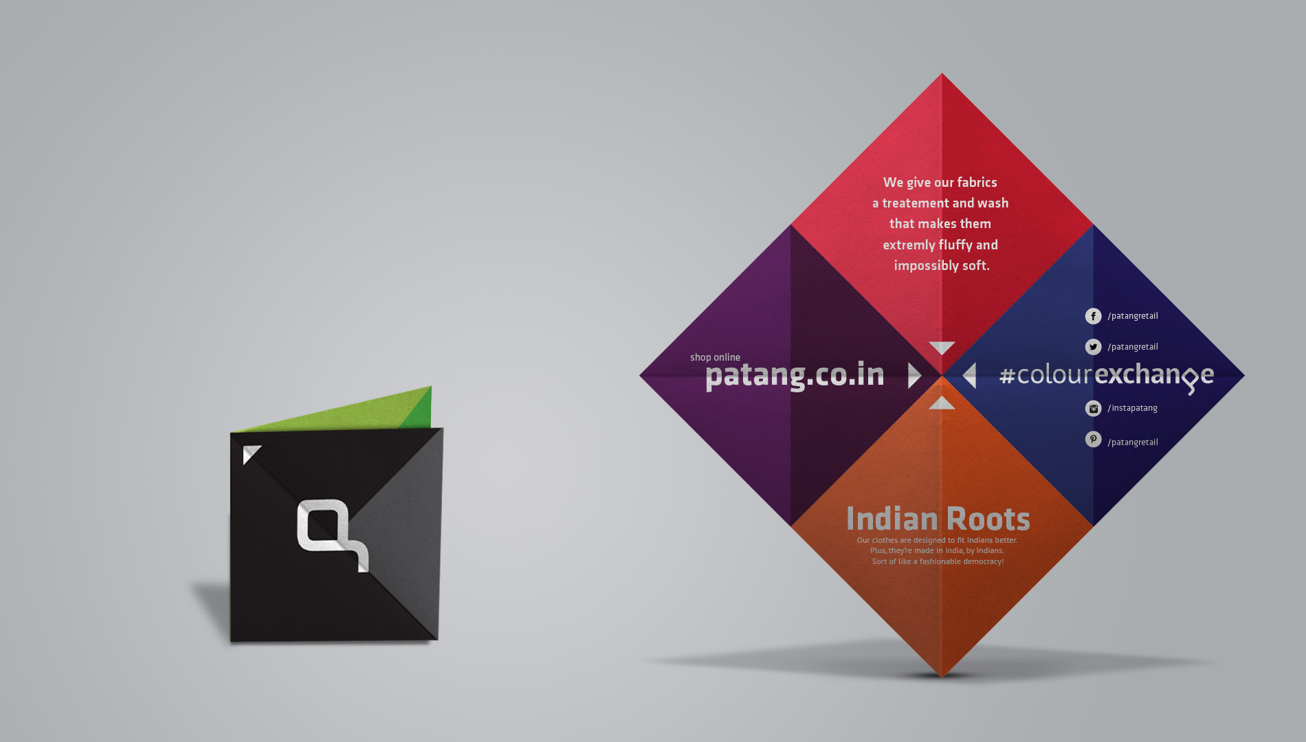
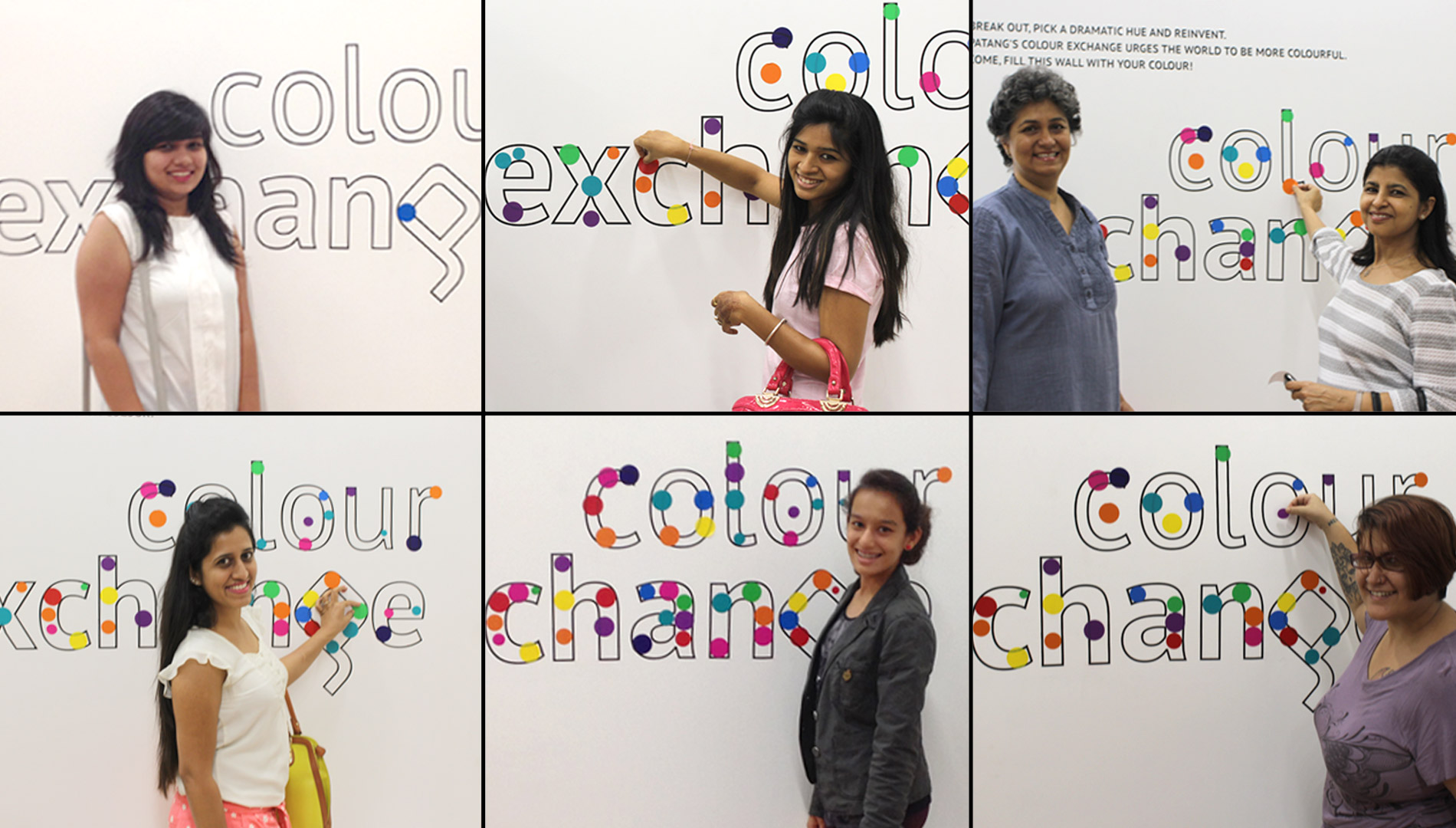
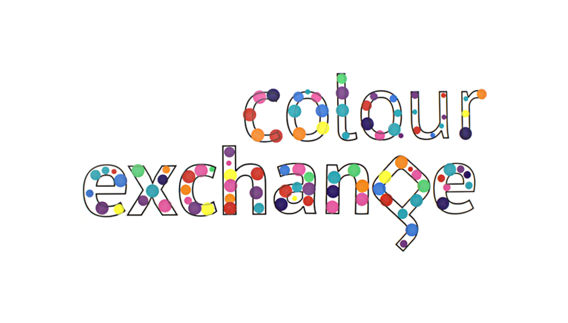
Comfortable basics in fascinating colours. With the brand definition in place, we extended it into its retail experience and social media communication. The idea of ‘colour exchange’ was about giving people chances to let go of their boring clothes and get attractive discounts on Patang products. The outcome was a well-received activity, which helped the brand reach out to a wider audience.
As Patang soars in the market, the future is surely bright and colourful!

colour palette : ss14
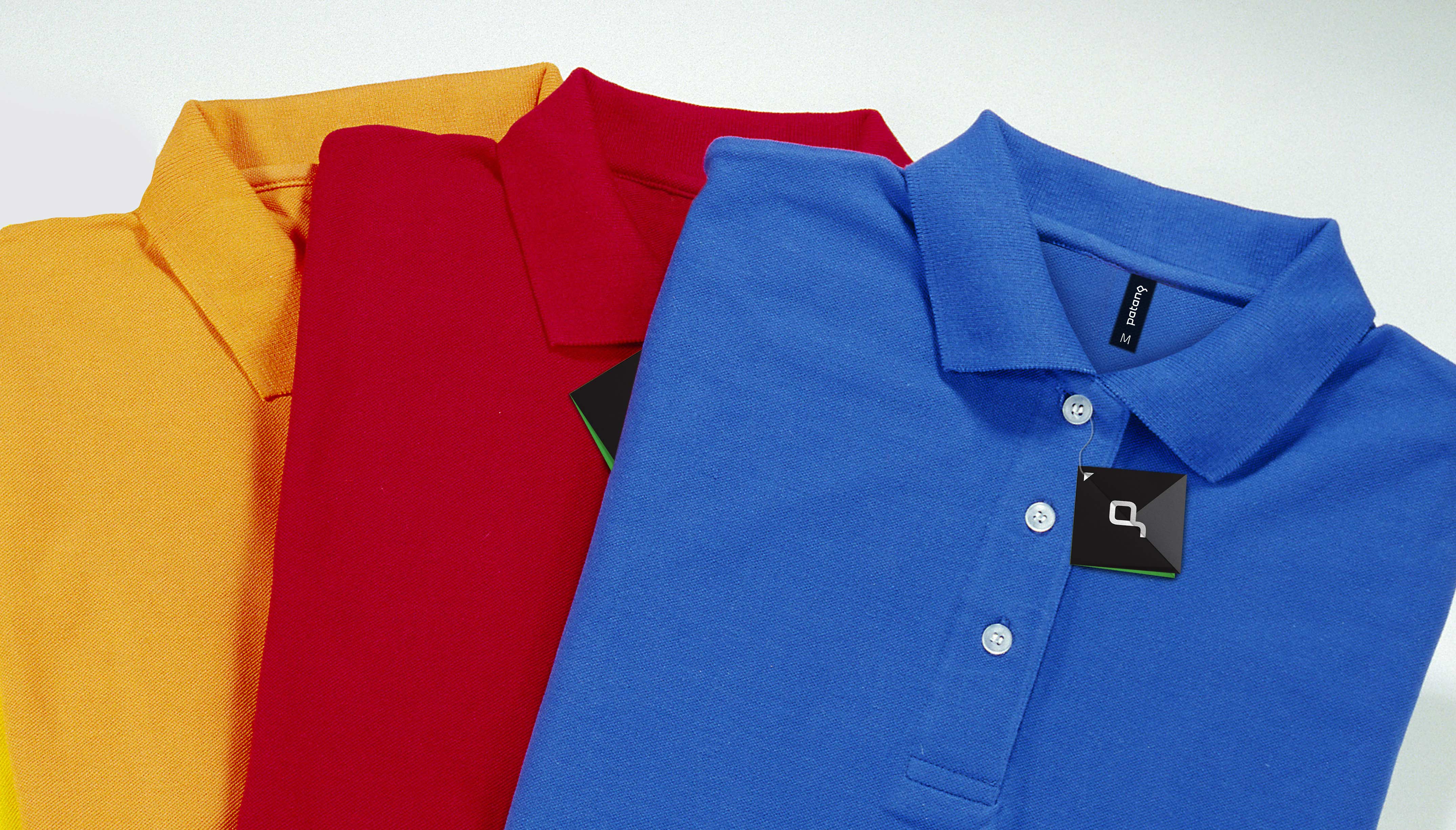
product label and tag
more than just a price tag

on a mission to spread the love

colour is contagious
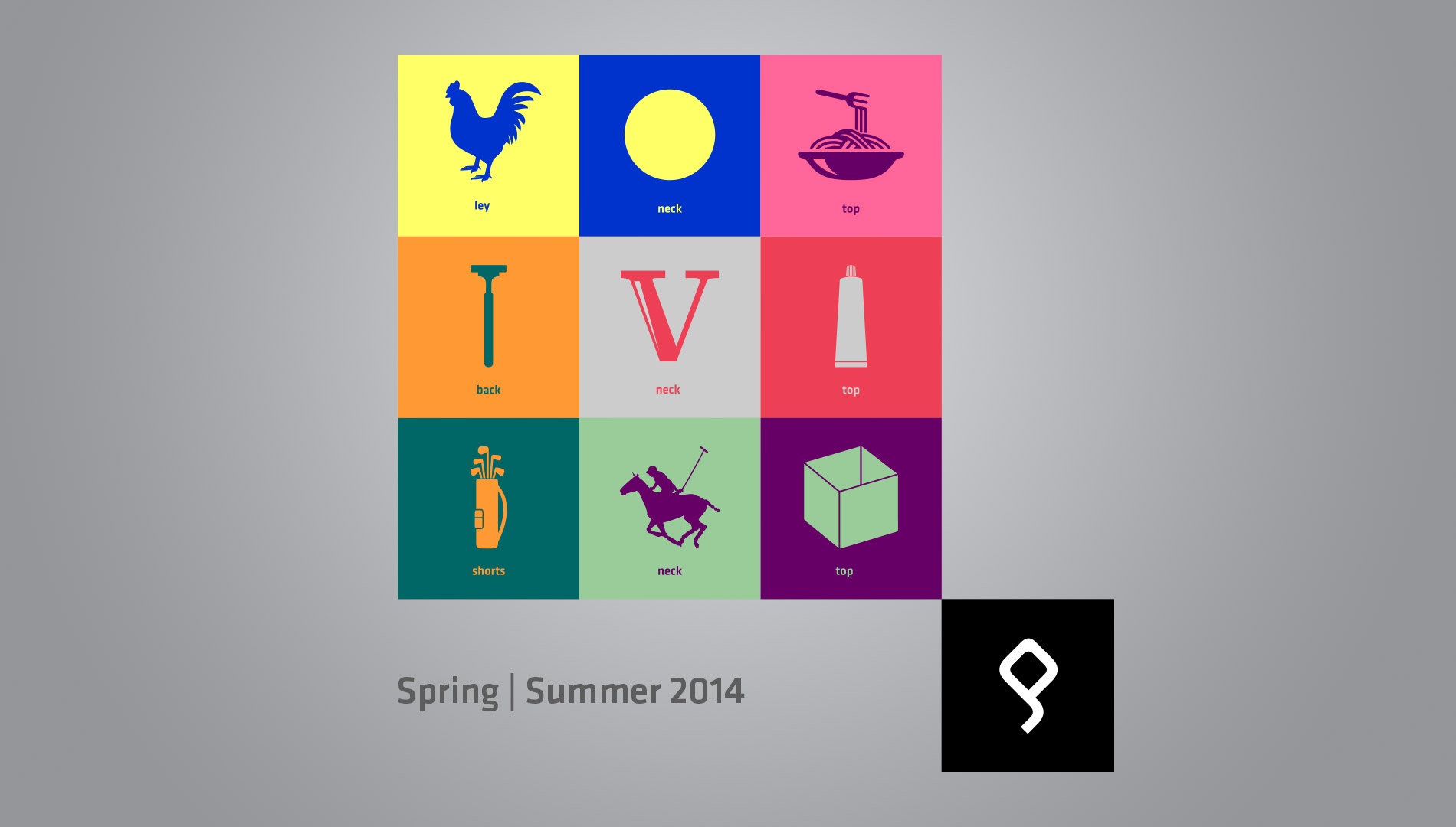
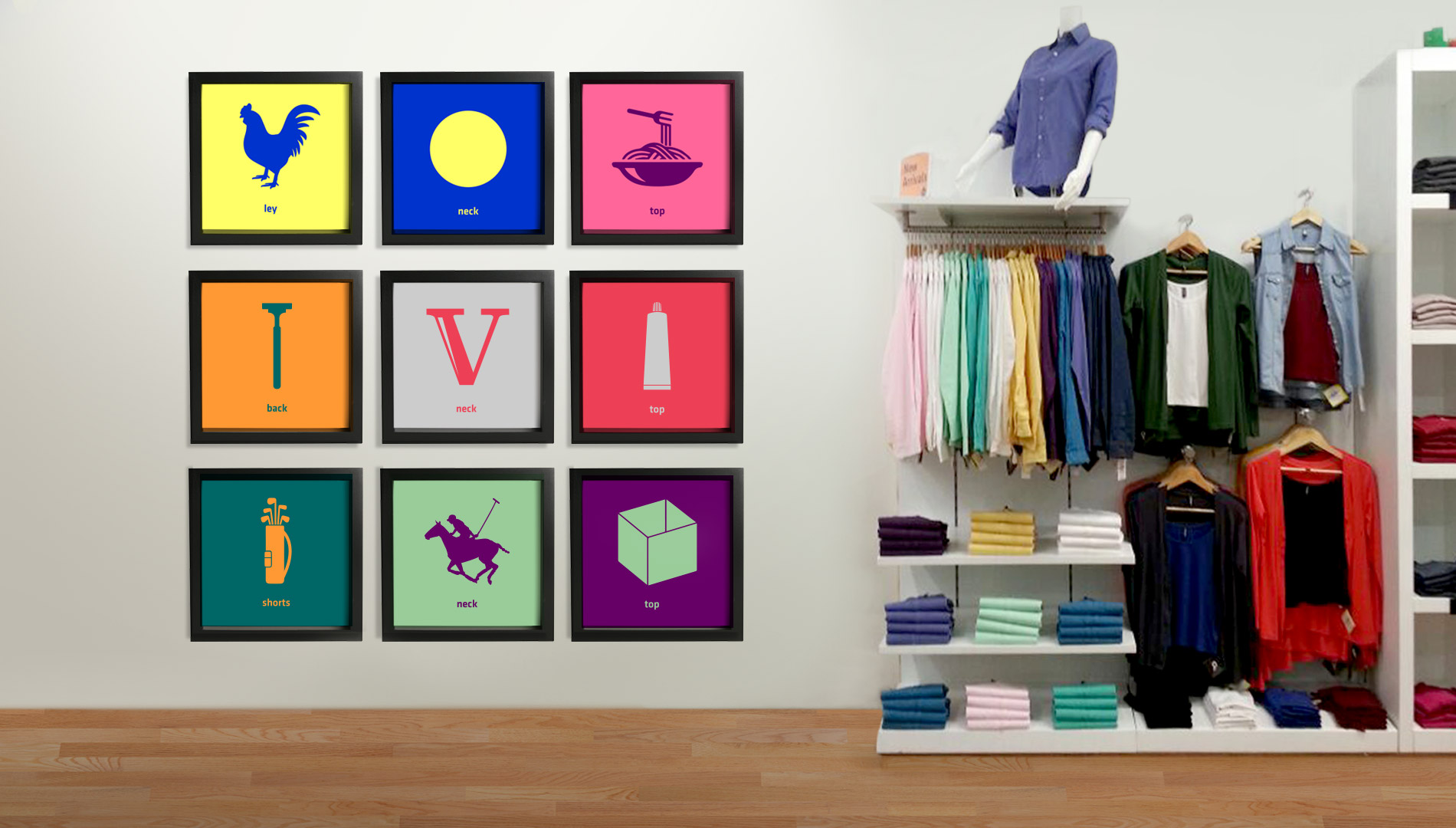
a visual representation of the brand's product line