![project_image]()
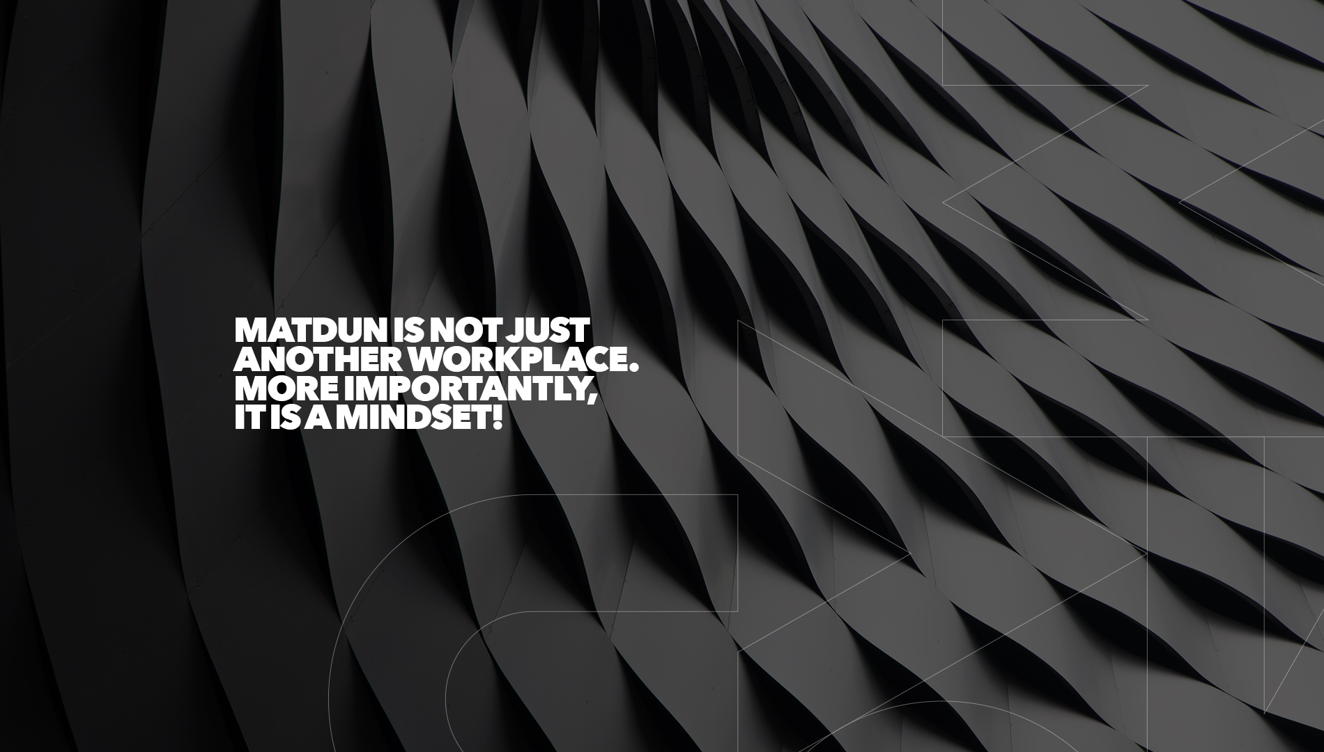
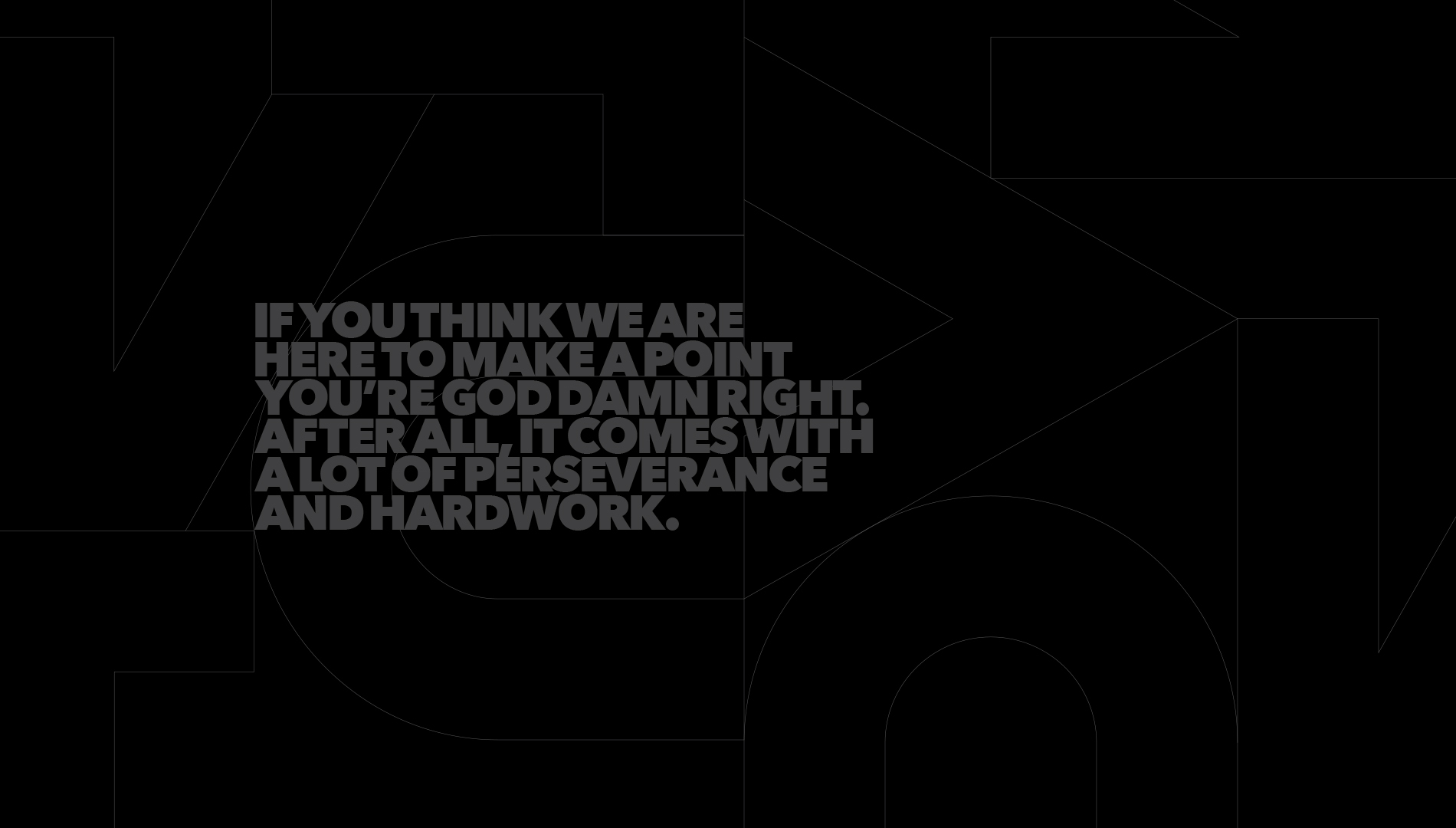
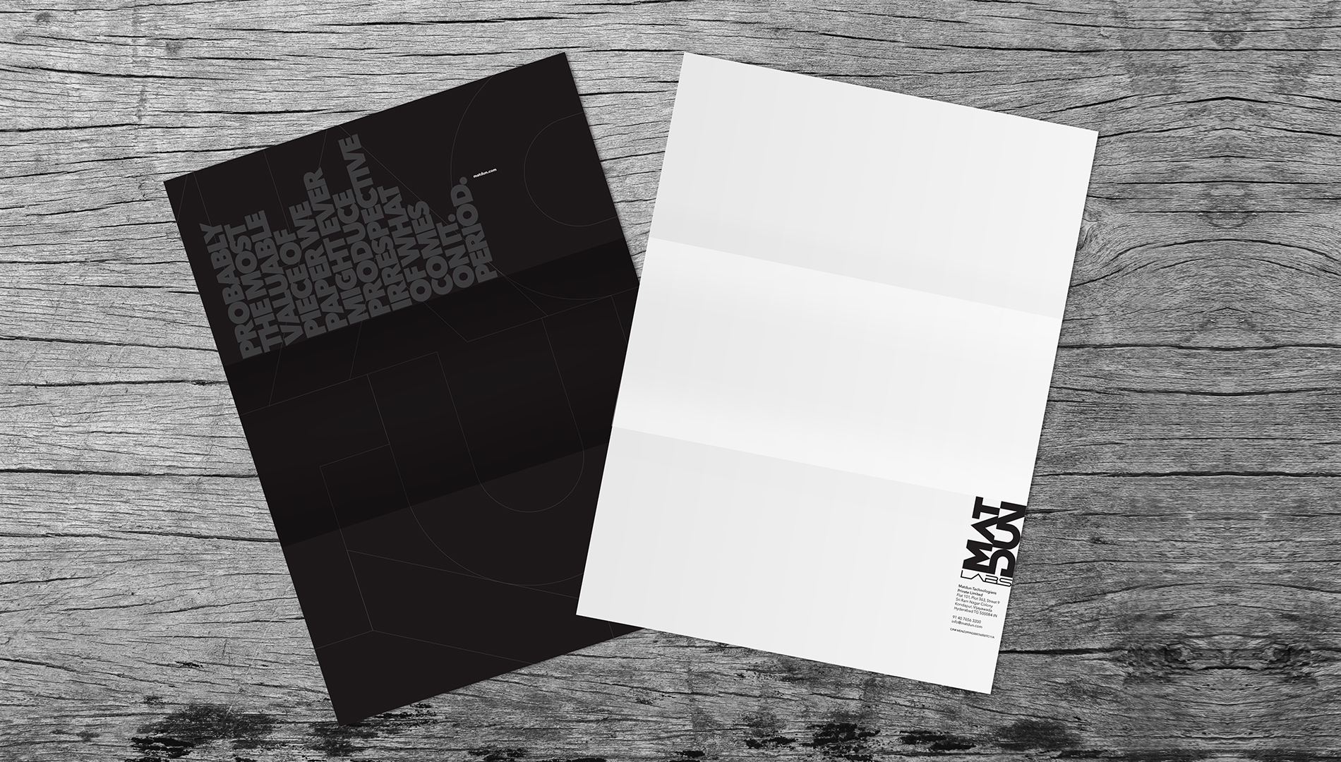
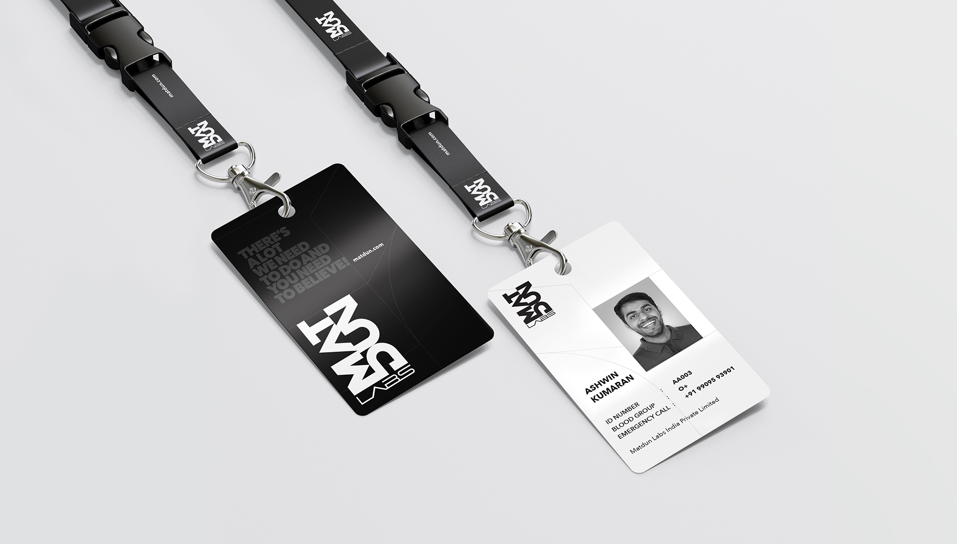
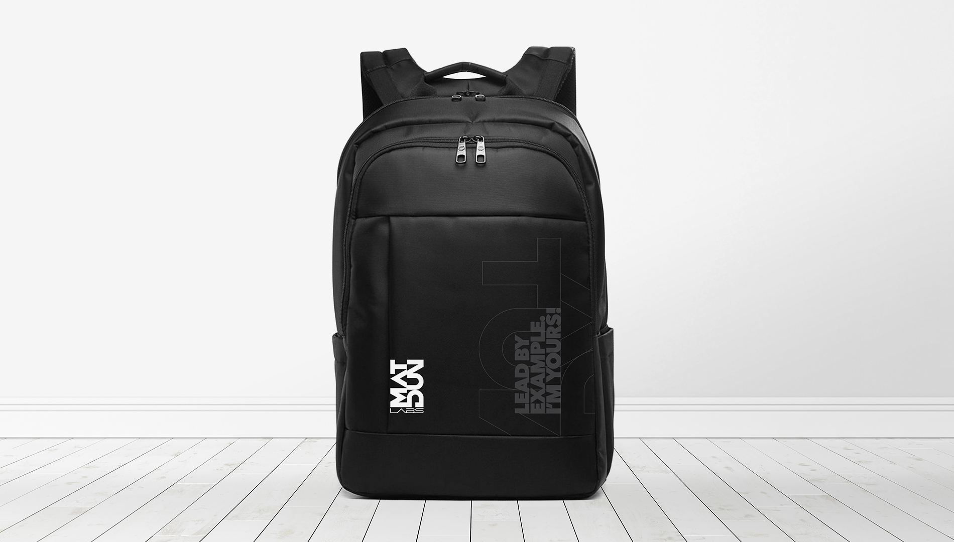
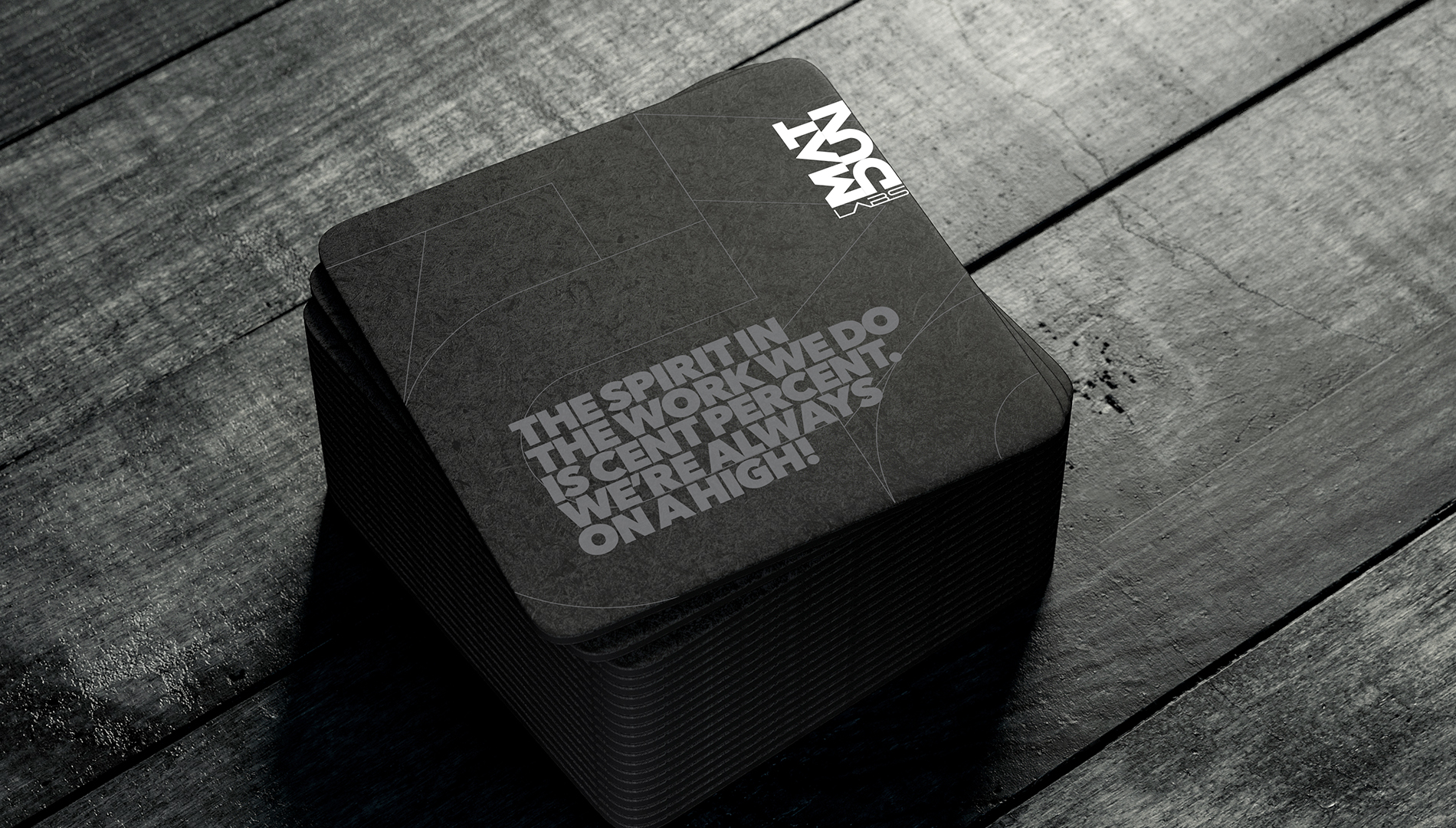
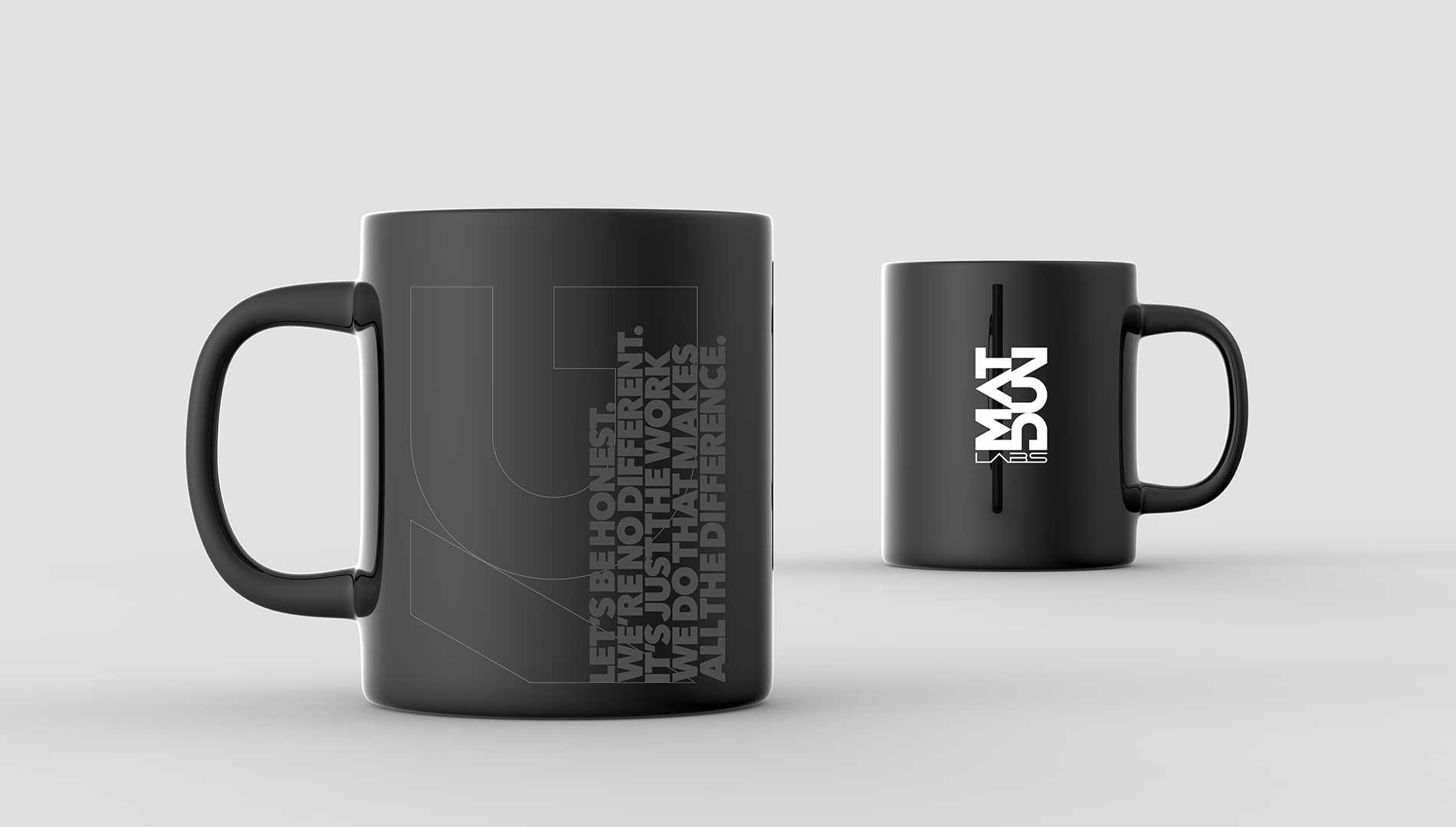
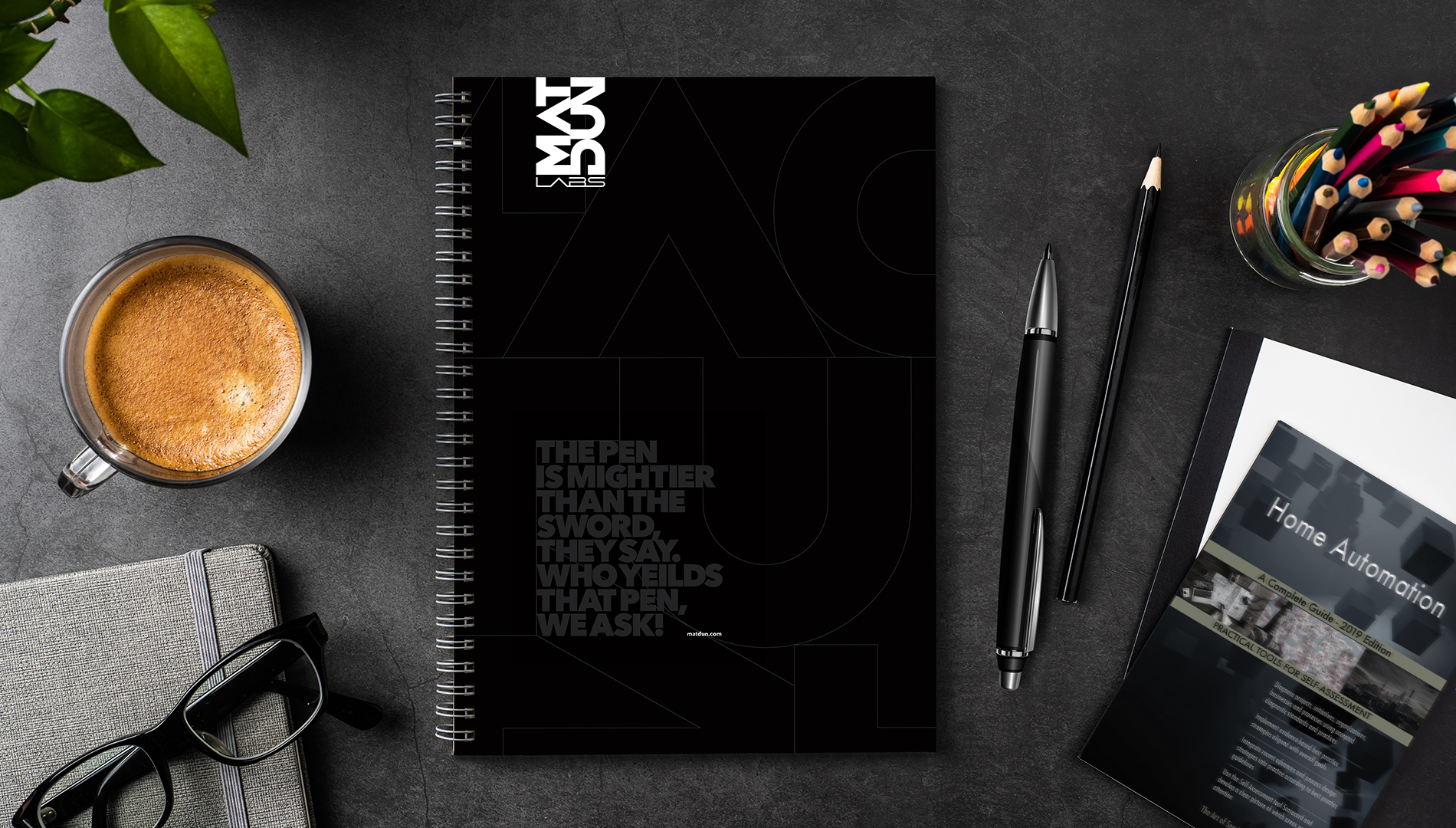
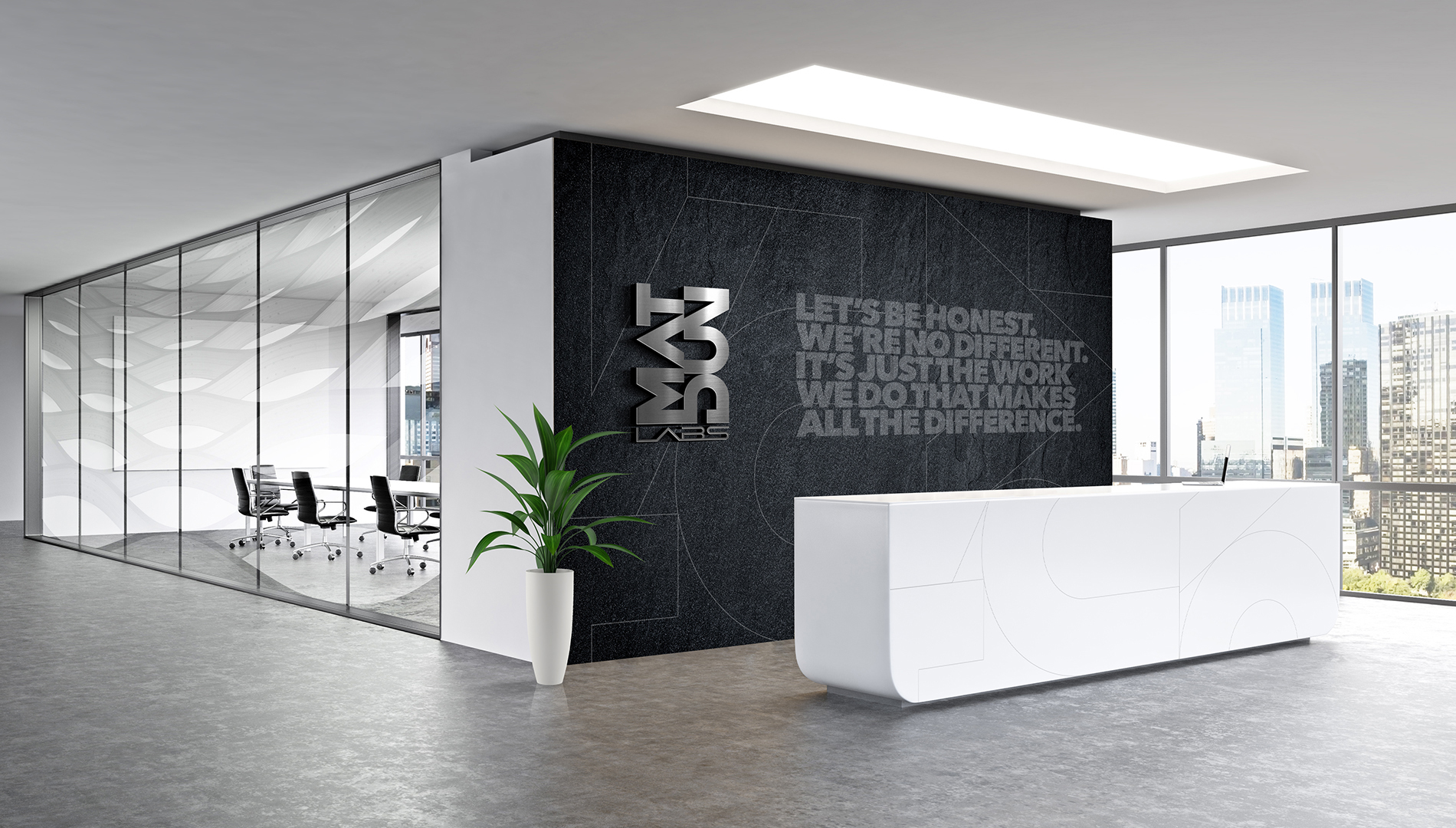
The design language showcased the sensibility of the company and it's perspective, which was about striving for excellence and continuous innovation. The visual effect of multiple patterns formed by the alphabets of the name coming together to create a spirit of harmony represents the culture of the company. We chose to further highlight the mindset through relevant quotes and made it integral to the language. A young company that is vocal about its intentions.
![project_image]()
The space is the physical manifestation of the design ideology and a critical element in the branding process. We kept it true to the story and allowed multiple expressions to come alive. The boldness of the spirit was carefully balanced by white spaces that represented the finesse and sophistication of the outcome - it's products.
![project_image]()
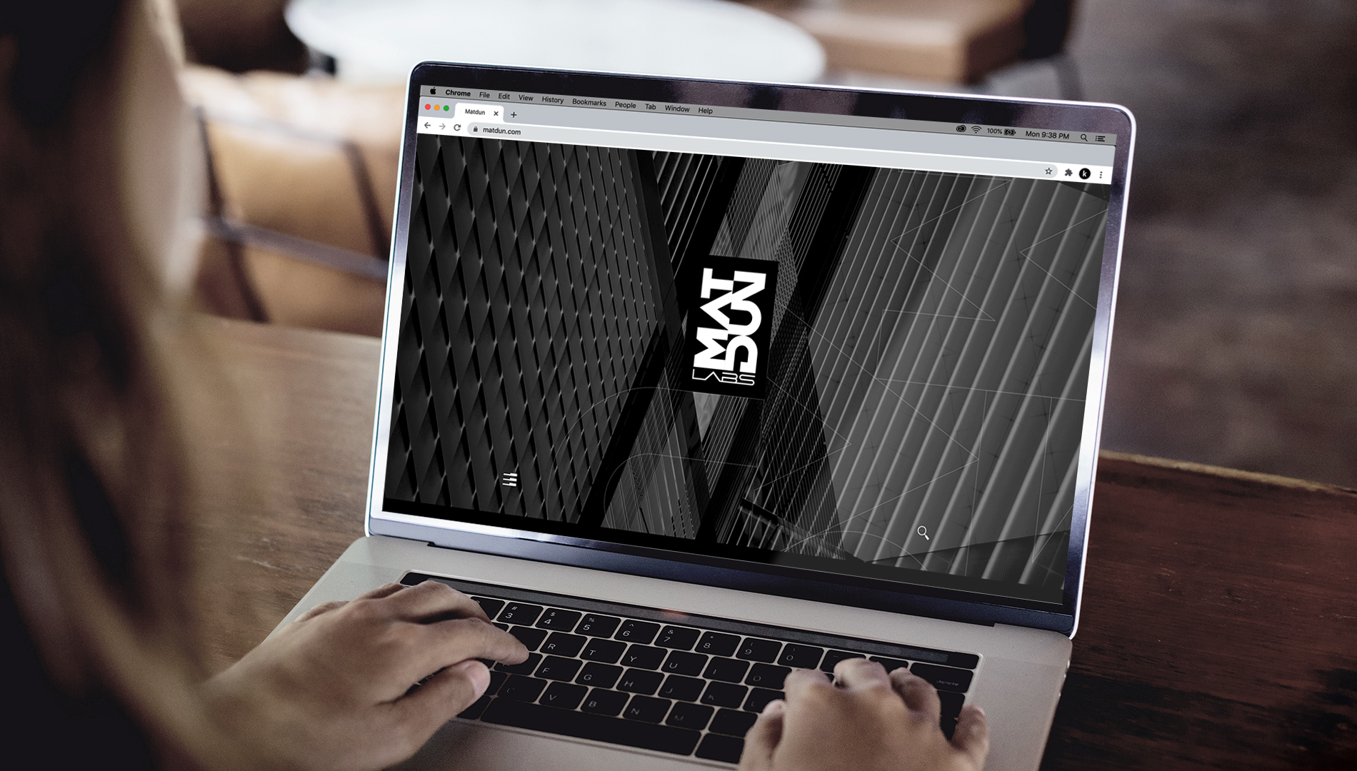
The website, a key brand asset had to highlight it's offering and it's story effectively. A custom design was the way forward to represent it's distinctness and attitude. Unlike many tech companies, here we chose to keep things simple and viewer friendly. We choose to tell the Matdun Labs story that is still in the making as new accomplishments get added, while it continues to pursue it's role of being a leading voice in its segment globally.


