

Branding a new global consumer company
A new vision was taking birth. A super tech consumer goods company was aiming to redefine the segment with its superior, next level offering. The task was to shape this aspiring global brand and give it a distinct expression.

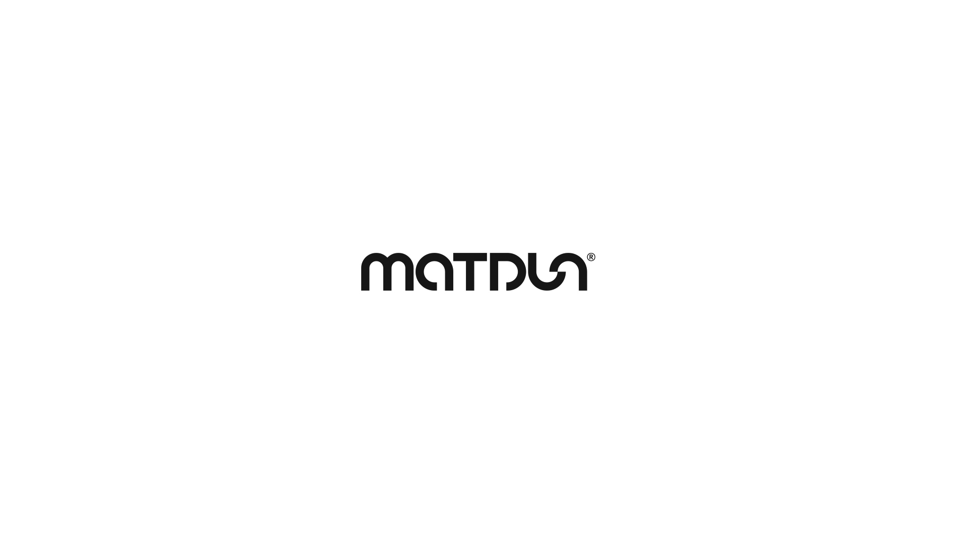
CONSUMER TECH GETS A NEW NAME
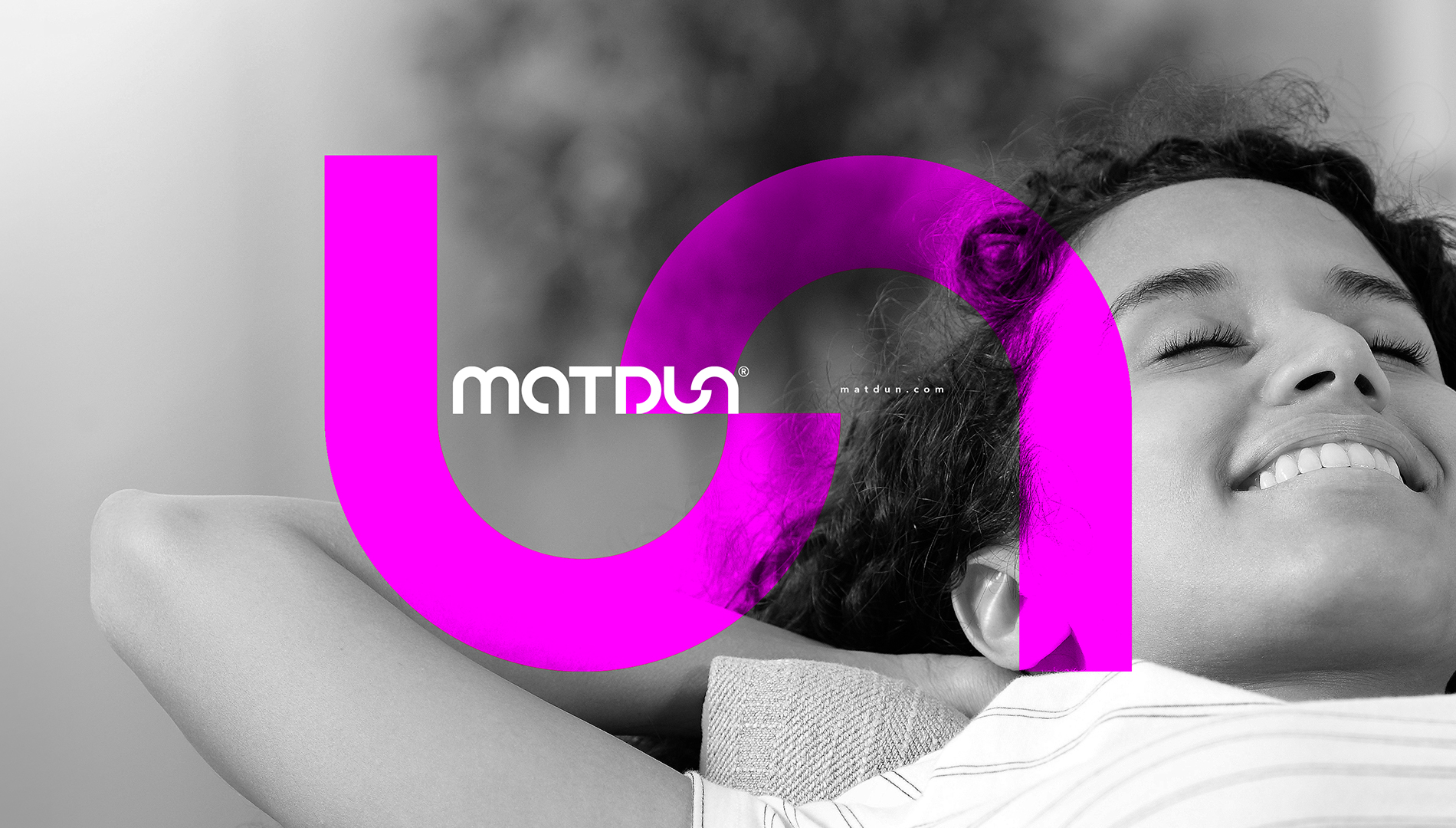
A confident, sure yet understated rendition that will indicate a unique persona being built for Matdun.
The dominant play with the letters 'U' and 'N' represents the act of unlocking, reflecting the spirit of innovation that forms the vert core of this enterprise.
The identity focused on its name while giving a subtle hint of lifestyle. The roundness of the type further indicated the holistic approach and service orientation.
A clean yet dynamic brand creation that goes well with its product range and can be easily applied to any surface and texture.
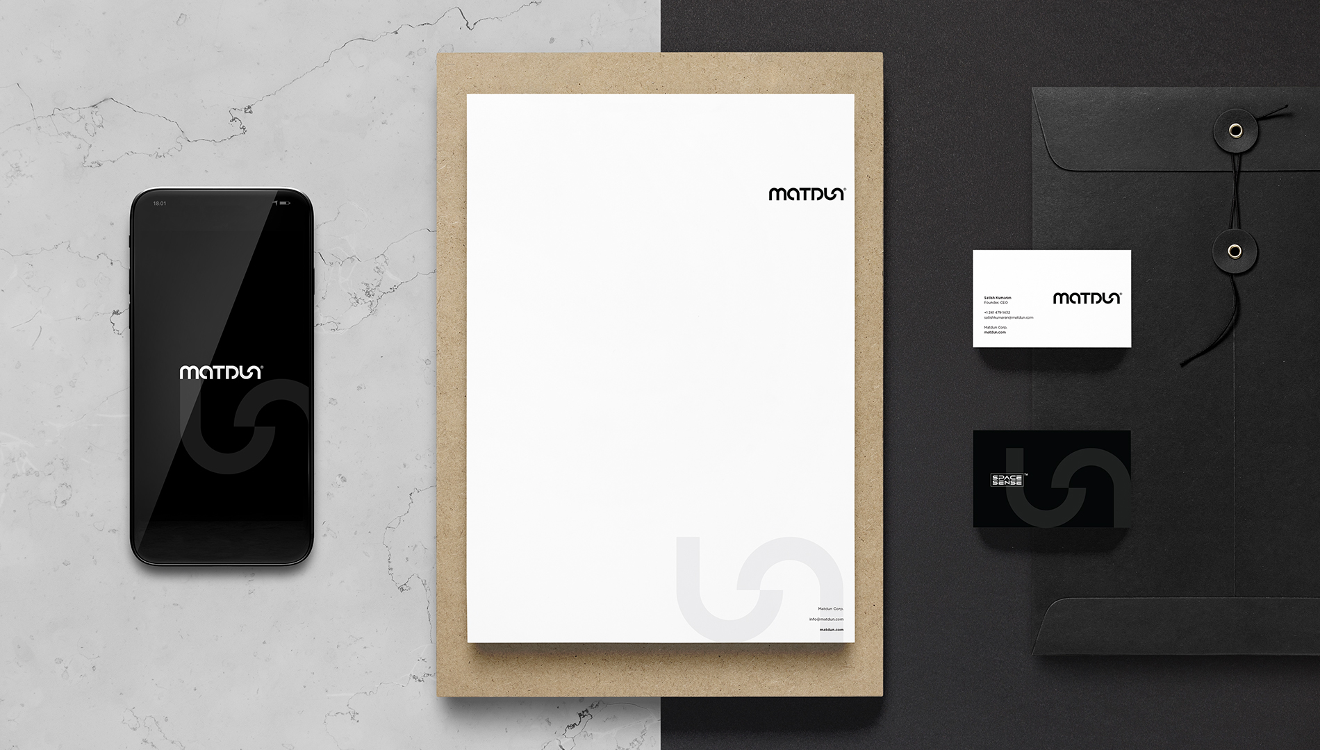
The uniformity and subtleness is well extended to its brand collaterals.
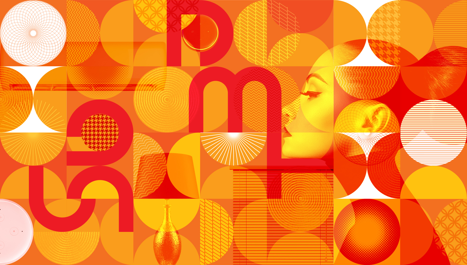
Technology can be serious but its outcome can have a lot of vibrance. Being a consumer tech company, we add the shades of comfort and convenience to our customer's life. The colourful graphic that goes with the identity makes for an interesting design language for the brand.
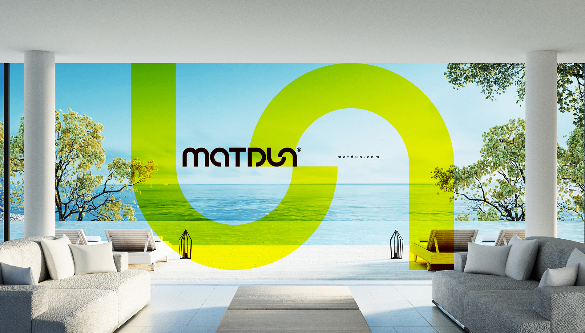
The space graphics further take the consumer interpretation of the brand forward, allowing individual interpretation to creep in. It lends vital flexibility to the brand wherein multiple colours can be used to represent the signature 'unlocking' emblem of the brand.
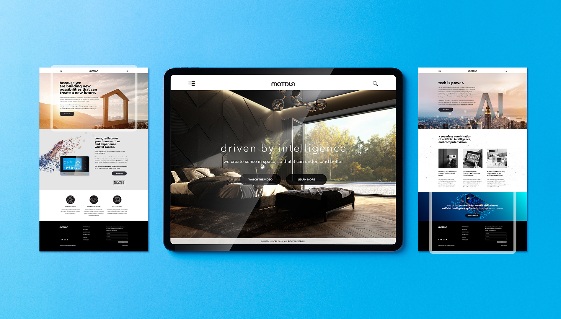
The brand website has been designed to create the appropriate context and provide the relevant visualisation for the company. It very clearly draws the operating space of the brand and highlights the kind of organisation that is being built.

Meant to create an impression and generate curiosity... and from what we hear, looks like it is doing its job!