A home is a home is a home, right? Wrong.
For Chordia Group, a home is a reflection of the owner’s lifestyle and not what’s trending. Mudra, therefore, is a deviation from the norm that is accepted as the luxury segment and is a residential project that actually caters to traditional Indian families – a long underrepresented community. By avoiding a typical strategy and instead employing a novel approach, the communication, too, appealed to the targeted community. Much like Mudra did.
BRAND CREATION
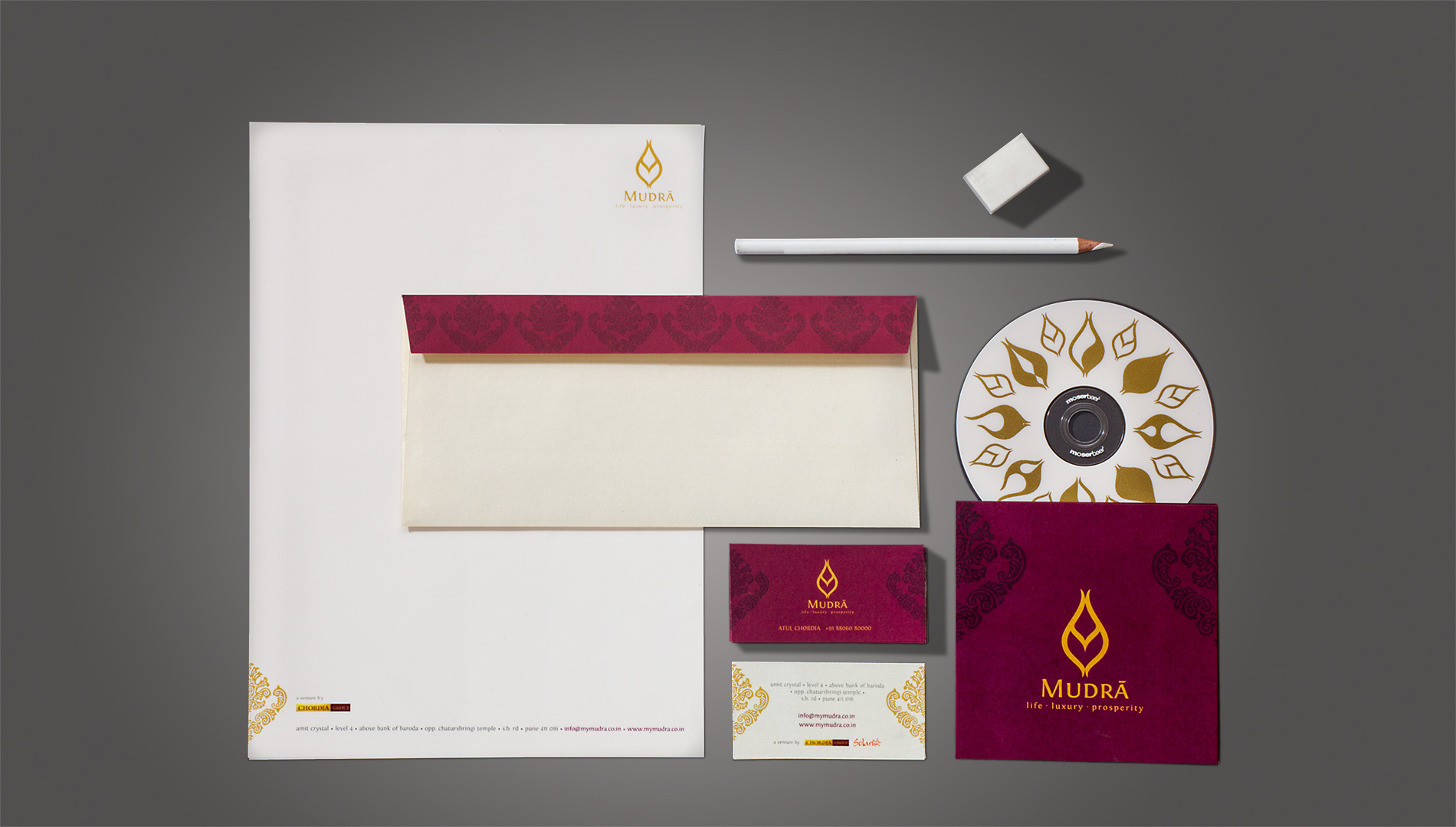
We didn’t work, we collaborated; not just with the client, but also the architects and the interior design team. Inspired by the idea of creating homes for traditional Indian families, we not only came up with the name and its symbolic representation, but also ensured the concept did not remain limited to just a name engraved at the entrance of this gated community. We decided to create a fluid identity – one that is connected to the customs and lifestyle of the ethnic group – that can be experienced at every touchpoint.
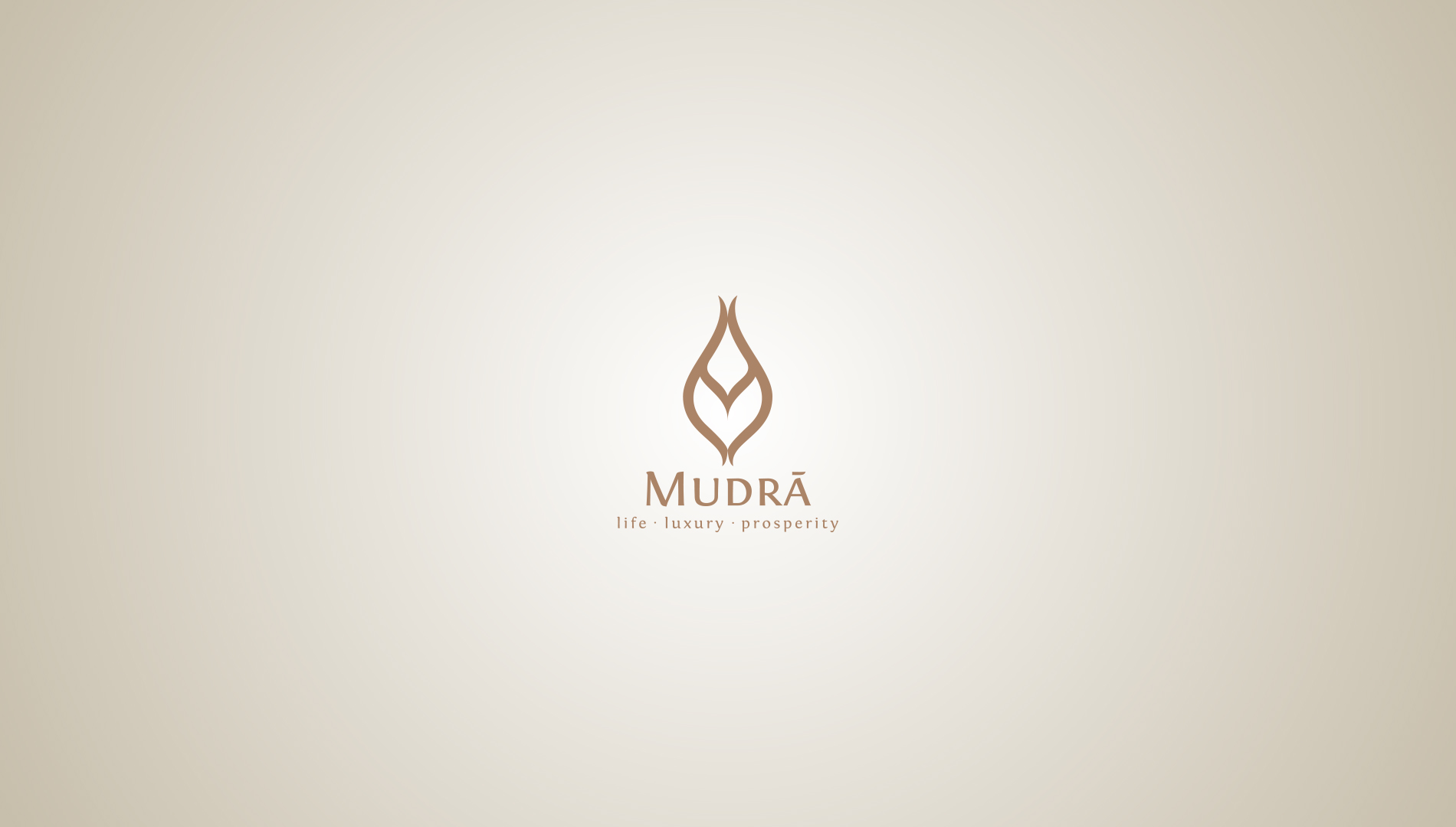
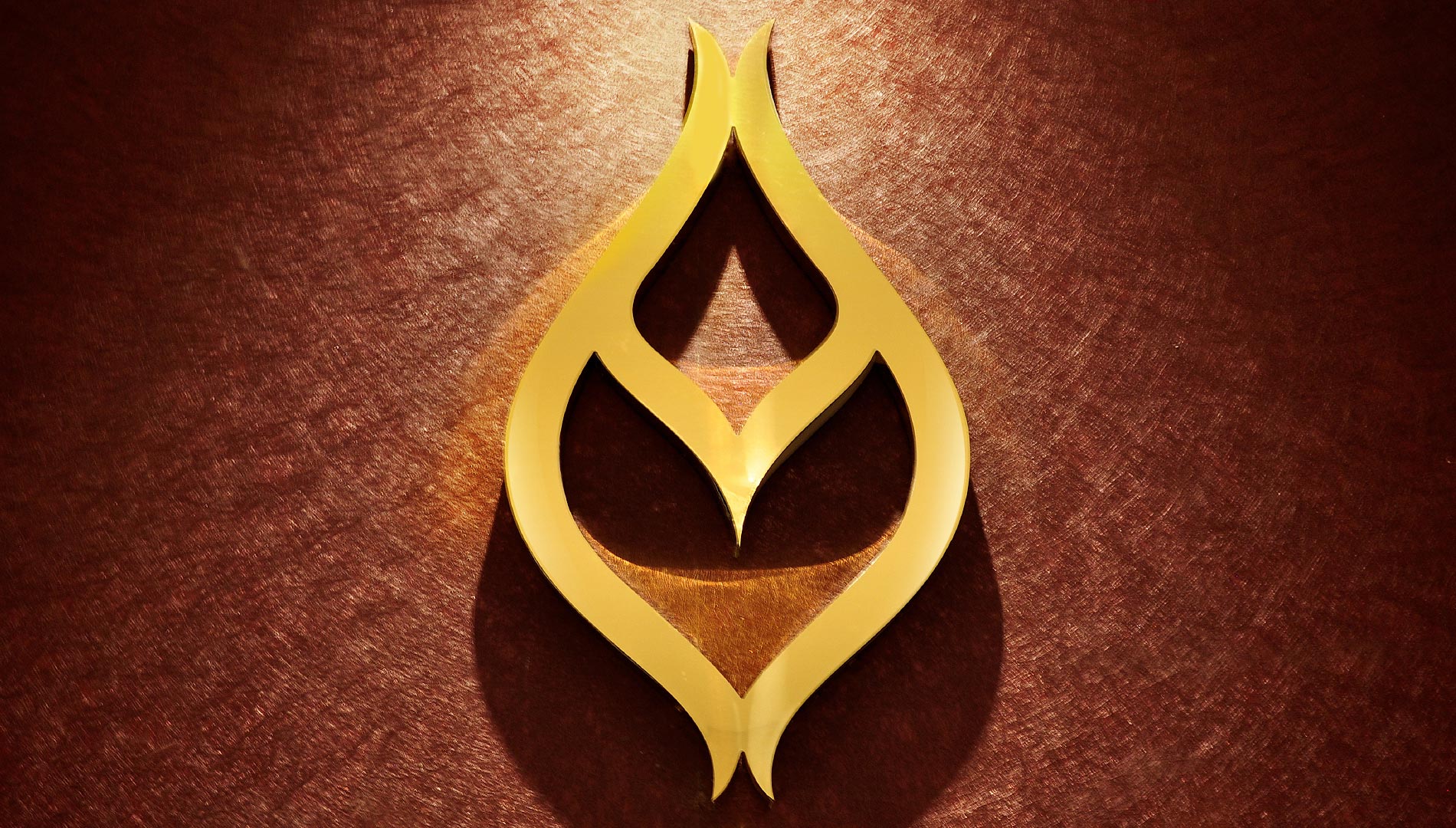
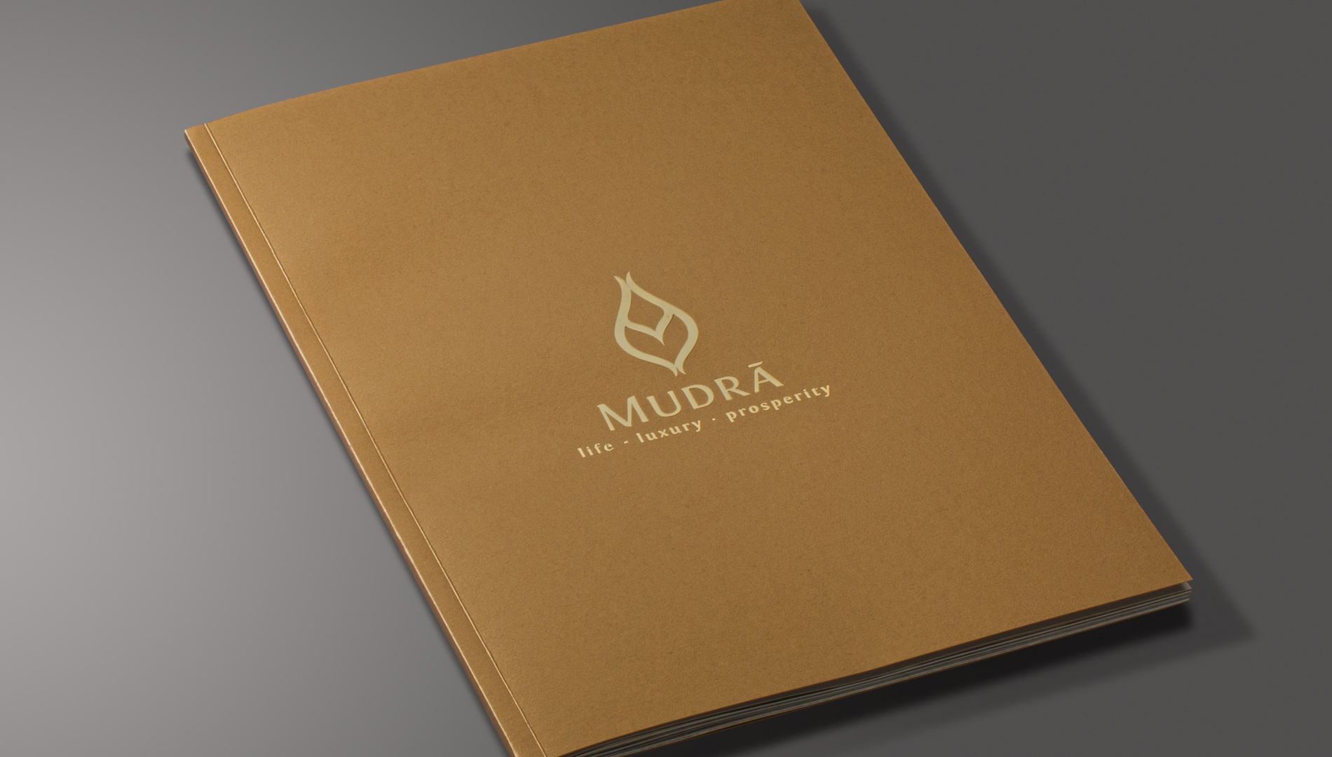
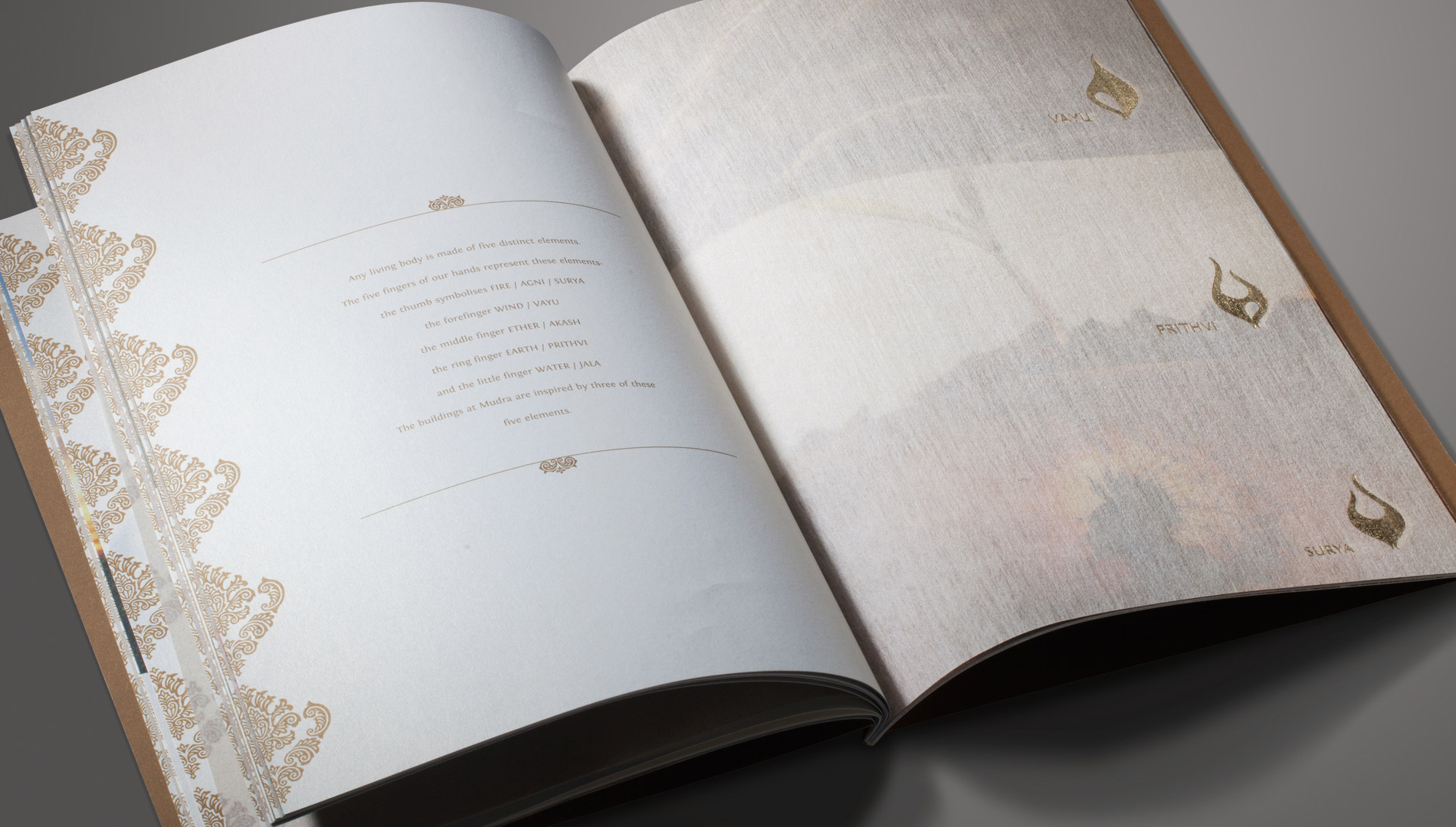
The identity emerges from the concept of Mudras or hand gestures. The main logo is a graphical illustration of the Surbhi Mudra, where all the fingers are connected. Signifying harmony and complete balance, it represents the five basic elements air, water, fire, earth and space, making it the perfect identity for the project.
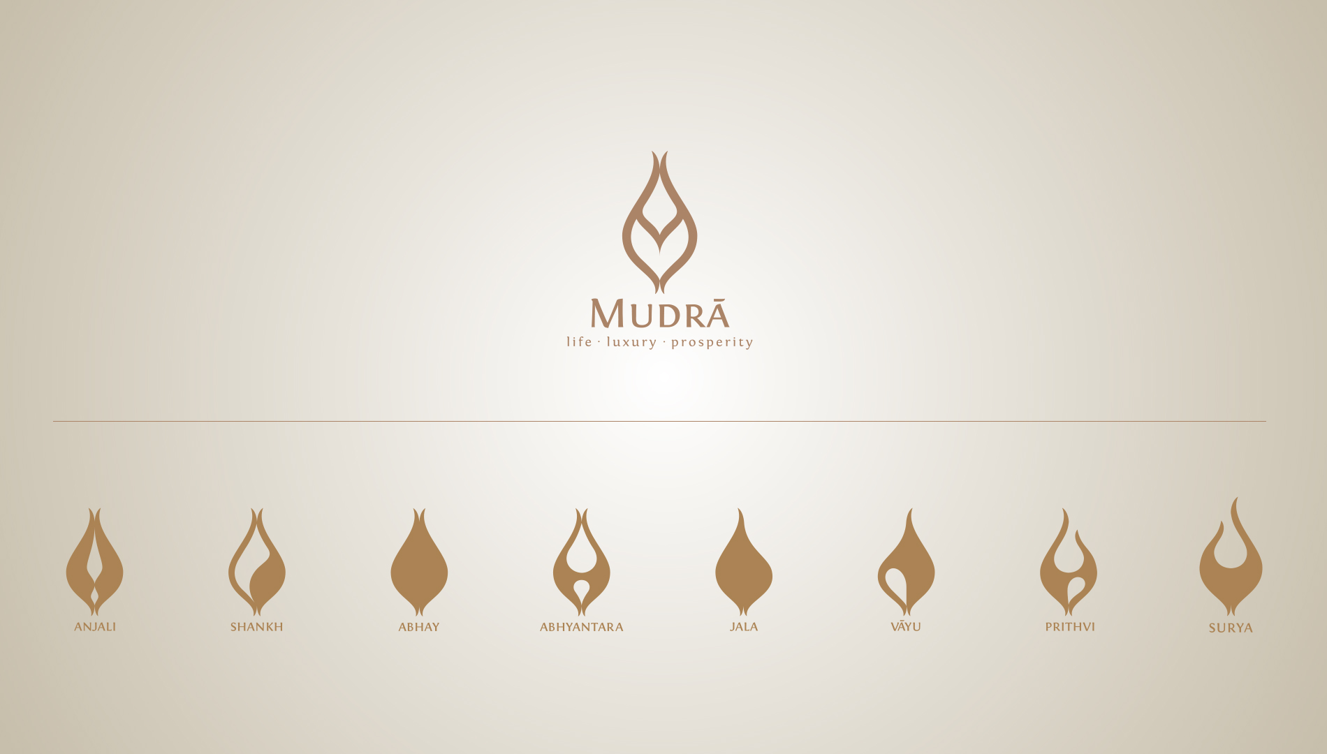
The family of Mudras represent various aspects of life and wellbeing. We carefully identified certain Mudras that align with key project features. The identity became dynamic to adpat to each of these Mudras and communicate the benefits of what they stand for within the project.
The primary symbol extends into multiple variants to create a fluid language. Their form is derived from the gesture of fingers and the meaning of the name of each Mudra.
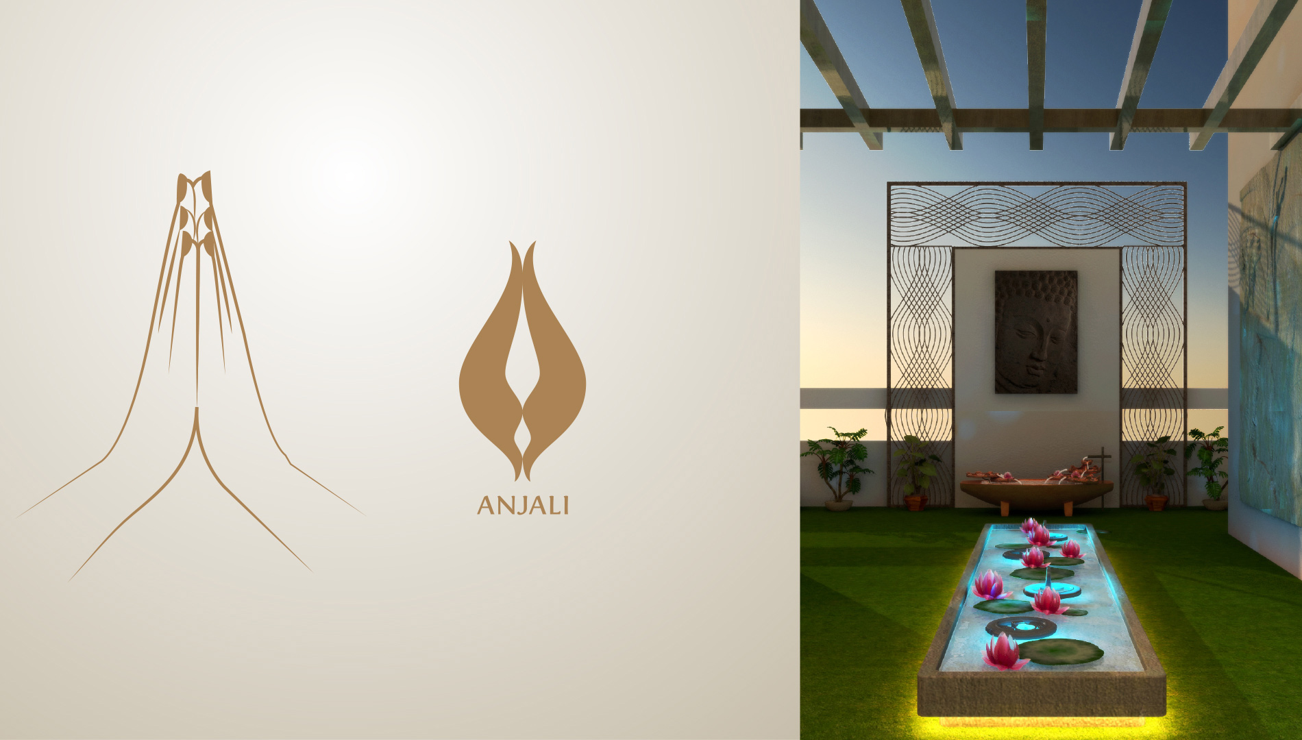
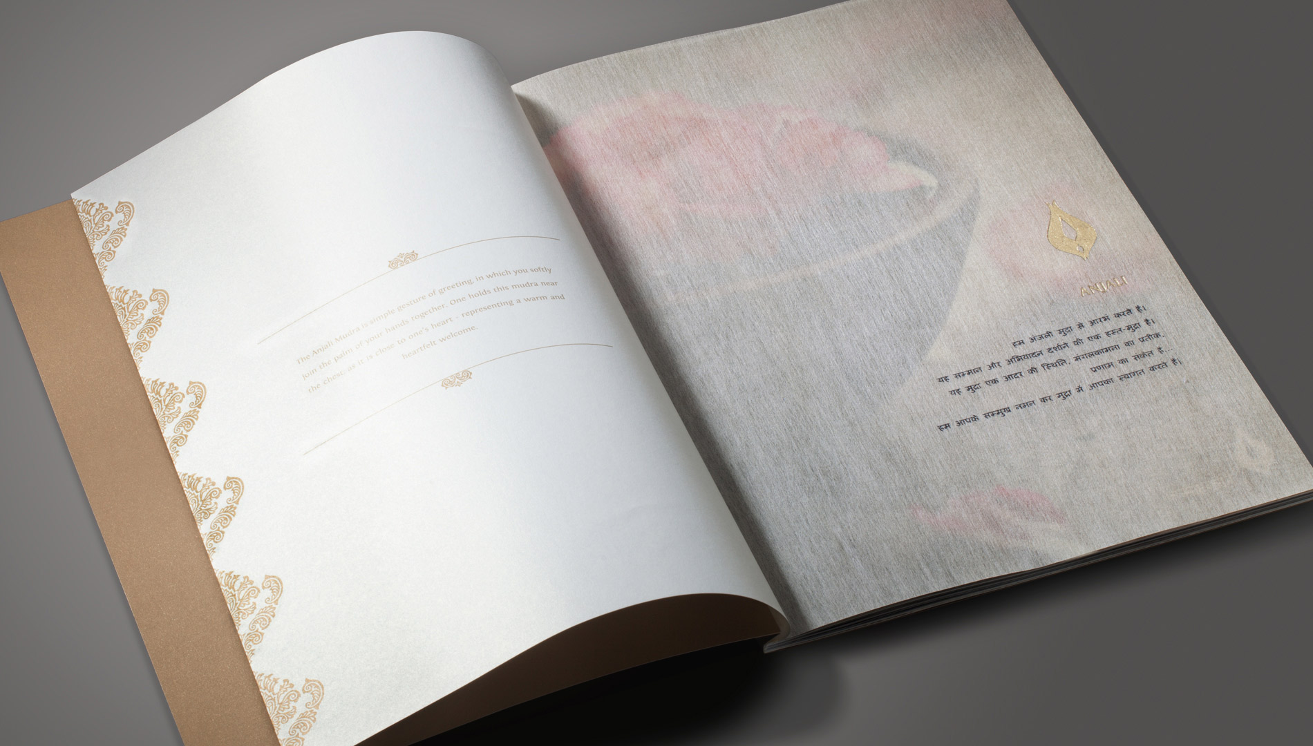
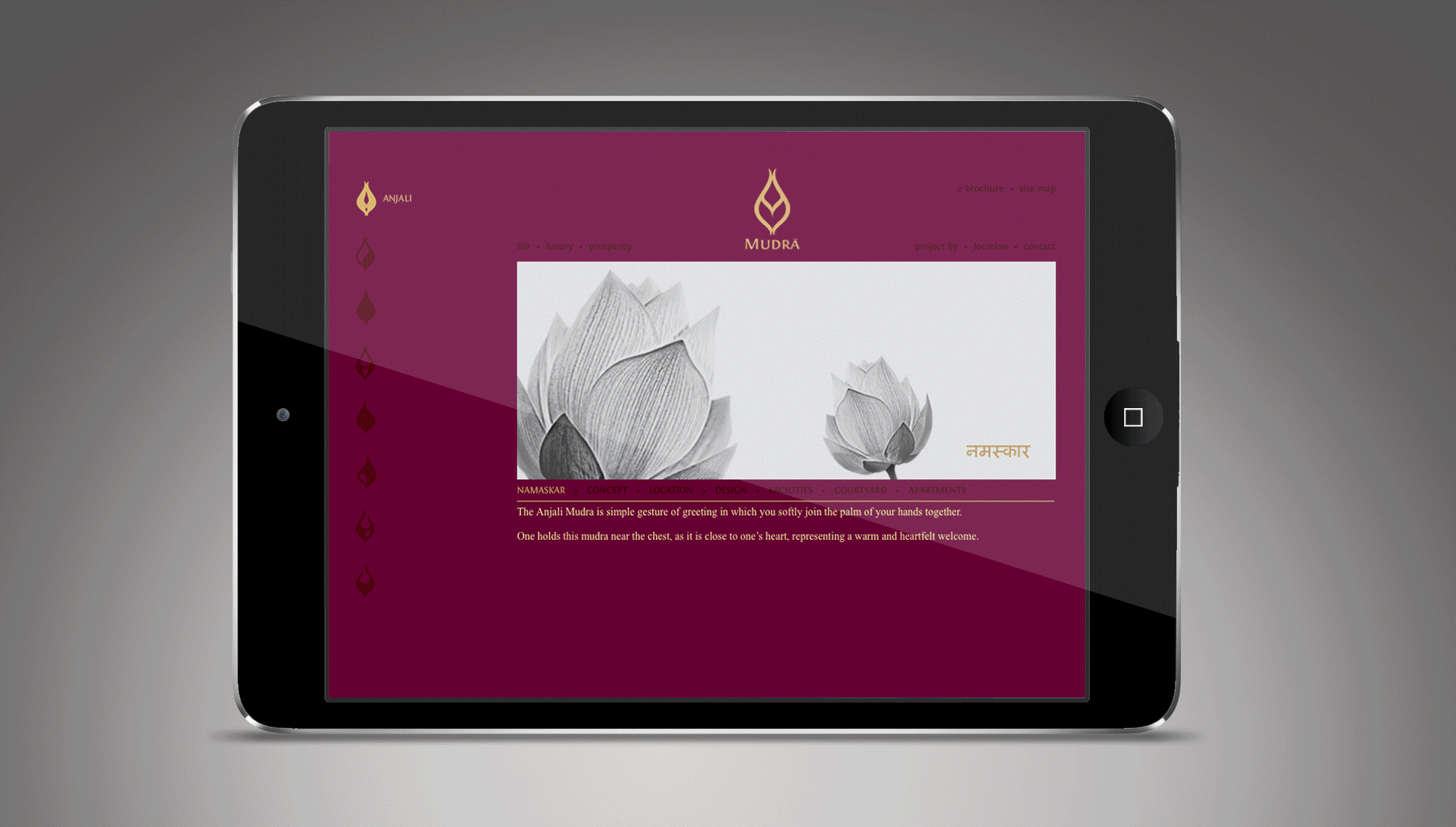
Welcome : Flowers : Offering
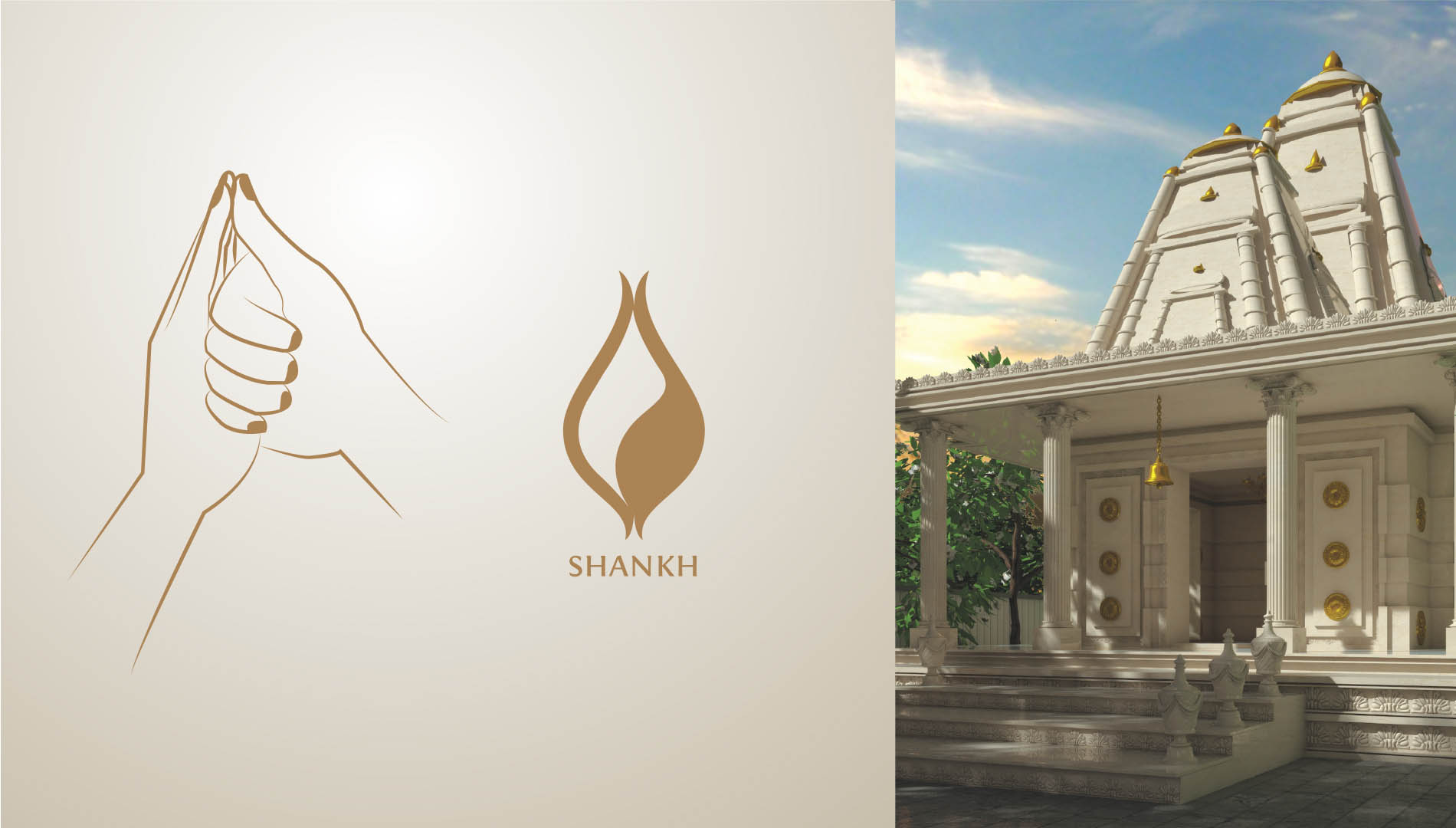
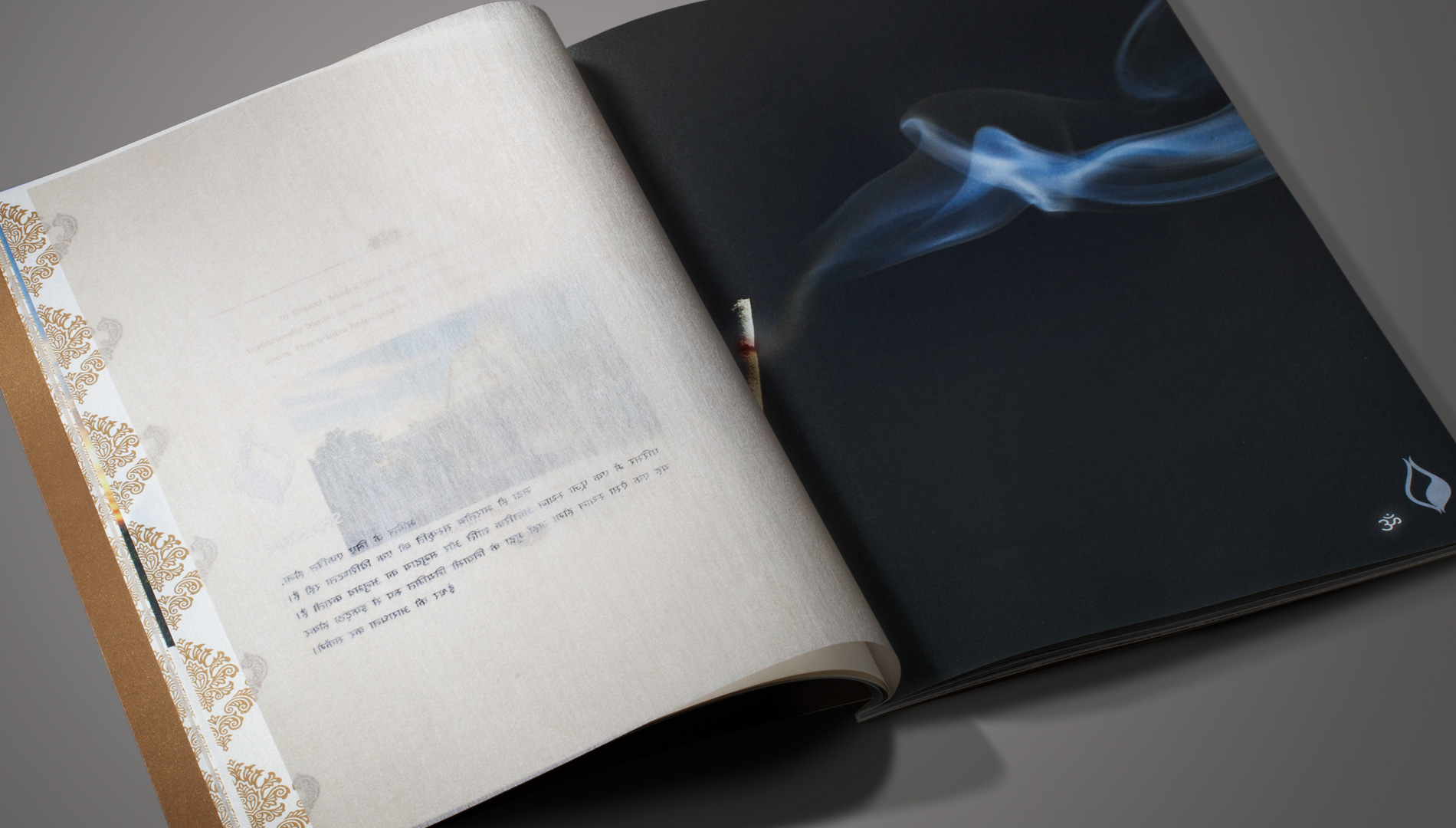
Place of worship : Positive energy
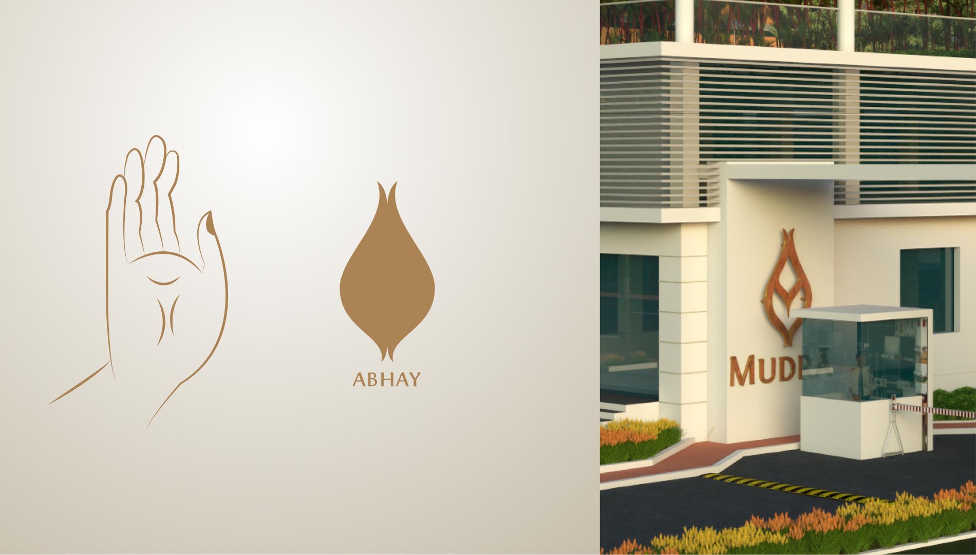
Security measures : Reassurance : Safety
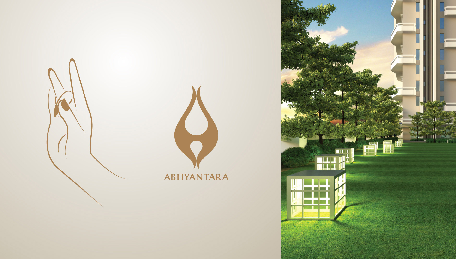
Peace inside and outside : Harmony
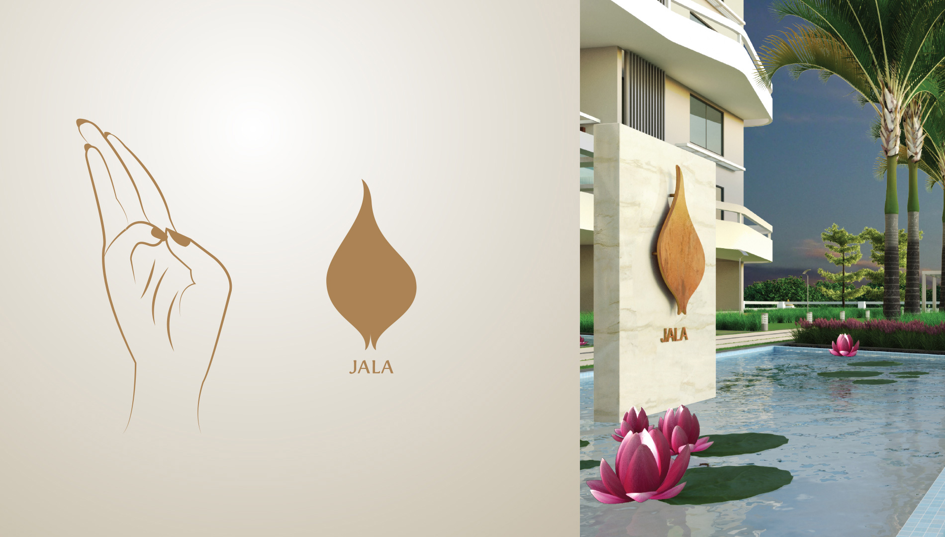
The visible and invisible presence of water : Purification : Hydration
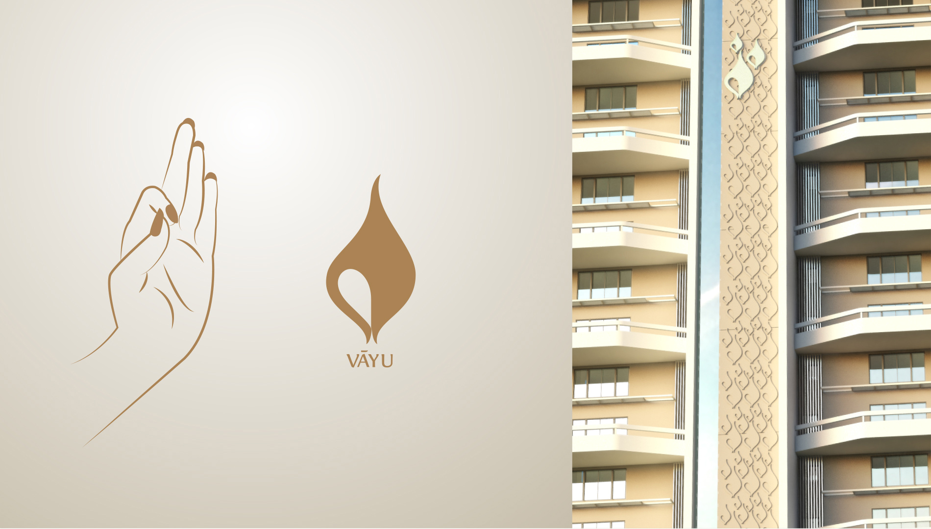
Primary Elements : An inspiration : Names of towers : Integrated into the architecture
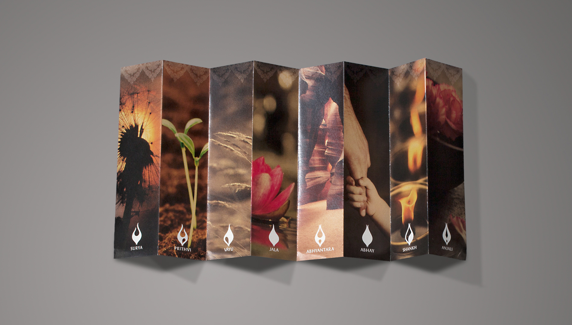
Guide to Mudra : De-constructed : Accordion-style
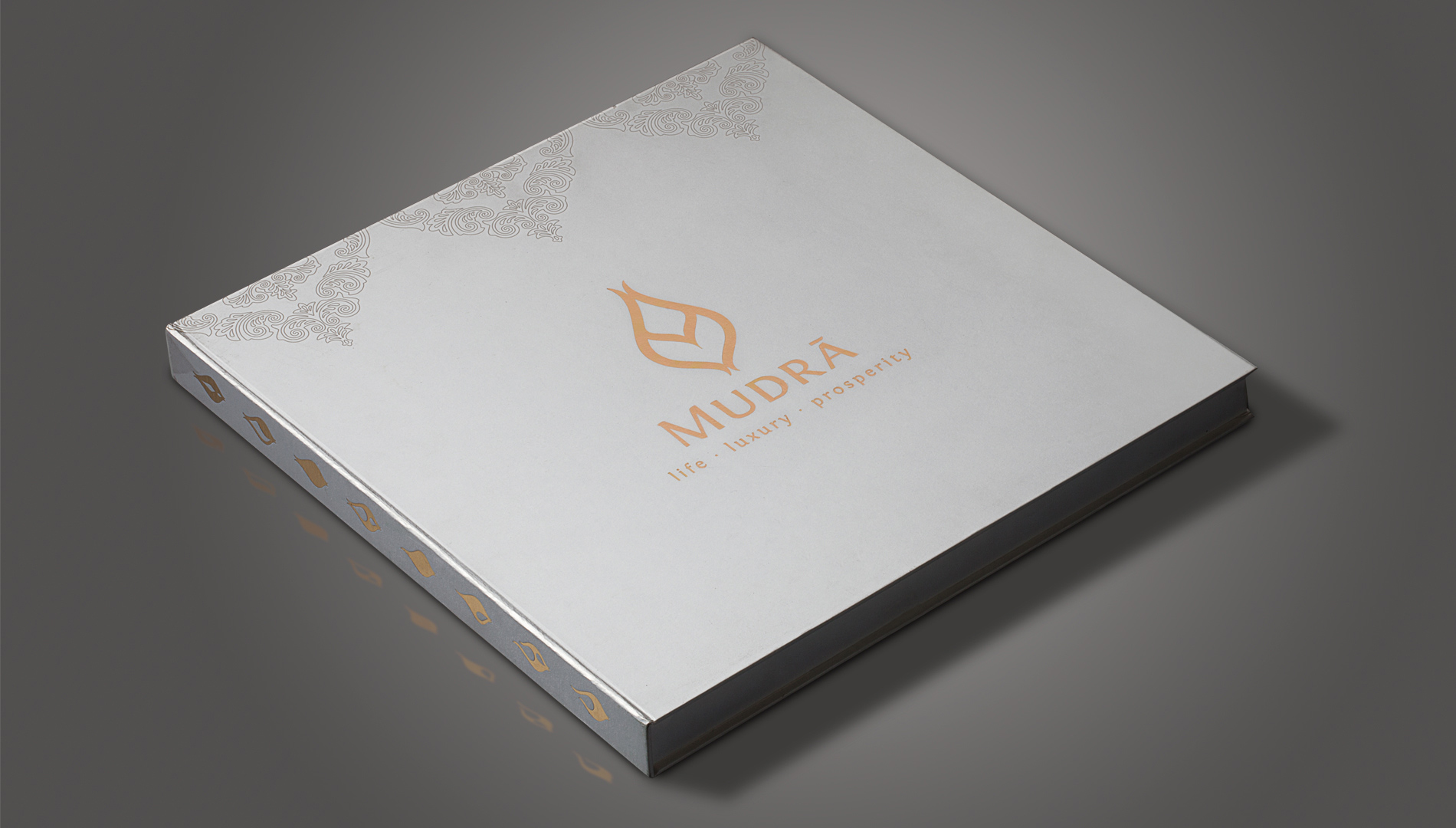
Not a typical project brochure : Made a new
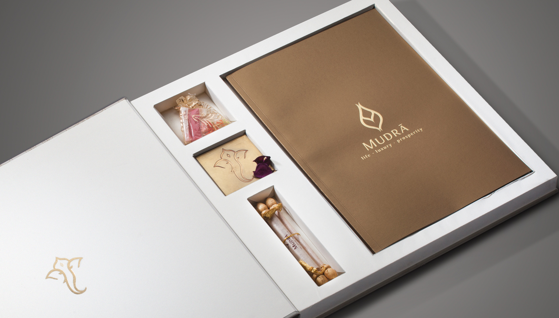
Ritual : Auspicious : Traditional mithai box : Invitation
English : Devnagiri : Everyone feels at home
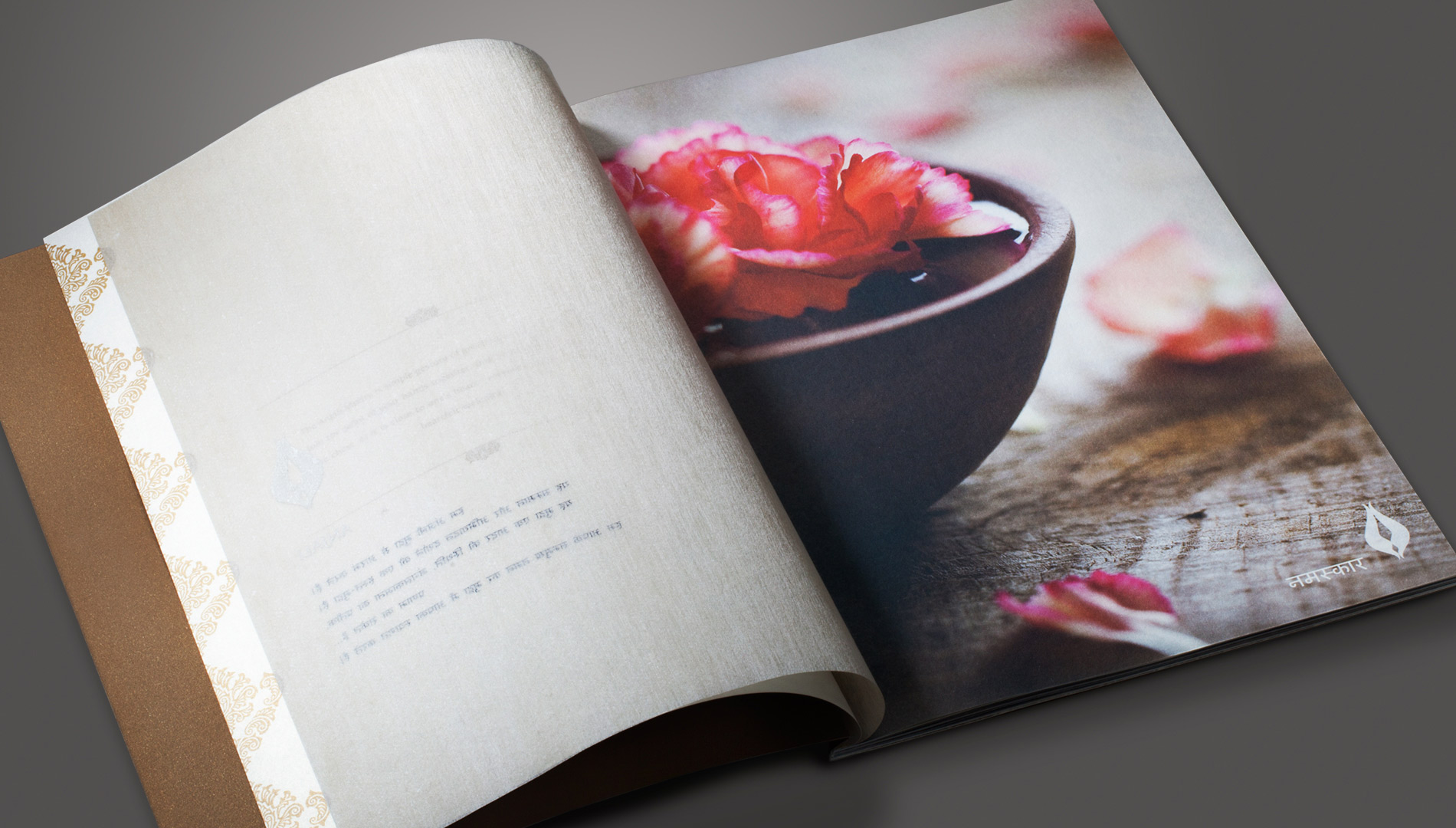
Namaskar : Greeting : Respect
Silk thread paper : Premium : Swadeshi
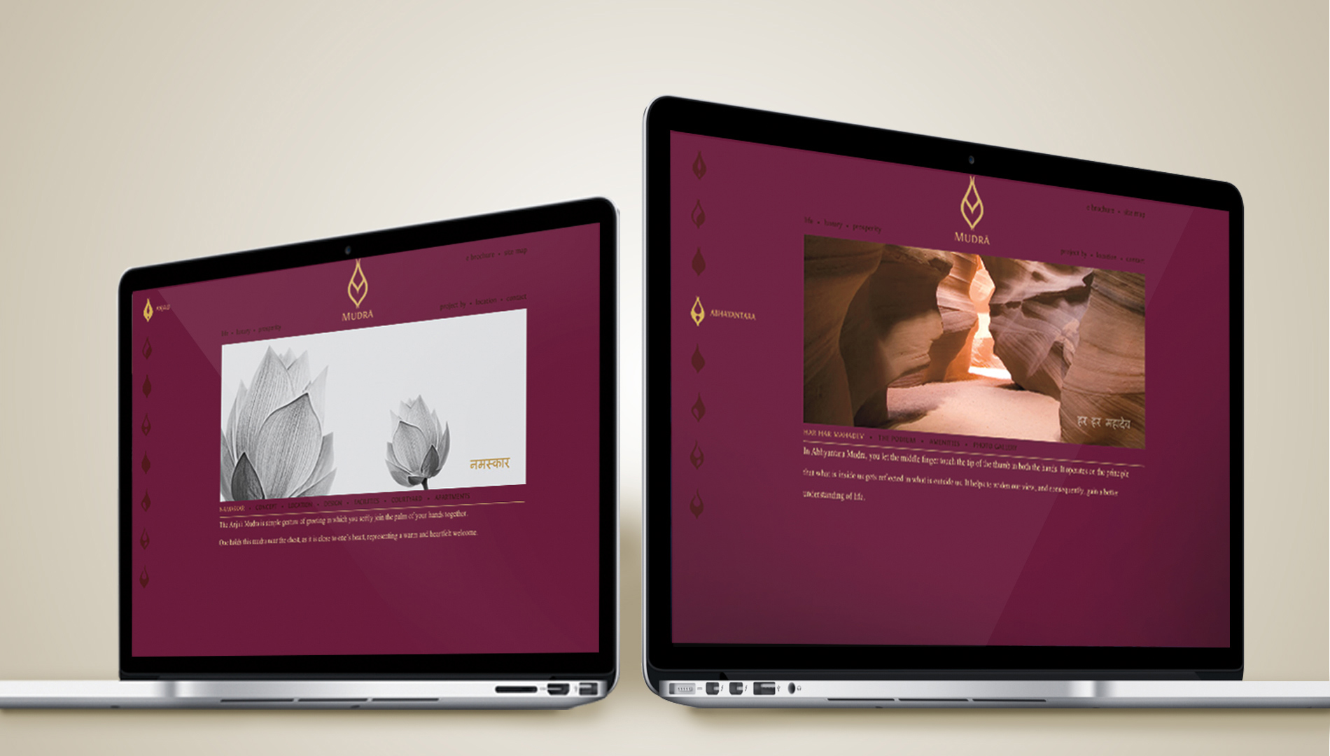
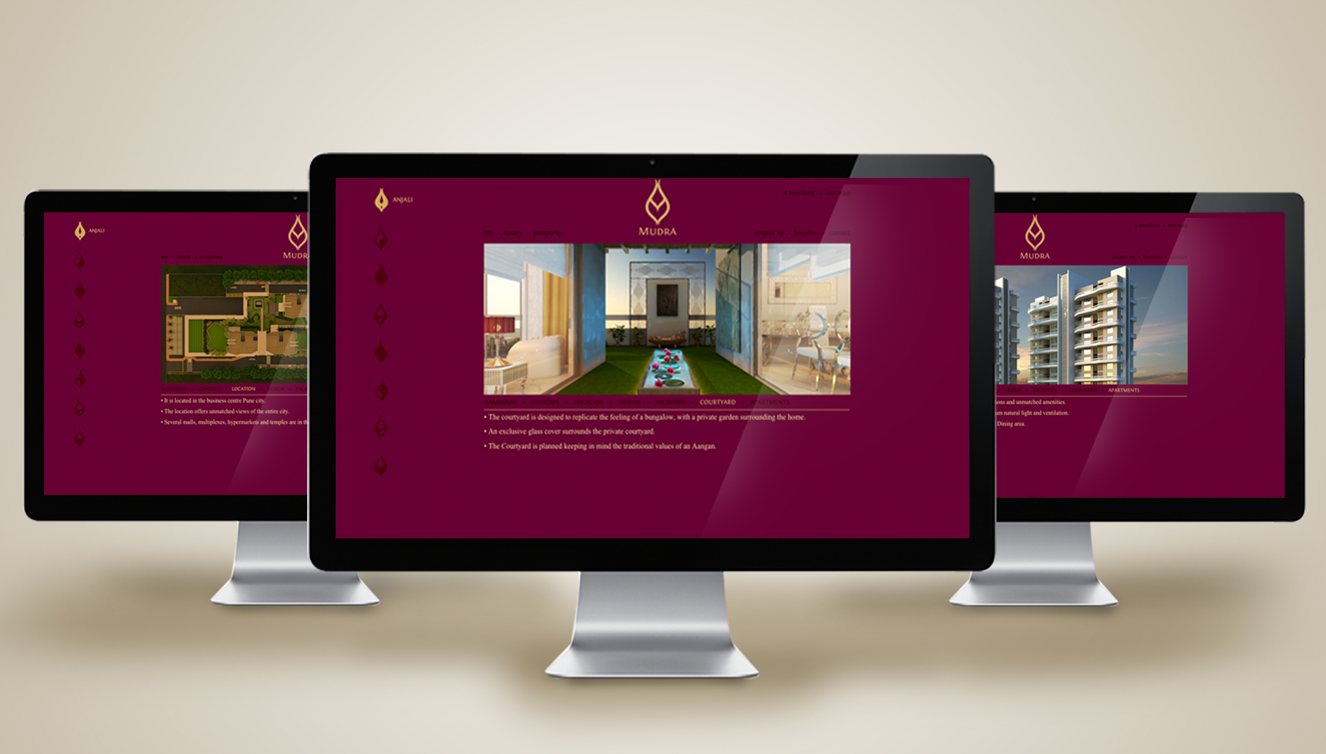
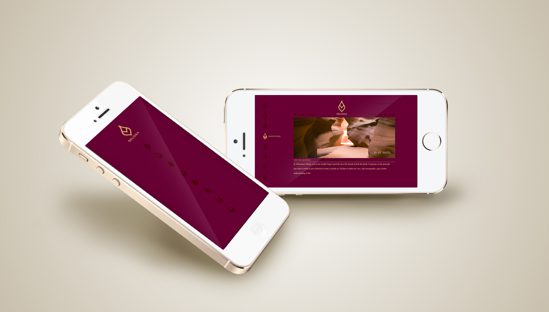
SYMBOL-LED WEBSITE
If the project is unique, as is the communication approach, can the website be far behind?
We implemented a wholly unexpected information architecture and navigation strategy in the Mudra website. By discarding the more traditional approach and using symbols for navigation, the website brought the Mudra way of life closer to the visitor.
The Mudra website compels the visitor to trace the path of the project through all its facets, making the experience unique and memorable.