We’re one, but we’re not the same.


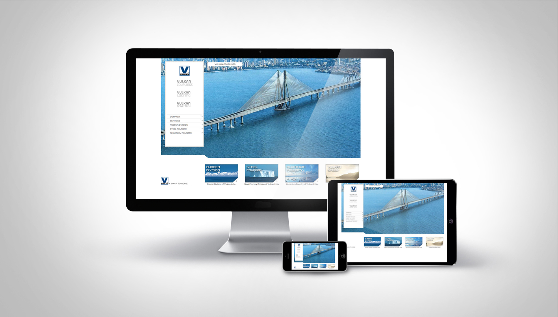
When Vulkan realised it needed a new website for the Indian market, it meant bringing together a fragmented identity that covered three brands, across multiple Strategic Business Units (SBUs) and different industries. The challenge for the Indian subsidiary of this German company was to bring together, in a cohesive and seamless manner, six existing websites, all active. How easy was it going to be, creating one cohesive, streamlined, professional site; one that covered the businesses of maritime, industrial, cooling, as well as aluminium, steel and rubber foundries?

project_image
MULTI-SITE
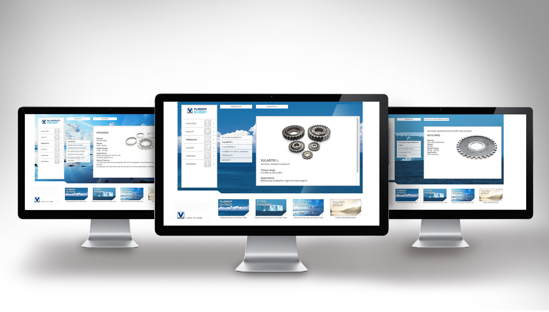
The challenge for the website was to unify separate brands under the Vulkan banner while keeping the identities separate. The starting point was to consolidate six websites into one, to start with, and then to build on that. If that wasn’t all, there were existing parent company guidelines that had to be adhered to. The complete digital solution included understanding the business and technologies, collecting a lot of information and categorising it accurately, whilst adhering to their German counterpart’s standards of design and photography.
project_image
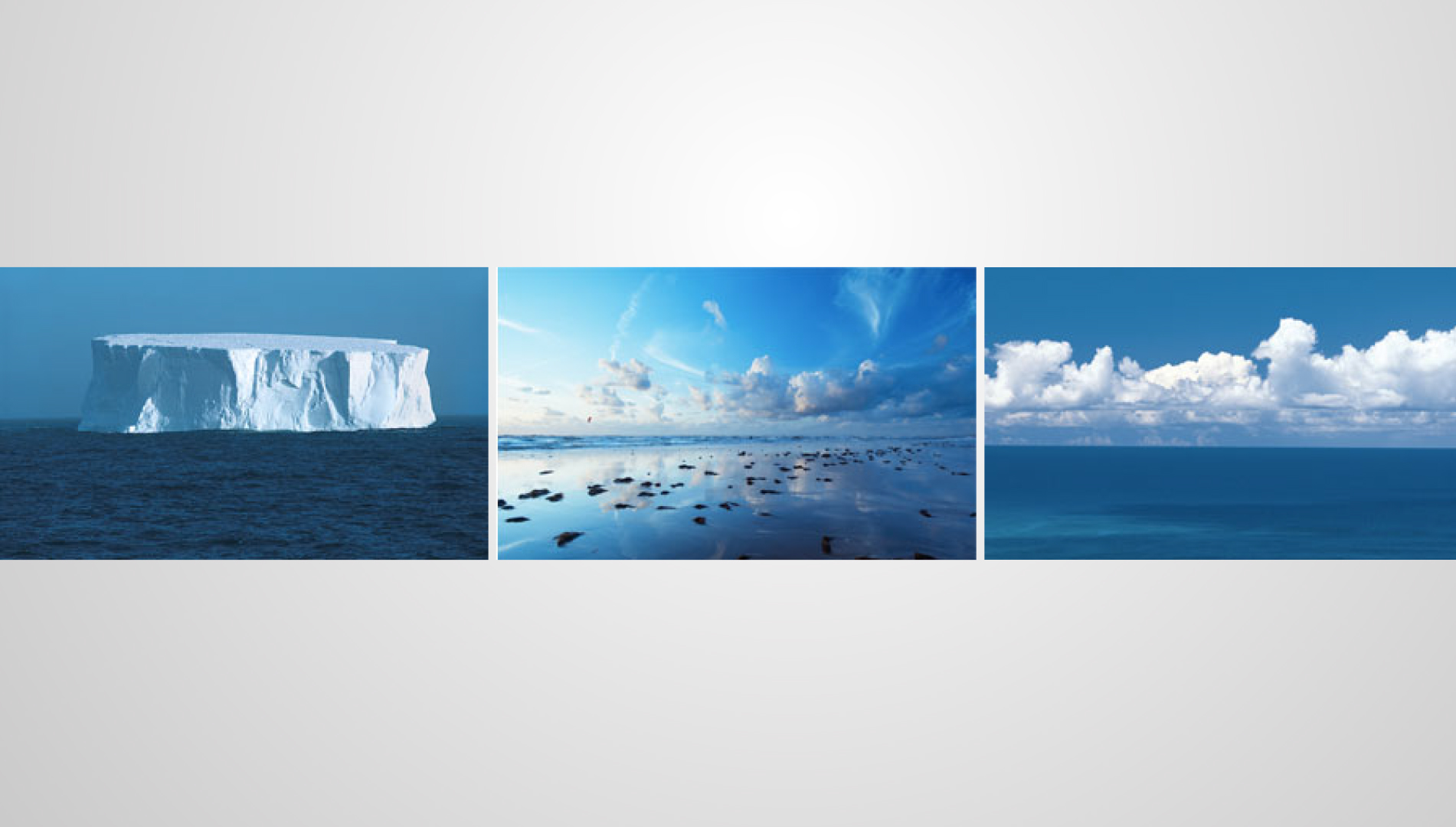
A fluid visual language
project_image
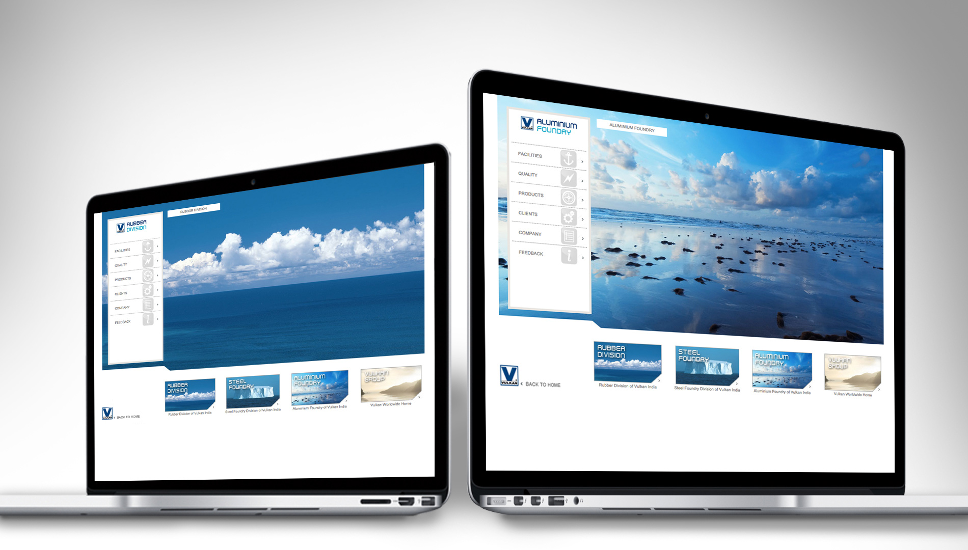
Easy to switch between SBUs
project_image
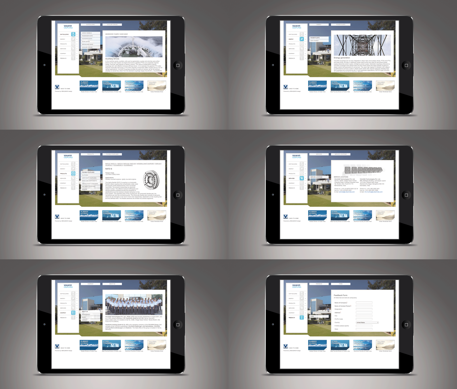
Explore each SBU in detail
project_image
Explore products in detail