

When a solution gets a befitting projection
Ezeeserve, a company that is here to simplify every society management’s woes with the power of technology, needed the right brand projection. One that would give it distinction and generate great interest.
SIMPLIFYING SOCIETY MANAGEMENT
The identity was designed to make it look easy and approachable. Bright yellow and orange brought in positive vibes and hope. The two forceful swishes or smileys as we call it connect the 'e' and 'e' to signify end to end solutions that's on offer and also the final outcome of our interventions. Smarter society management was chosen as the positioning to clearly introduce the domain yet give a subtle indication of a superior service experience.

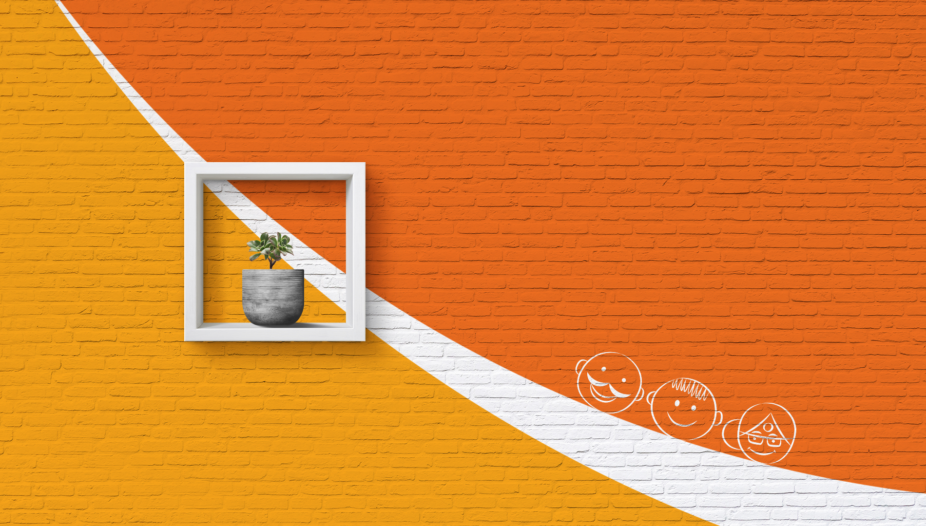
Since this was about technology bringing people together and enabling smooth interaction between them, we thought of humanizing the brand. A society is made up of its people and it is infact the coming together of diverse personas who reside together in harmony. We created characters to highlight this unique attribute.
Specific icons were created to highlight its service offerings.
A distinct signature design language was thus born for Ezeeserve.

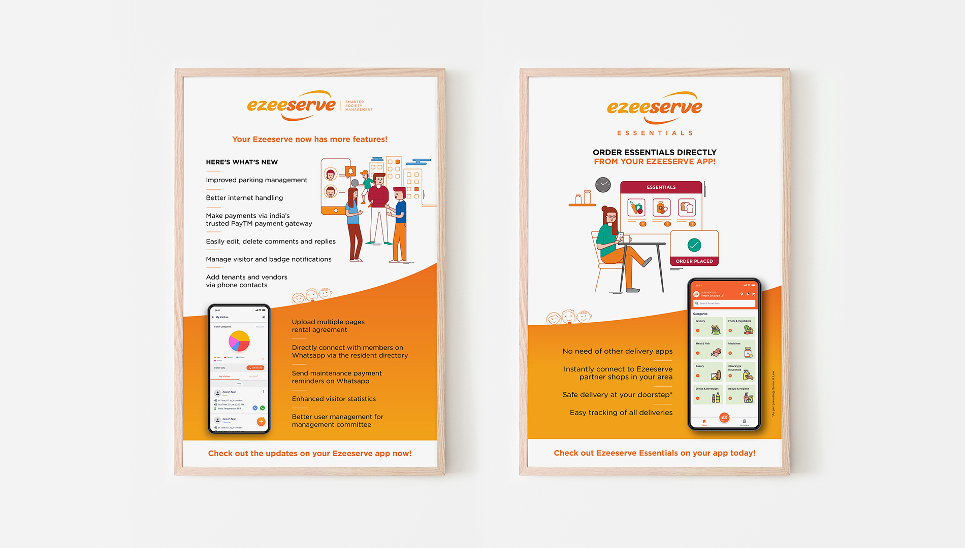
This brand signature was further extended in to the sales stationery collaterals.
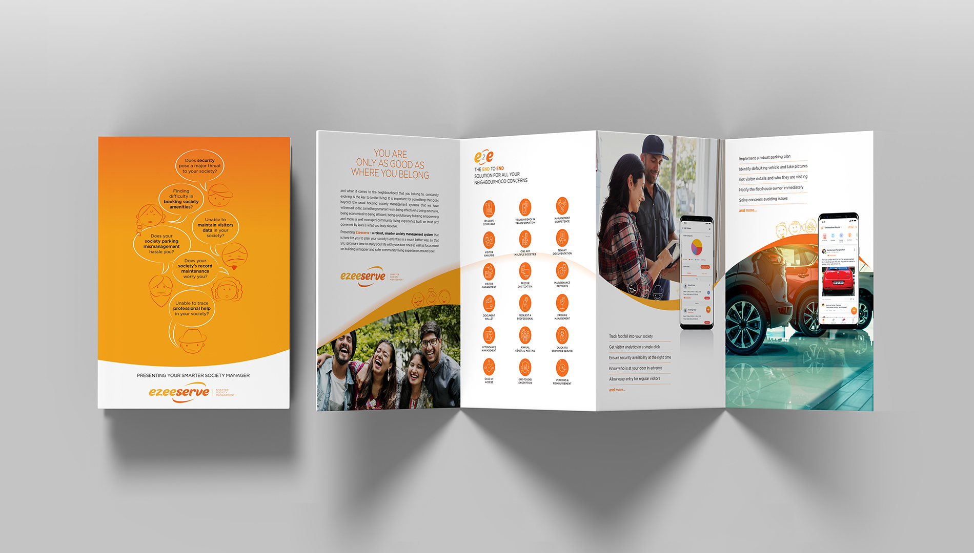
Sales collaterals were created to give the required vital information designed along the set design language.
Other communication collaterals also followed the set design language to bring in consistency.
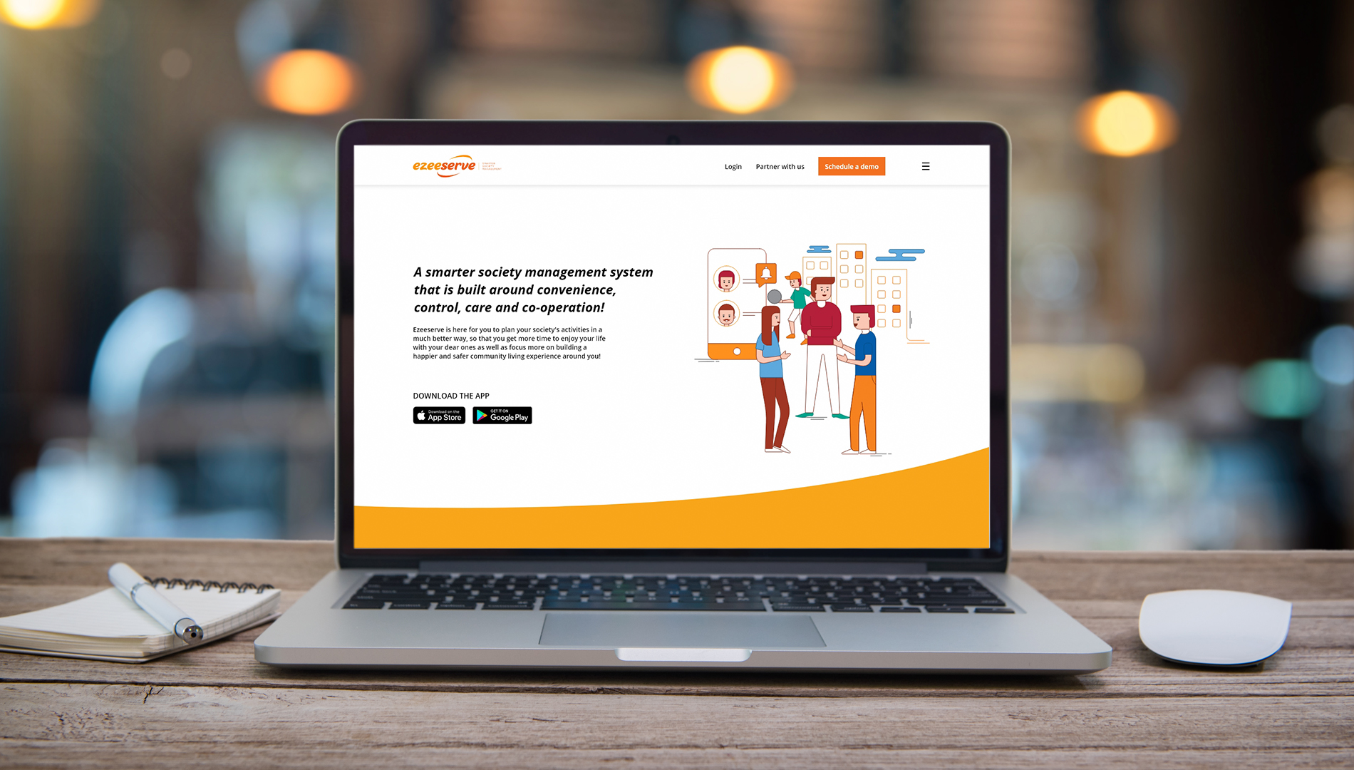
The website was designed to yet again communicate vital key information while staying true to the unique brand projection.
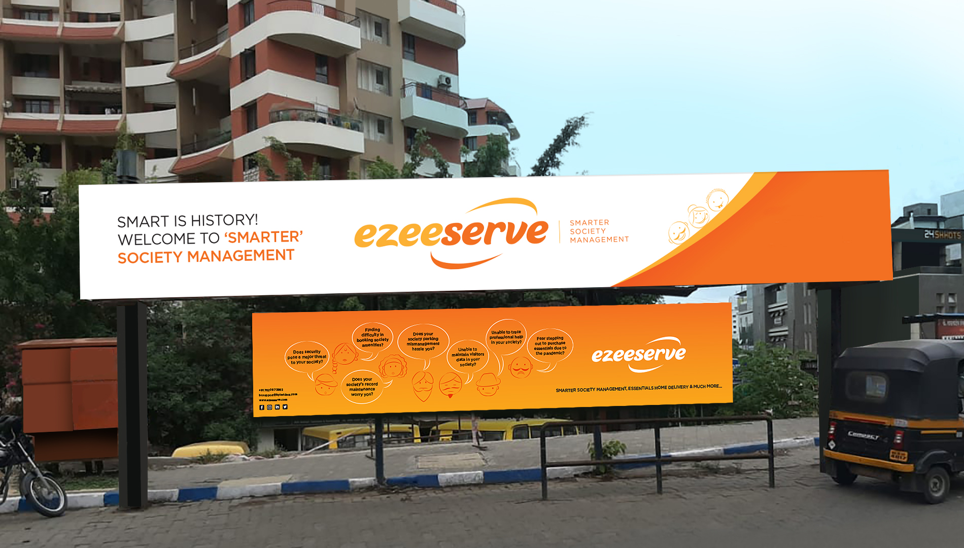
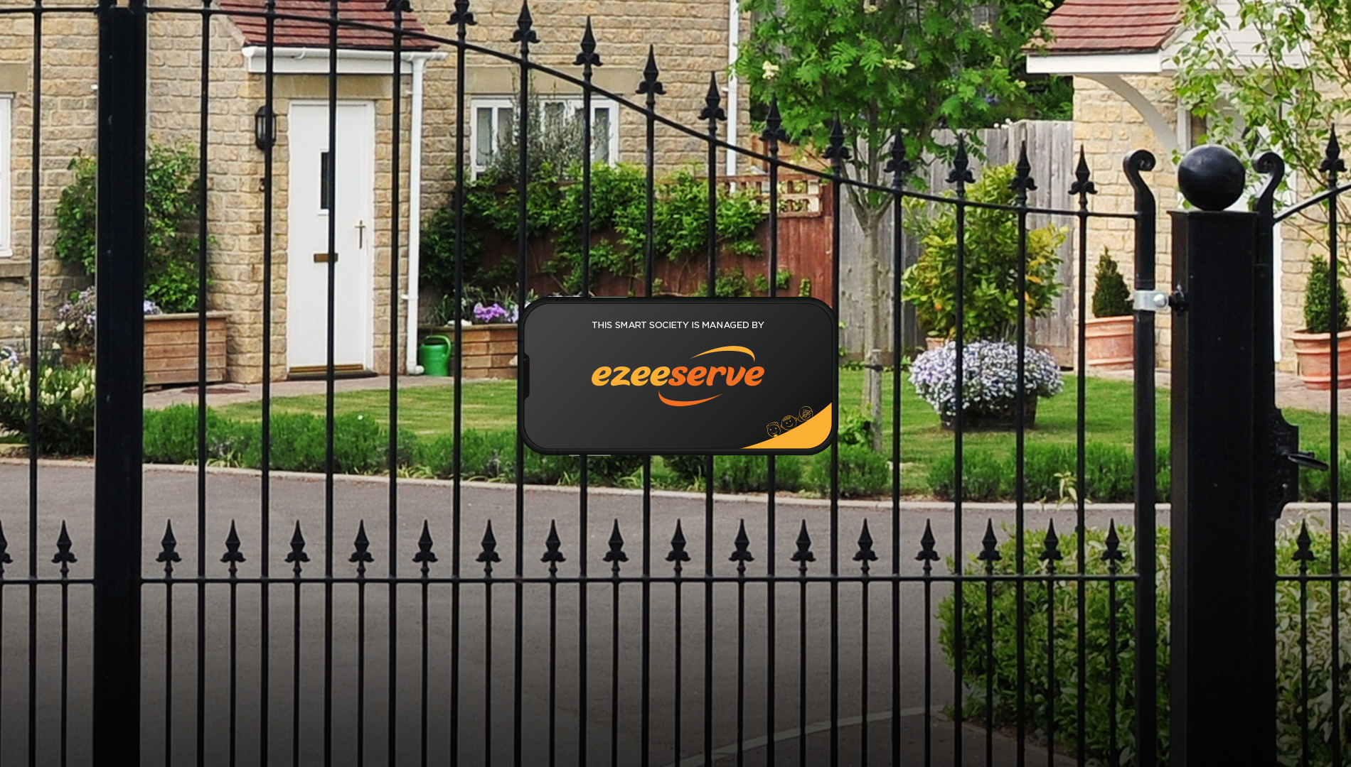
Specific ambient media was explored to introduce the brand to the audience and generate buzz. With this a new, smarter living experience now awaits your society, exclusively brought to you by Ezeeserve.