Face it, advertisements are an interruption.
Just before a murder is solved, just as the hero kisses the girl, just as two women realise they’re separated twins, an ad jars you back to real life; washing soaps, toilet cleaners, instant noodles, deodorants. Mostly boring, always an interruption. Is there a way consumers can give their feedback – good, bad, ugly – to make ads relevant? Adhop brings brands and consumers together, enabling dialogue. Consumers can choose which ads to watch and give their reaction immediately. The name adhop was spot on. What it needed was strong branding to make the experience as interesting as the idea.

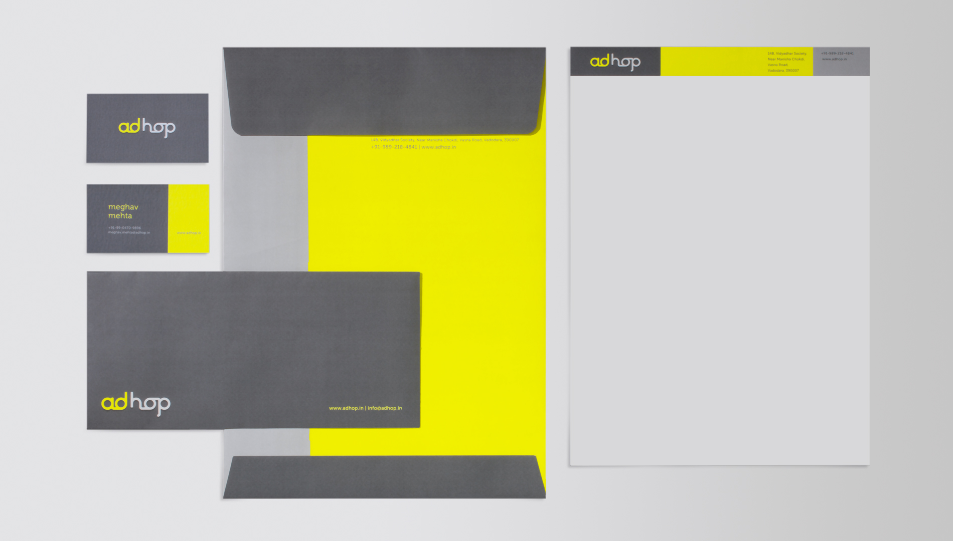
BRAND IDENTITY
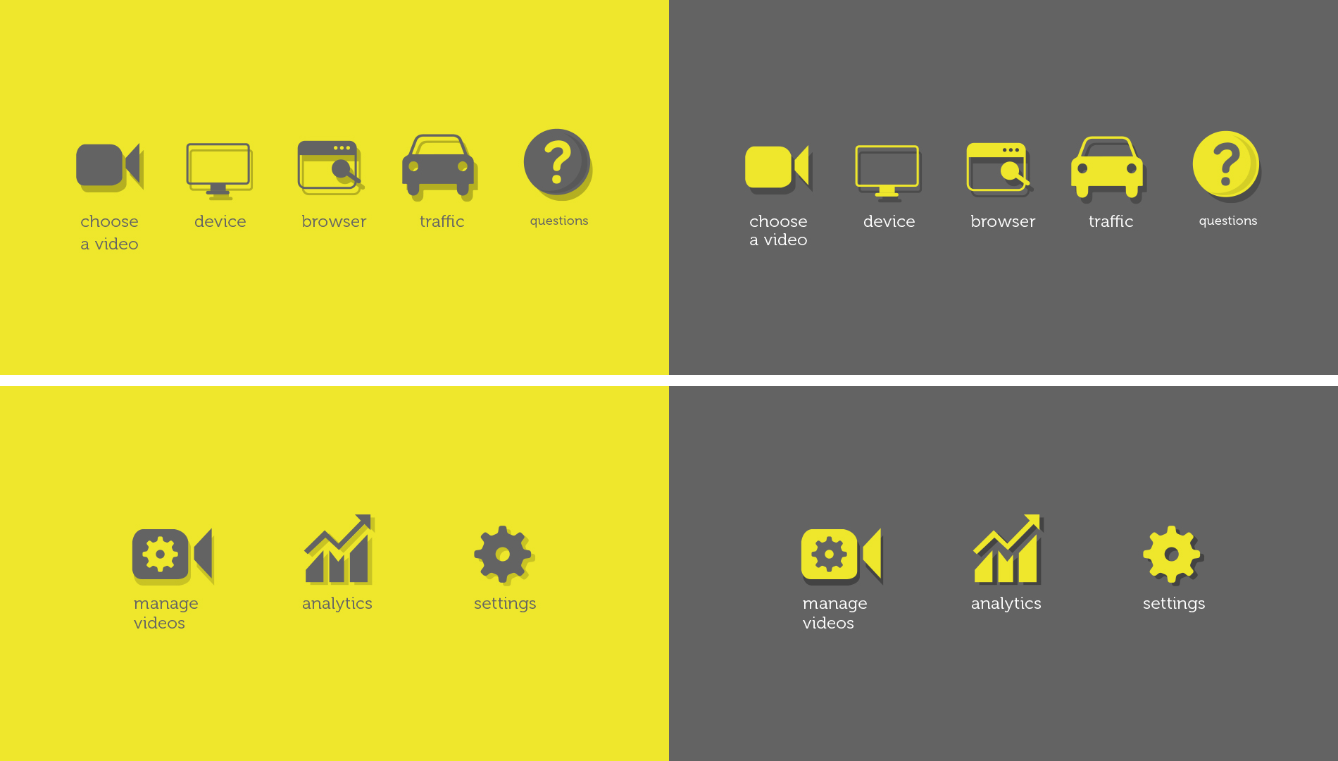
Ad... hop, as the name suggests, is a digital platform that invites customers to view ads and tell brands how they really feel about them. This gives the brands genuine insights about their customers and helps improve content. It’s a cyclic journey of adhopin'. A 'loop like' form for the logo seemed like a good place to start, its boldness reinforced with a bright yellow. To keep the flavour of continuous dialogue, which was to take place online, a lot of icons and symbols were put in place to make it easier for consumers to give feedback.
Loop : Bright : Bold

Boring grey to sunny yellow

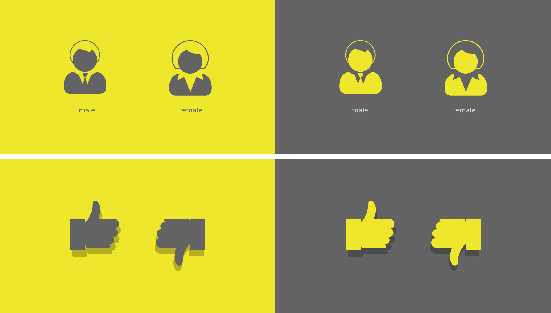
Visual language : Iconography
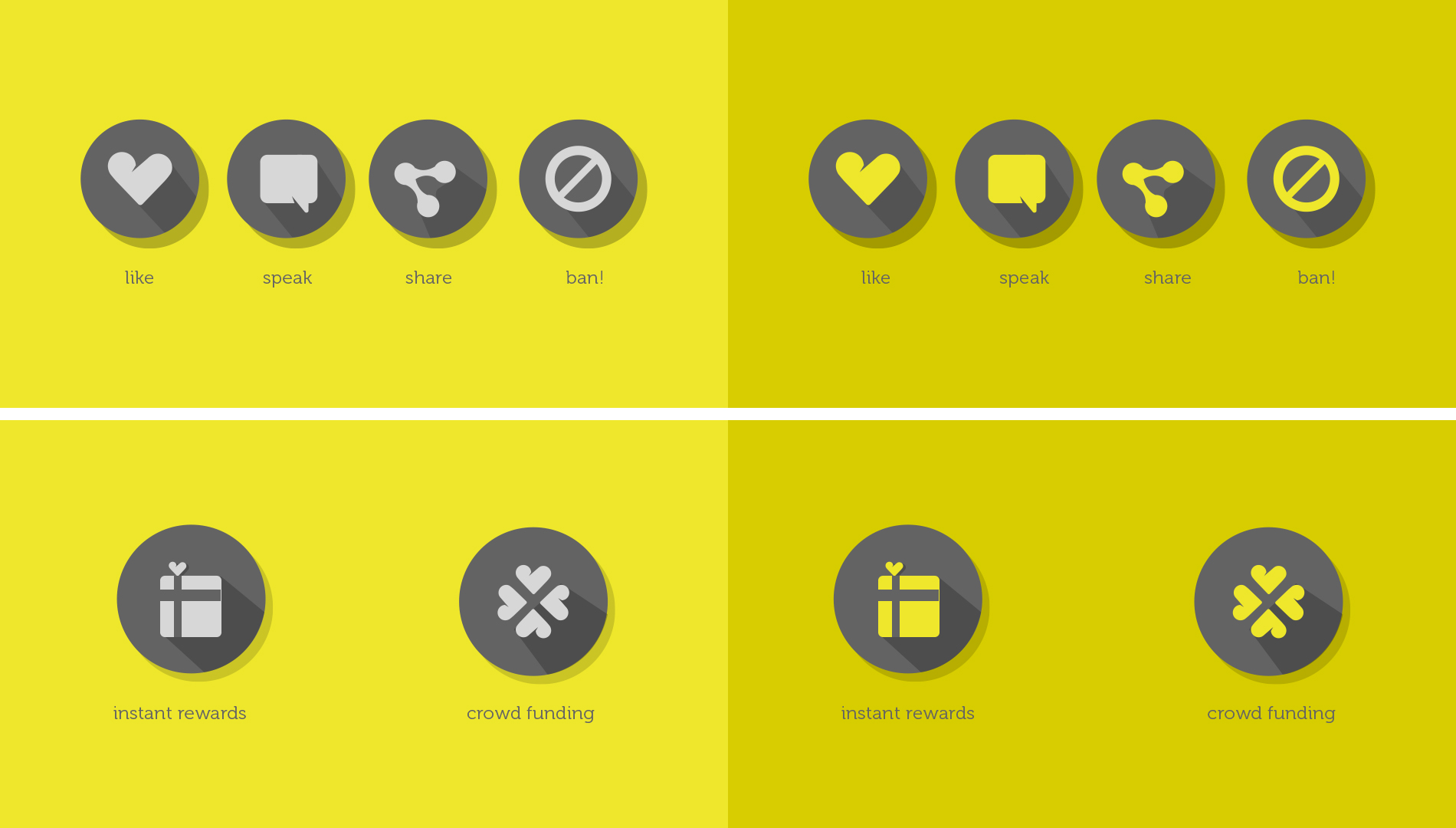
Icons for action
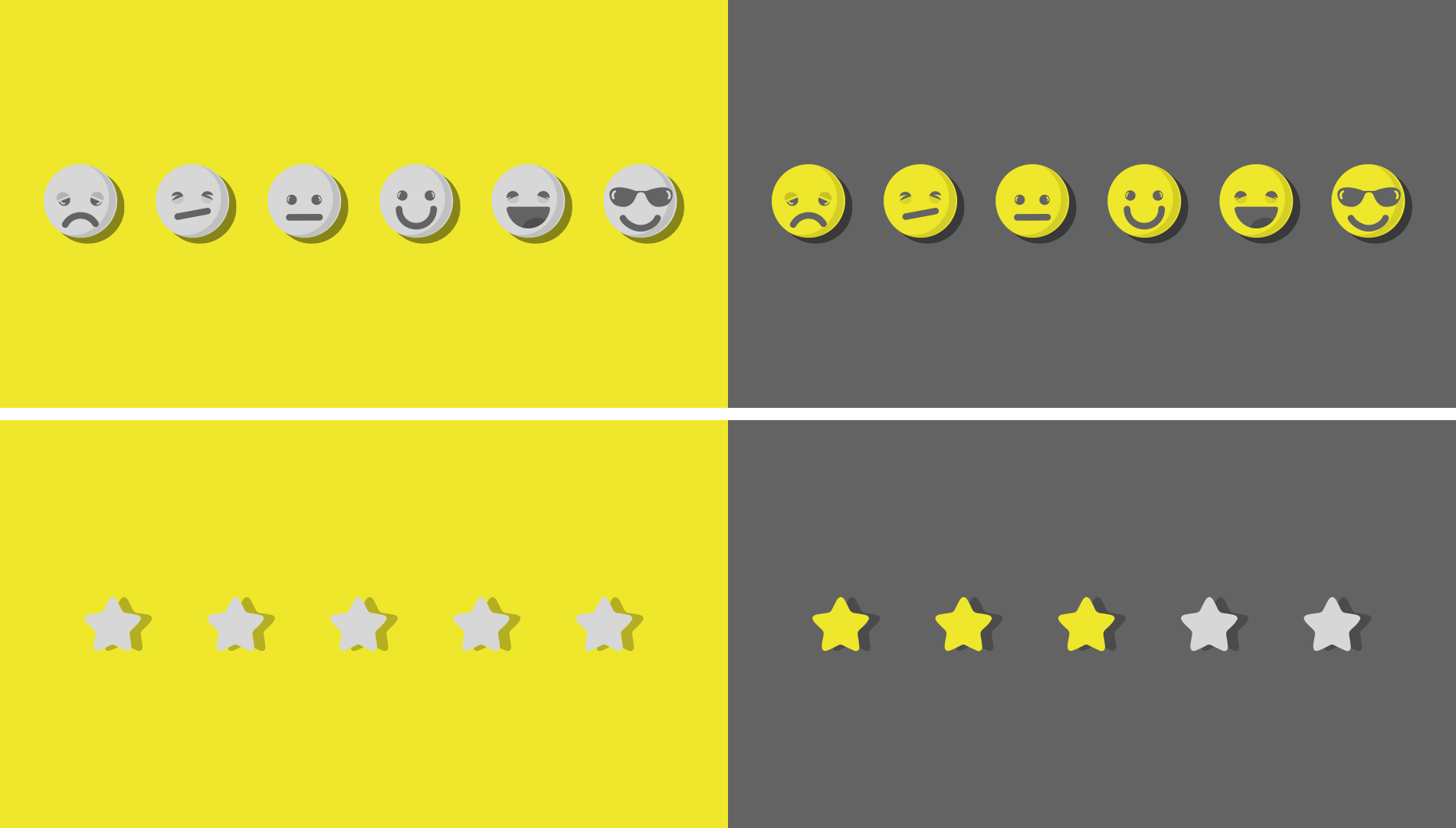
Express : Preferences