![project_image]()
A PROJECTION OF AUTHORITY
It was imperative that the project was authoritative, though the venture was a new one. An evolved articulation was thus required instead of just another functional representation. Strat & Quant thus stood out as an appropriate choice as it represented the strategic interventions that one needed to achieve quantifiable outcomes.
![project_image]()
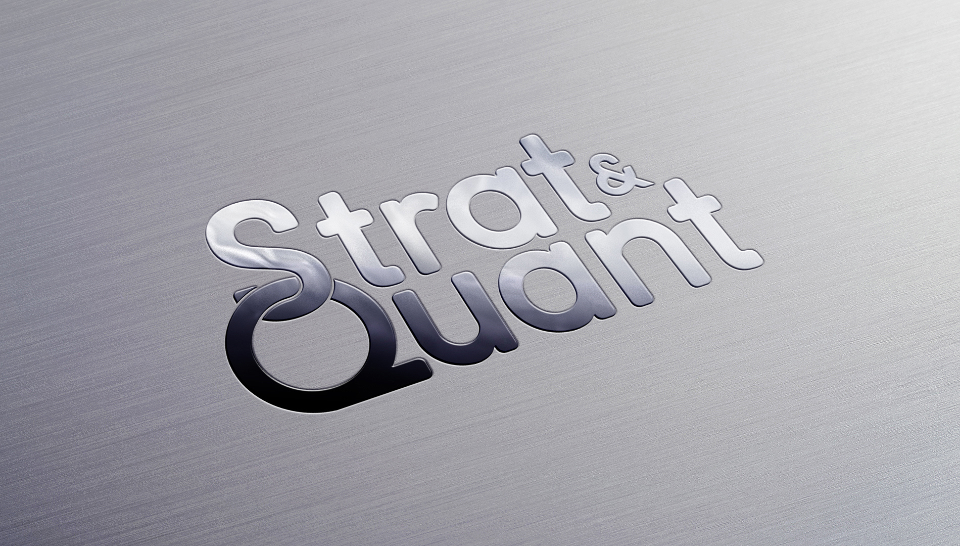
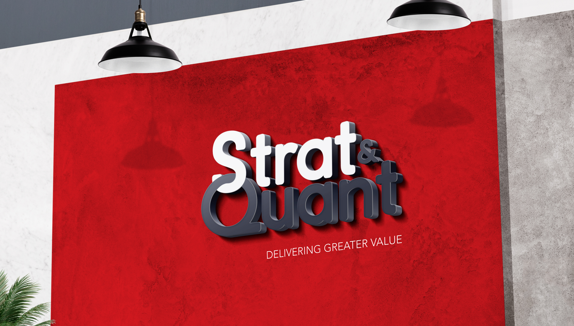
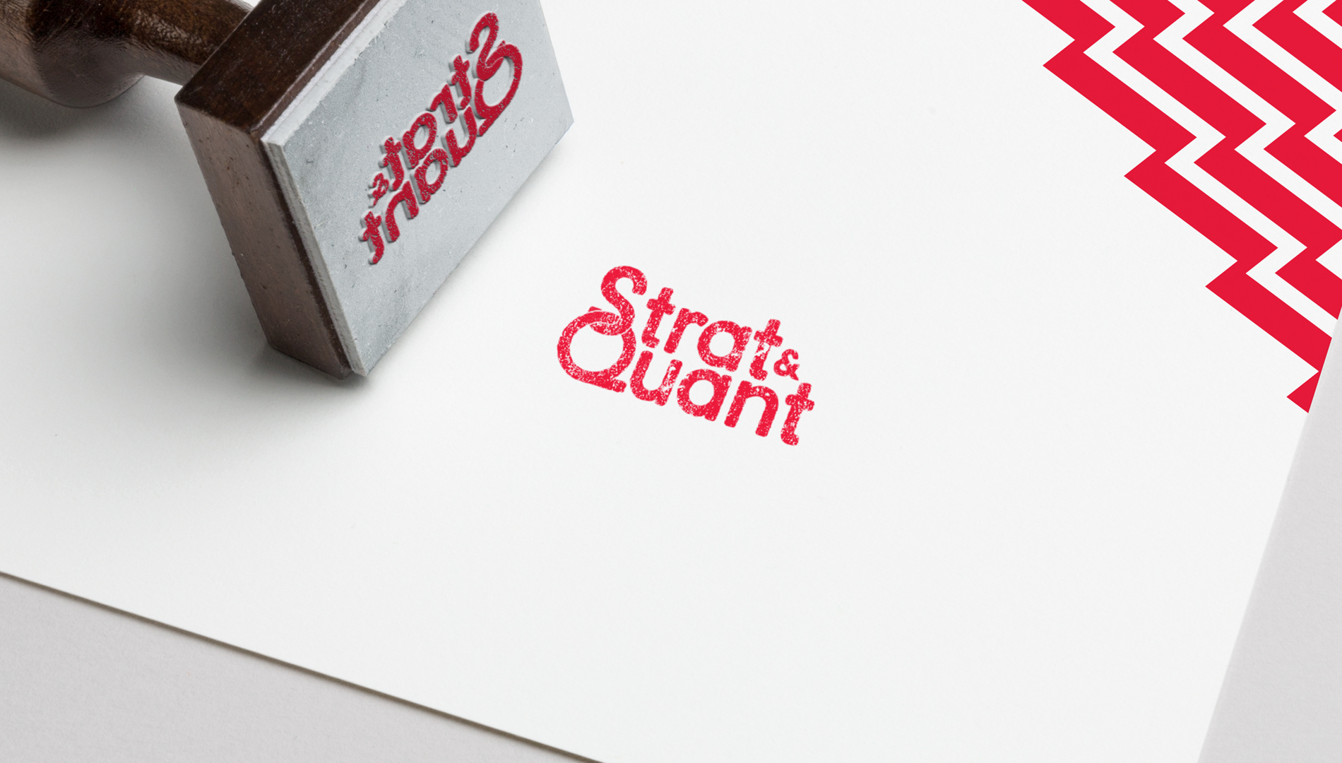
In order to emphasise on the name, a typeface based identity was created with a subtle play to bring out the essence of the brand.
![project_image]()
The positioning line 'Delivering Greater Value' emphasised on the entity's role play and how it aimed to helps its clients gain from the association.
![project_image]()
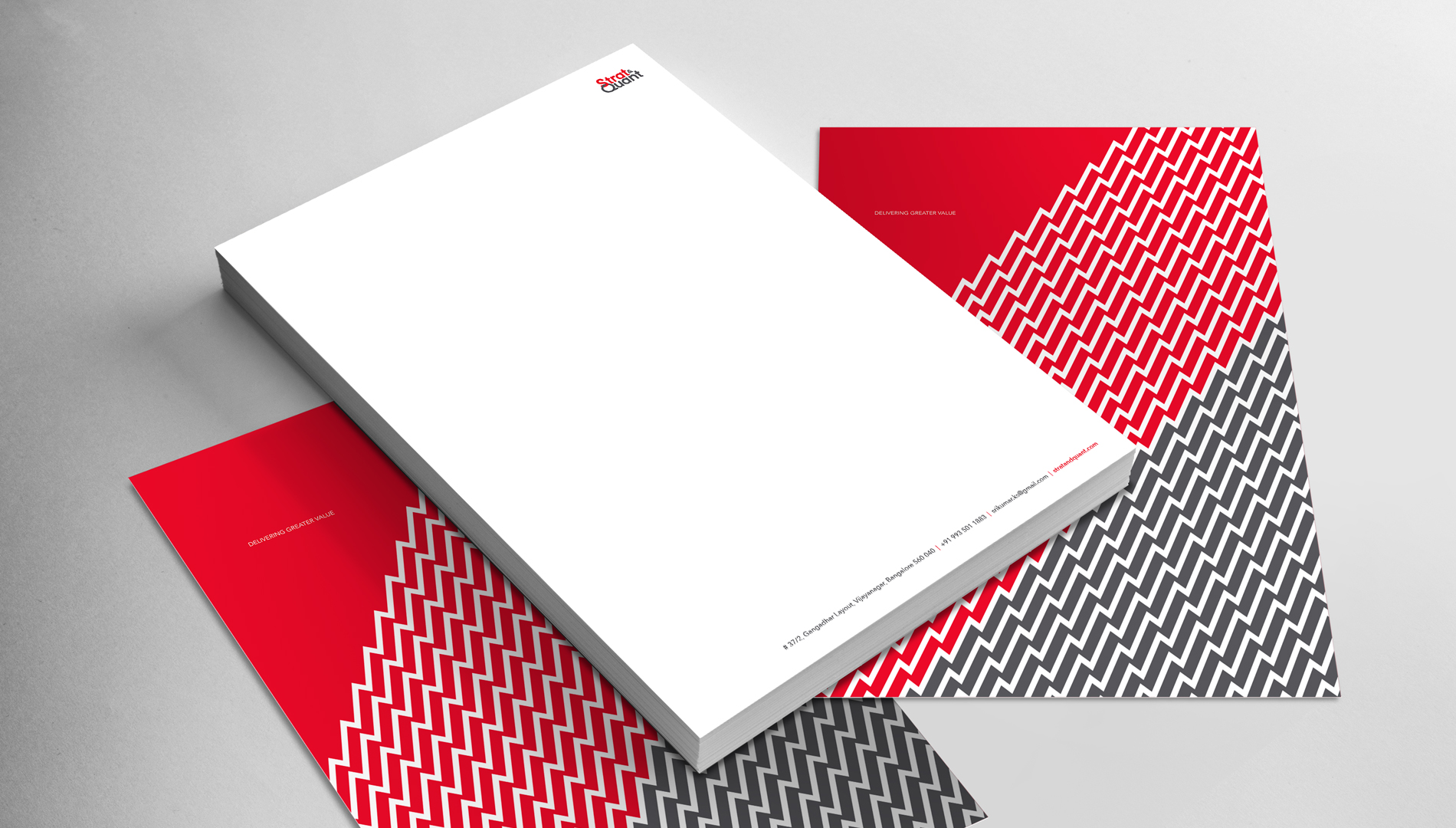
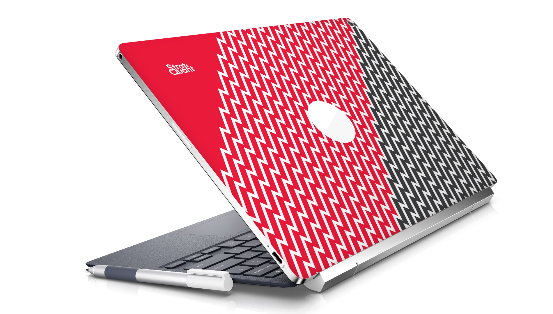
Consulting is about driving in objectivity and focus. So a design language was created that showed the sense of purpose through a play of straight lines. A metaphor to indicate the journey from planning to outcome, driven by insights and interventions. The minimal type exploration was thus presented in a rather powerful setting to demonstrate the impact of our association.
![project_image]()
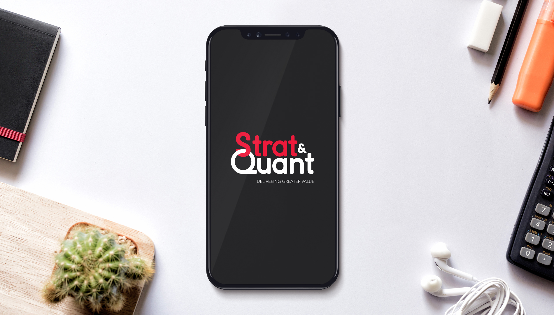
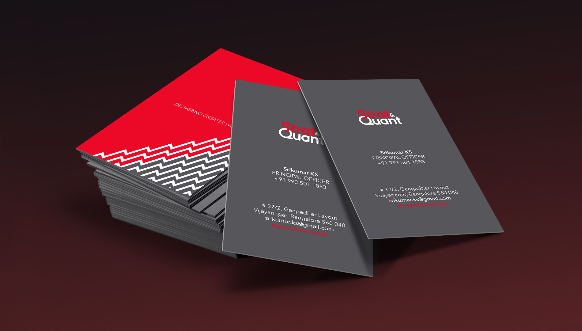
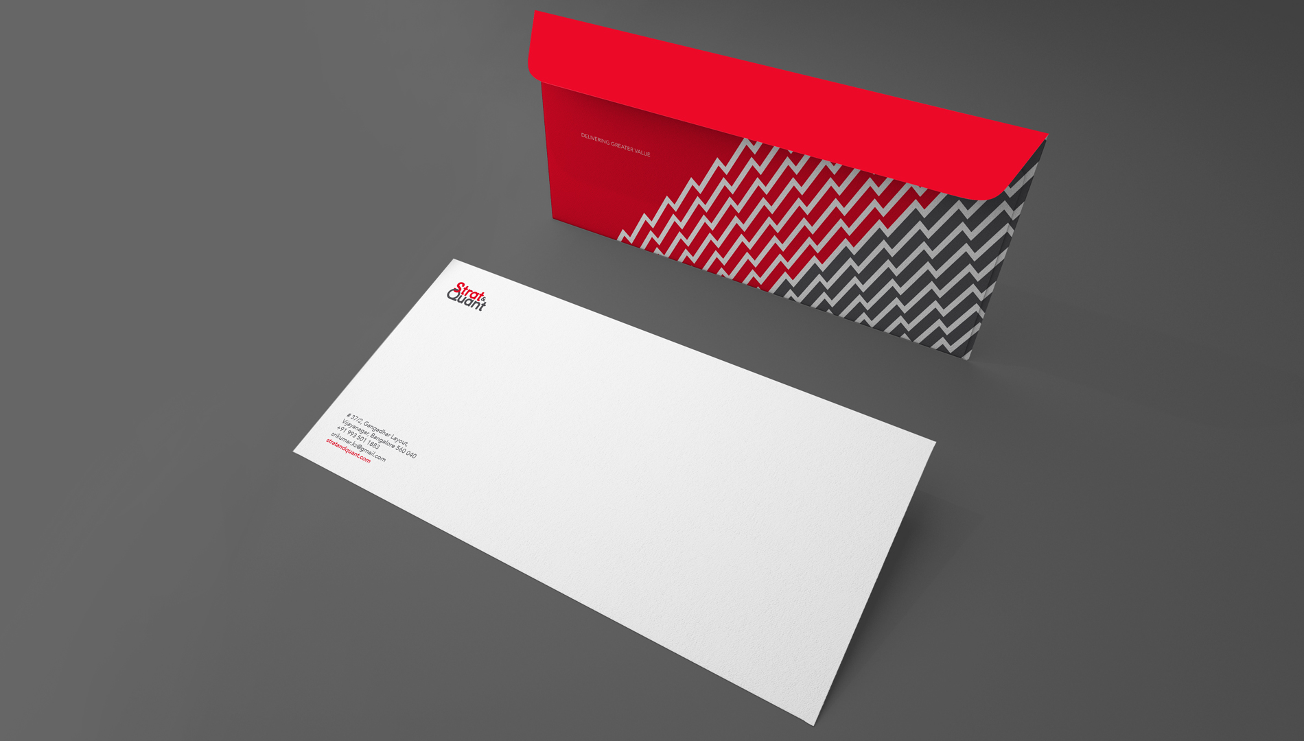
Thereafter the branding language was extended to all collaterals in order to drive in consistency and aid strong recall.


