Surface protection goes deeper than you thought.


Scratchgard, the pioneer of the device surface protection industry, enjoyed a wide market share thanks to its strong trade network. But not for long. Competition, in the form of duplicates and copycats, were soon scratching at the door, and market share plateaued. To make a mark again, Scratchgard needed to excite the market, starting with their trade partners. But in this immensely low-involvement category, the regular wouldn’t work. Something bold, something disruptive was needed. Something to grab the attention of the customer.

project_image
BRAND DESIGN : Visual Language
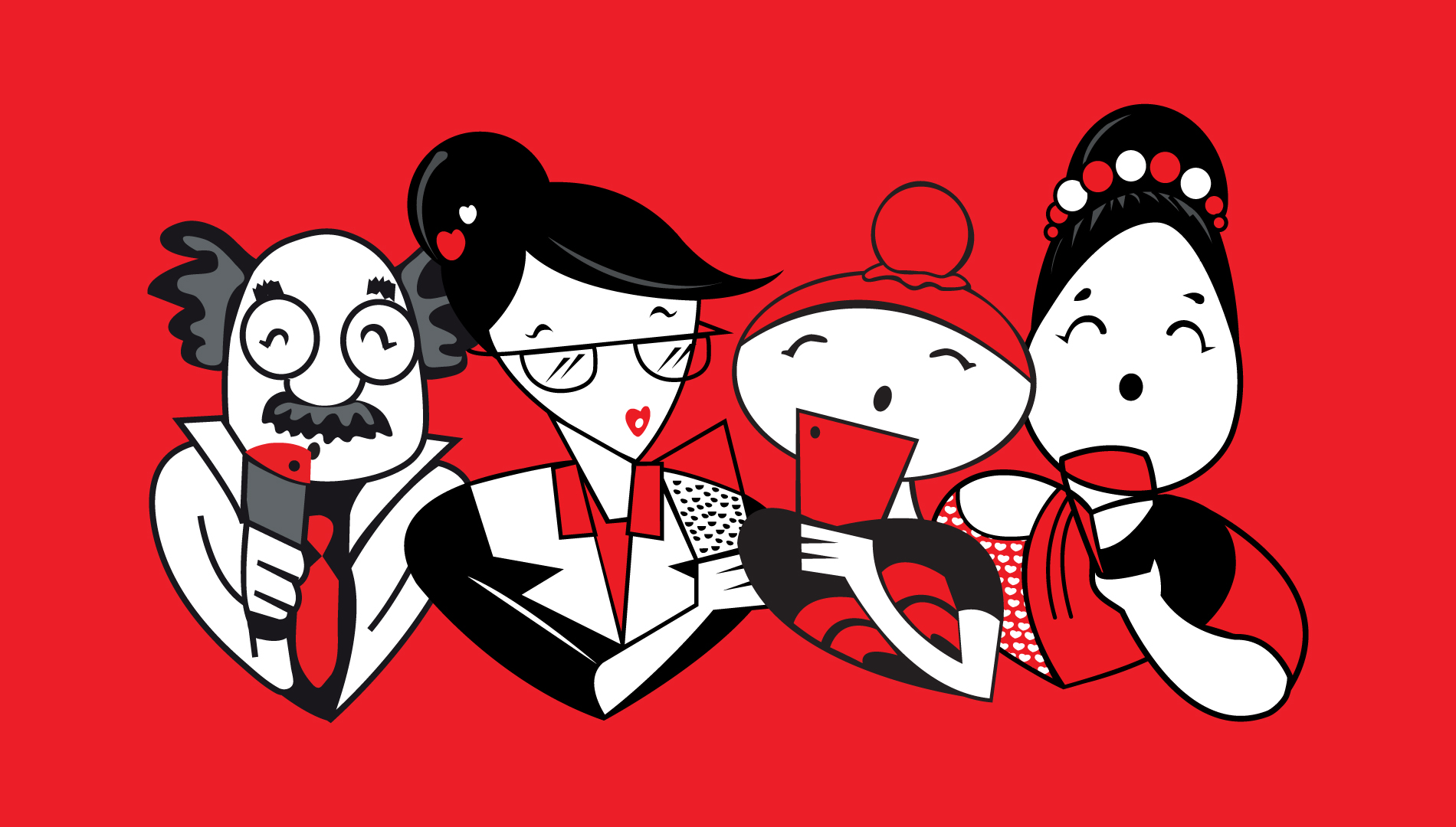
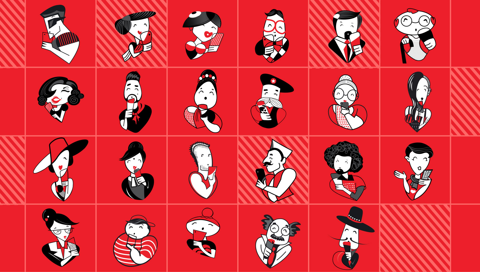
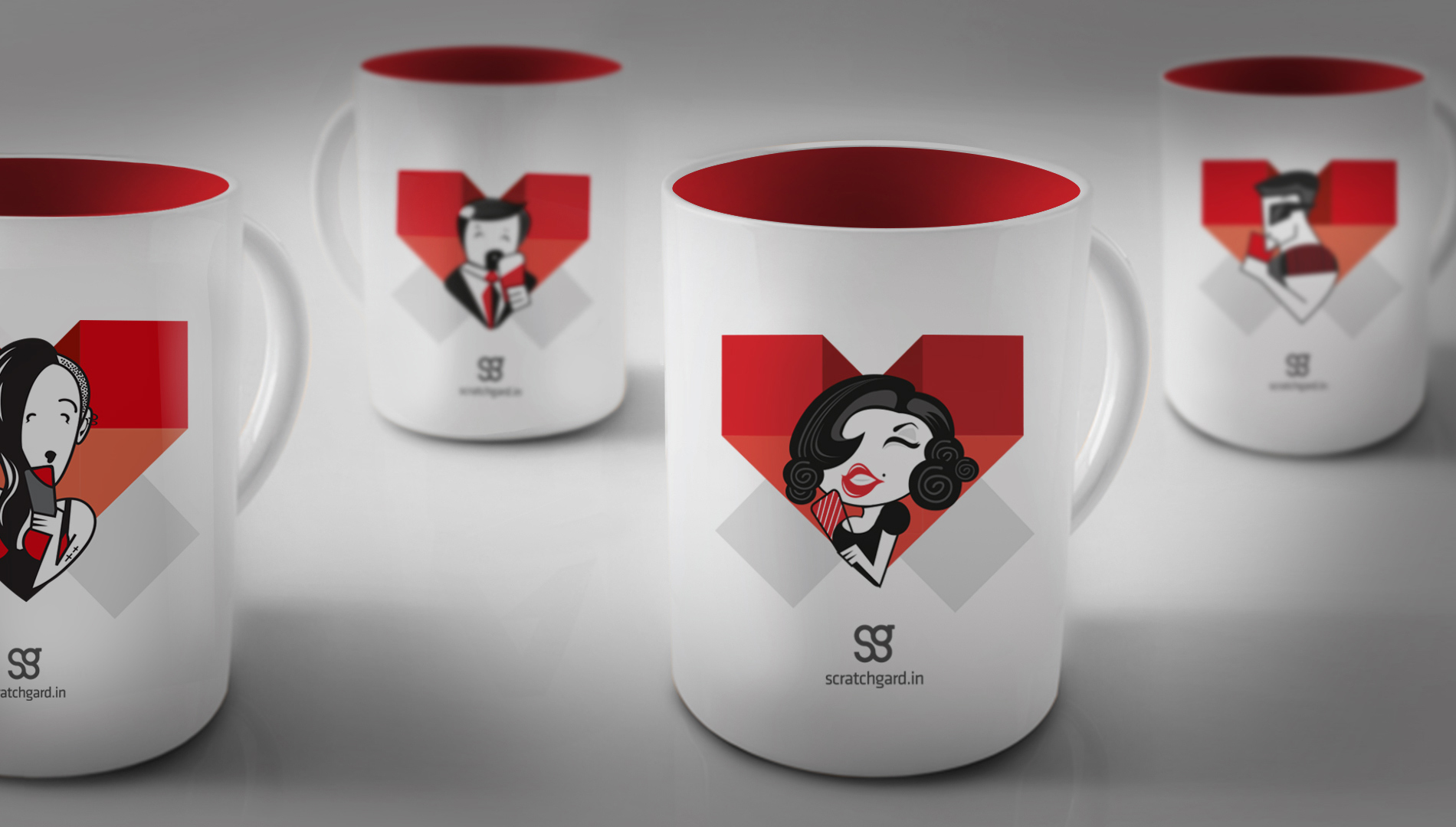
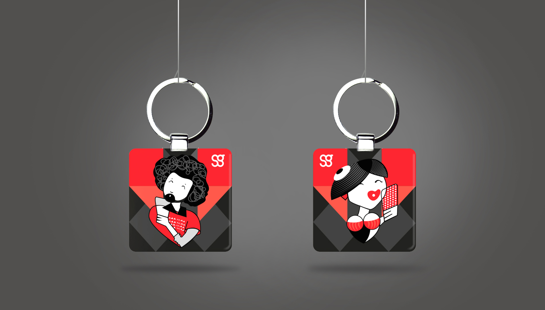
Love will always find a way.   The challenge with Scratchgard was realising there is no specific customer to talk to. Everybody has a phone/device today. The difference lies in the personality of the user. Despite this difference, there is a common thread that binds us all. Love. We are all in a deep relationship with our devices. Illustrations of real-life characters in love with their device were used to create the new visual language for Scratchgard. We played with the existing brand colours, subtly integrating the heart into each personality. Adaptable, playful and engaging, there’s something for everyone in the new look.
project_image
The geek : The socialite : The selfie queen : The political activist : The cool dude : The next door auntie : The retired colonel : Real, everyday people who love their phones
project_image
Love : At first glance
project_image
project_image
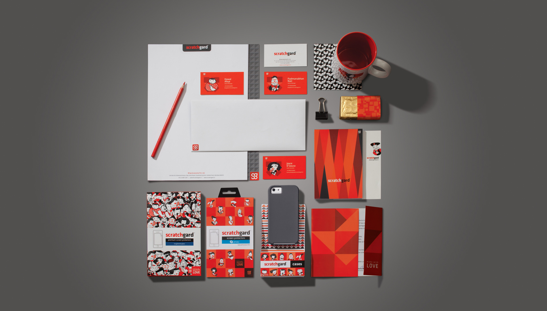
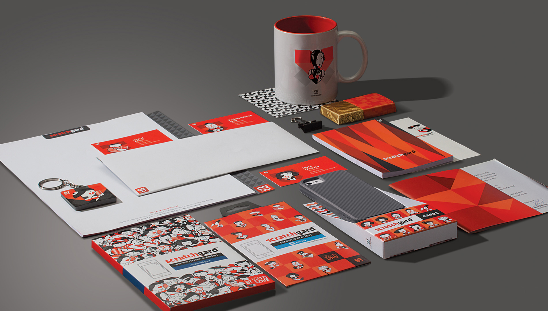
My personality : My company : Involved
project_image
Personalised : Dealer notepads : Part of the brand
project_image
Cool : Hot
project_image
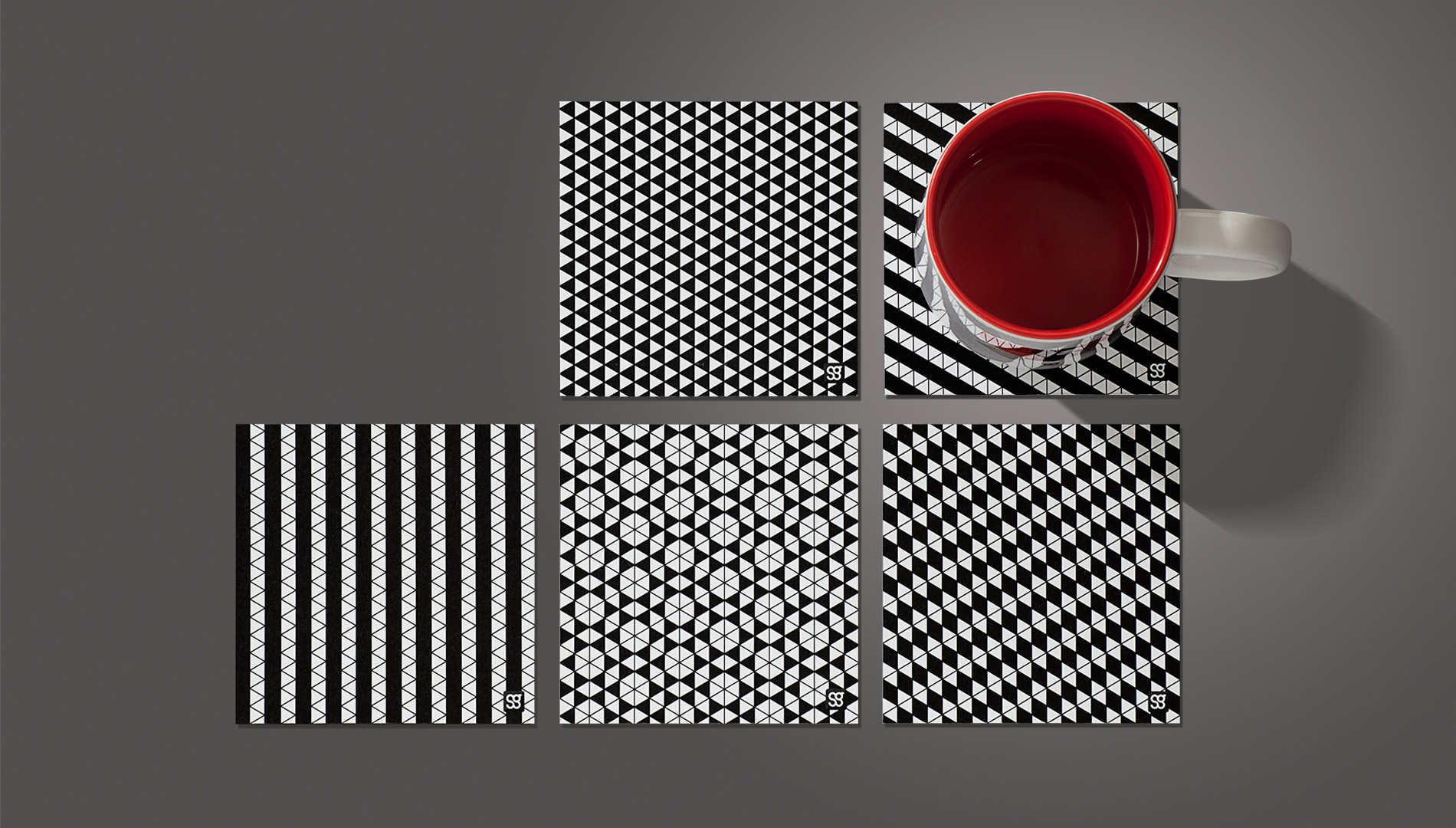
Stylish : Collectible : Coasters
project_image
Love on the move
project_image