

where the brand is the experience
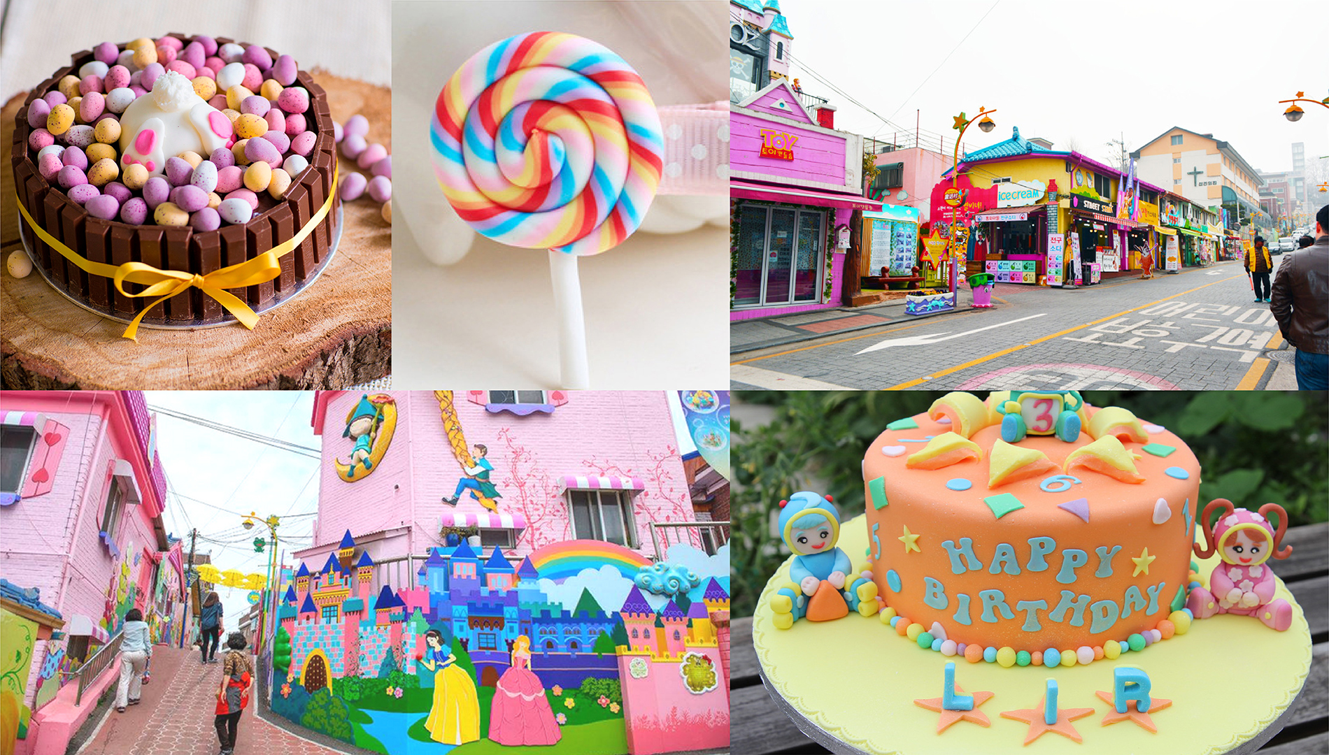
A young would be entrepreneur, a fine sugar artist from the north east approached us to bring alive a unique experience she wanted to create around baking. Having lived in Korea for a while, she was influenced by their design sensibilities and wanted to set up her cake shop inspired by the ones she had seen there. She had even conceptualised the name ‘Meraki’ which stood for soulfullness and passion. We had to give this unique vision a distinct character and colour.
CREATING THE BRAND
We decided to simply follow her cues as she was living the dream day in and day out. We chose to listen, understand and absorb all that was going on in her mind because we believed restraint is key to good brand outcomes at times. Very soon we could fit in her shoes and that's when the creation began. This wasn't a usual cake shop, it was store, a platform, a training institute, all merged into one where people could celebrate the art of baking.
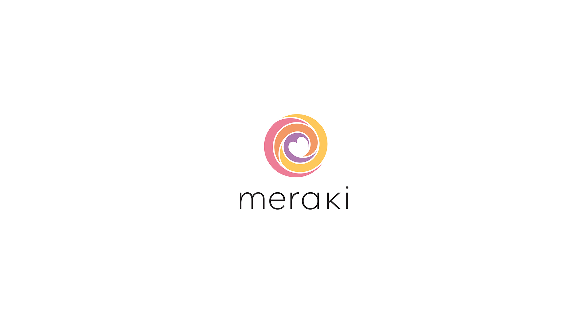
the identity draws inspiration from the potter's wheel which through its cyclic, rhythmic movement presents a unique creation every time. It also resembles the act of icing on the cake. As passion blends with creativity and finesse, we get a 'Meraki'ulous outcome
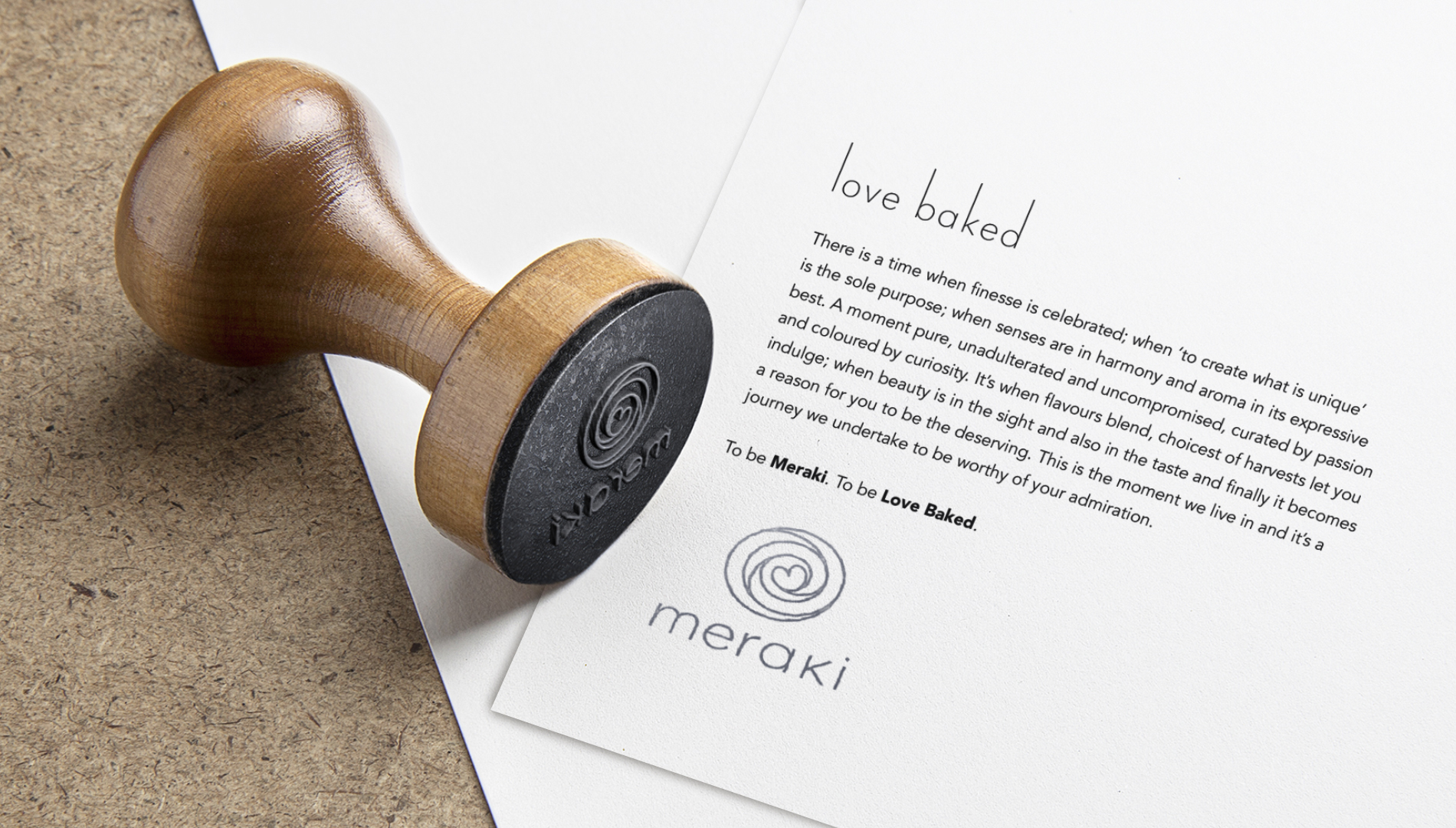
we thought why don't we give this brand a philosophy instead of just a positioning statement. Something that could define their core and ensure they always remained in a state of relationship with their patrons. Here emotions had to supersede commerce. The answer was 'Love Baked'
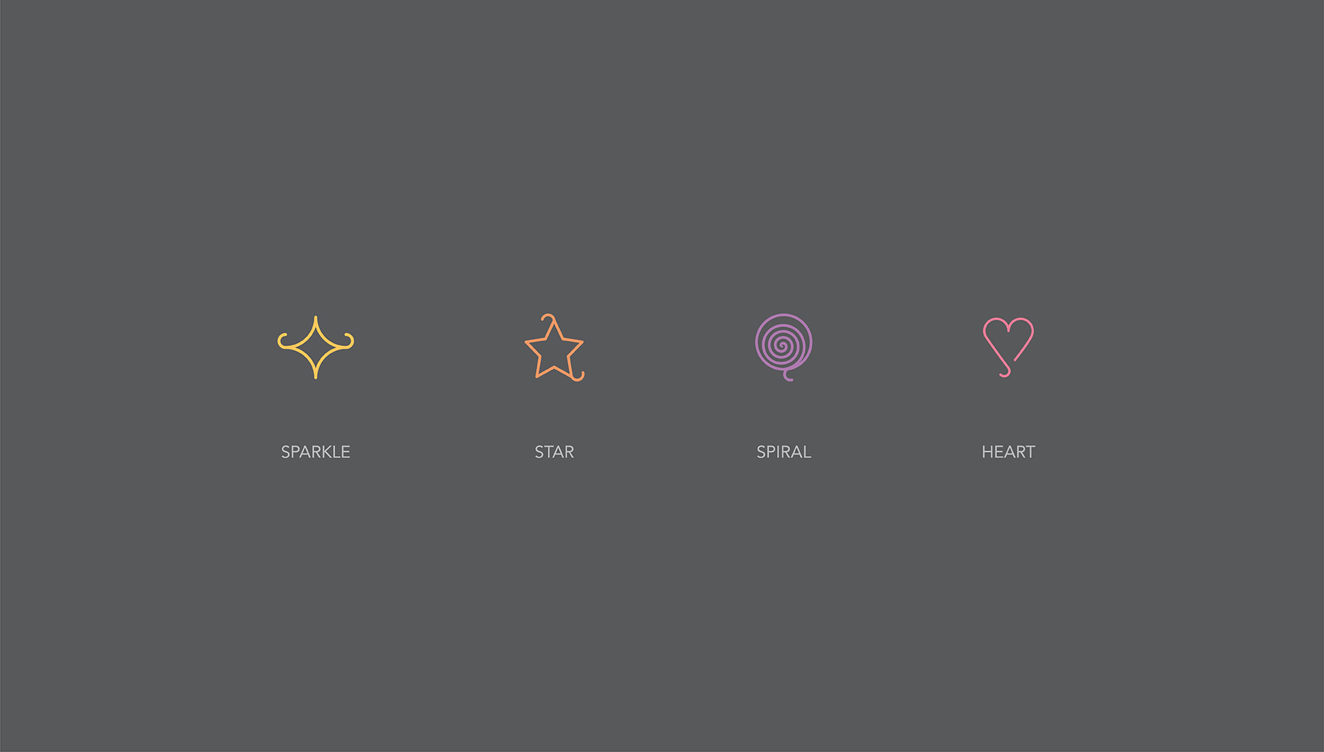
this was about a magical experience, a fantasy, about joy and celebrations. It was about living the finer moments. So we created elements which could symbolise the same
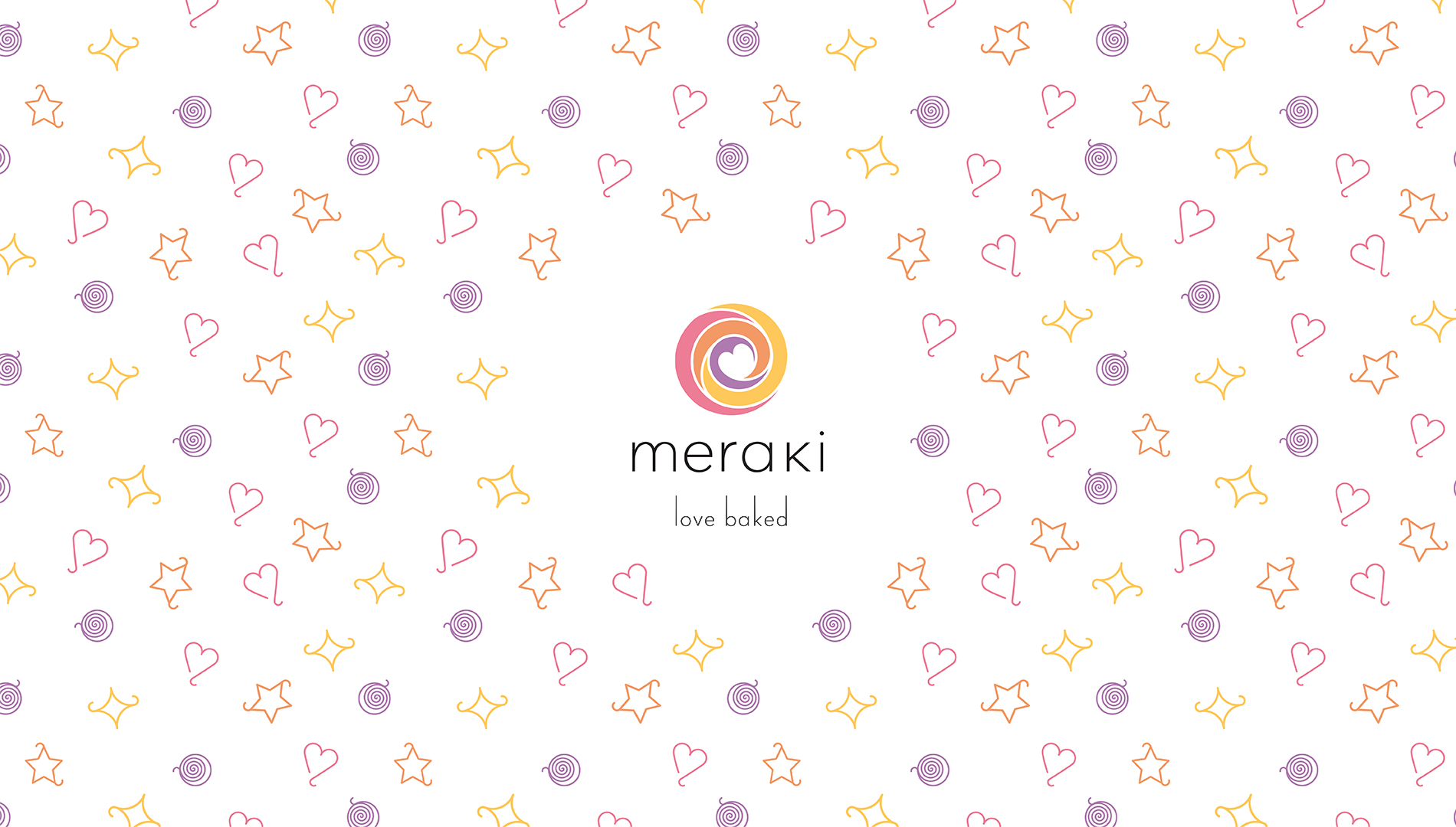

the colours had to be warm, affectionate and emotive, promising a great time always
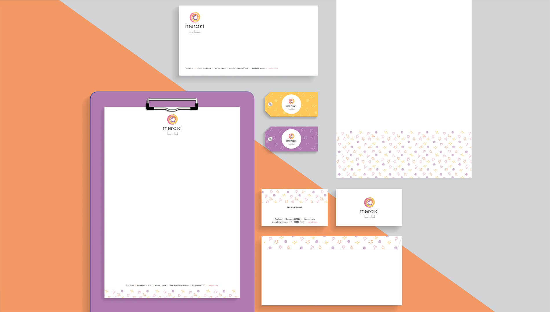
the corporate stationery was designed to reaffirm the brand philosophy
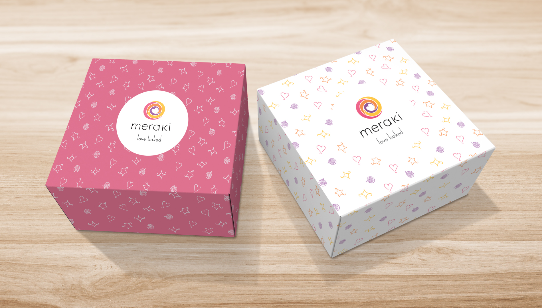
the cake boxes, minimalistic yet vibrant, carried forward the design language
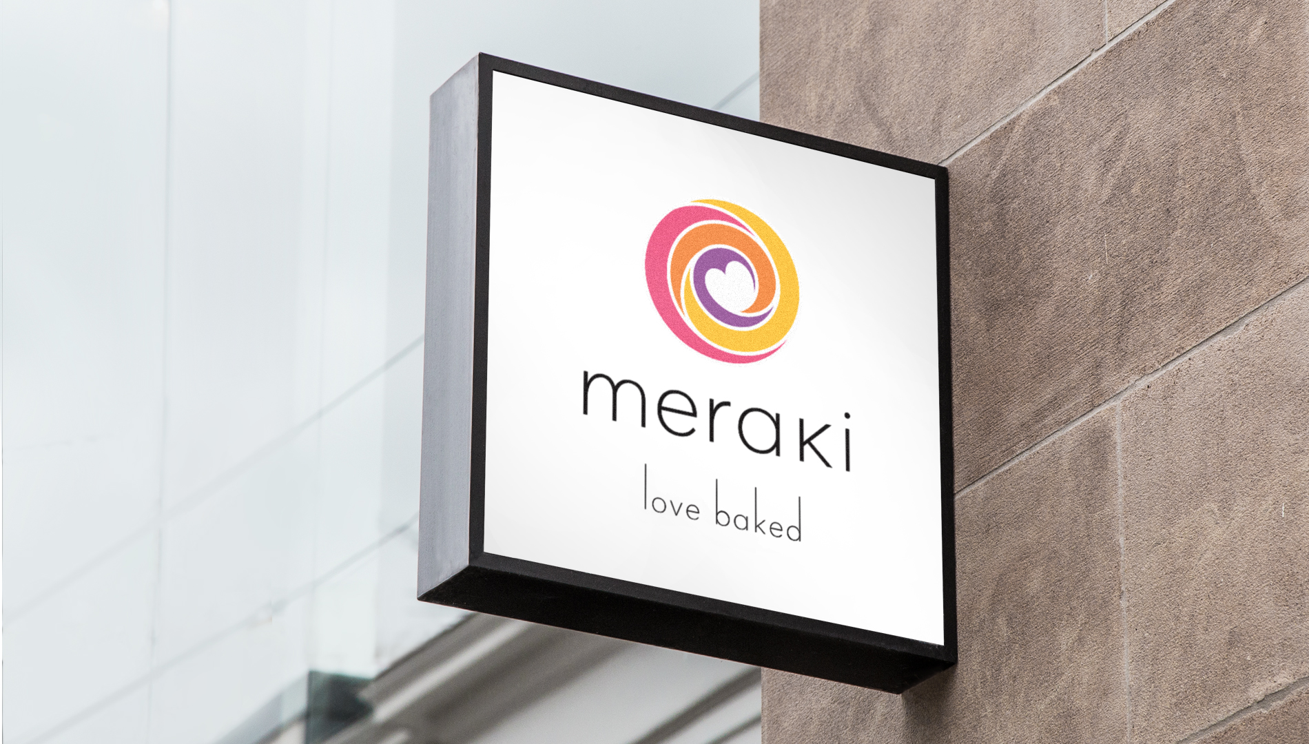
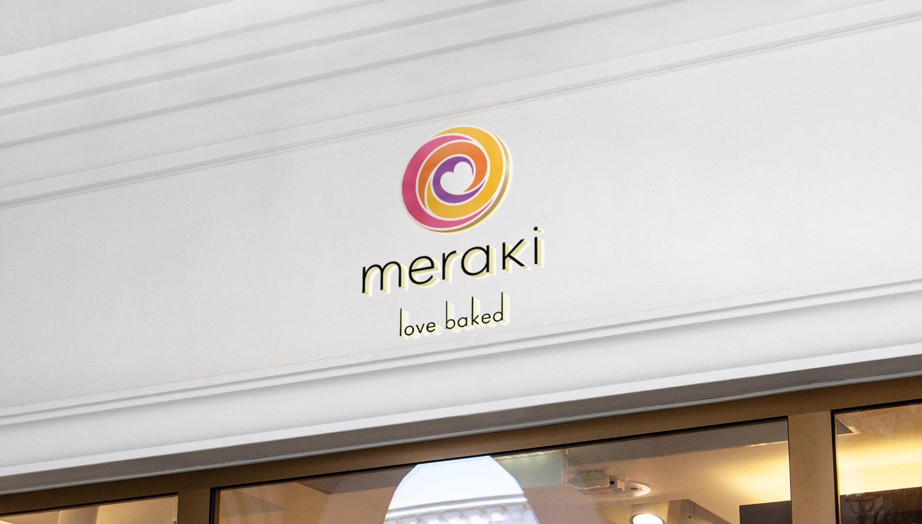
the backlit signage, because here being subtle was being effective
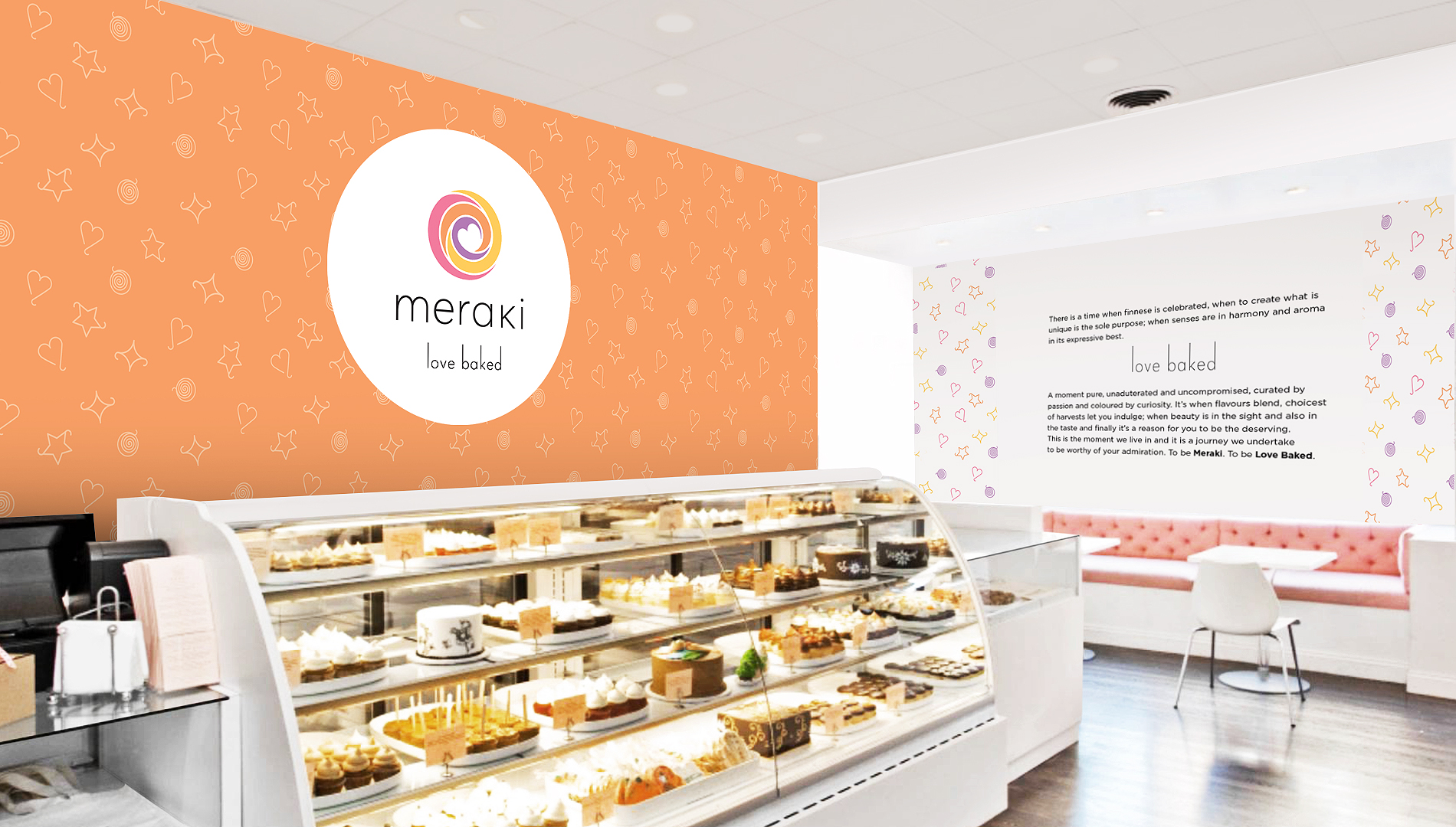
the store branding, again minimal was to build a complimenting setting. We were clear that the hero was the experience of Meraki. The infectious energy one felt after interacting with the brand owner, endorsed the need to brand the store while leaving a lot of room for a delightful interaction to happen. It was an artist's workspace and that had to be acknowledged