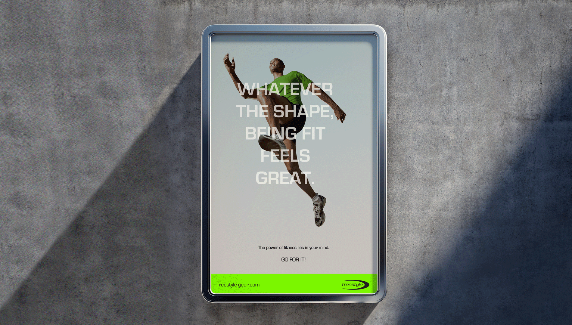
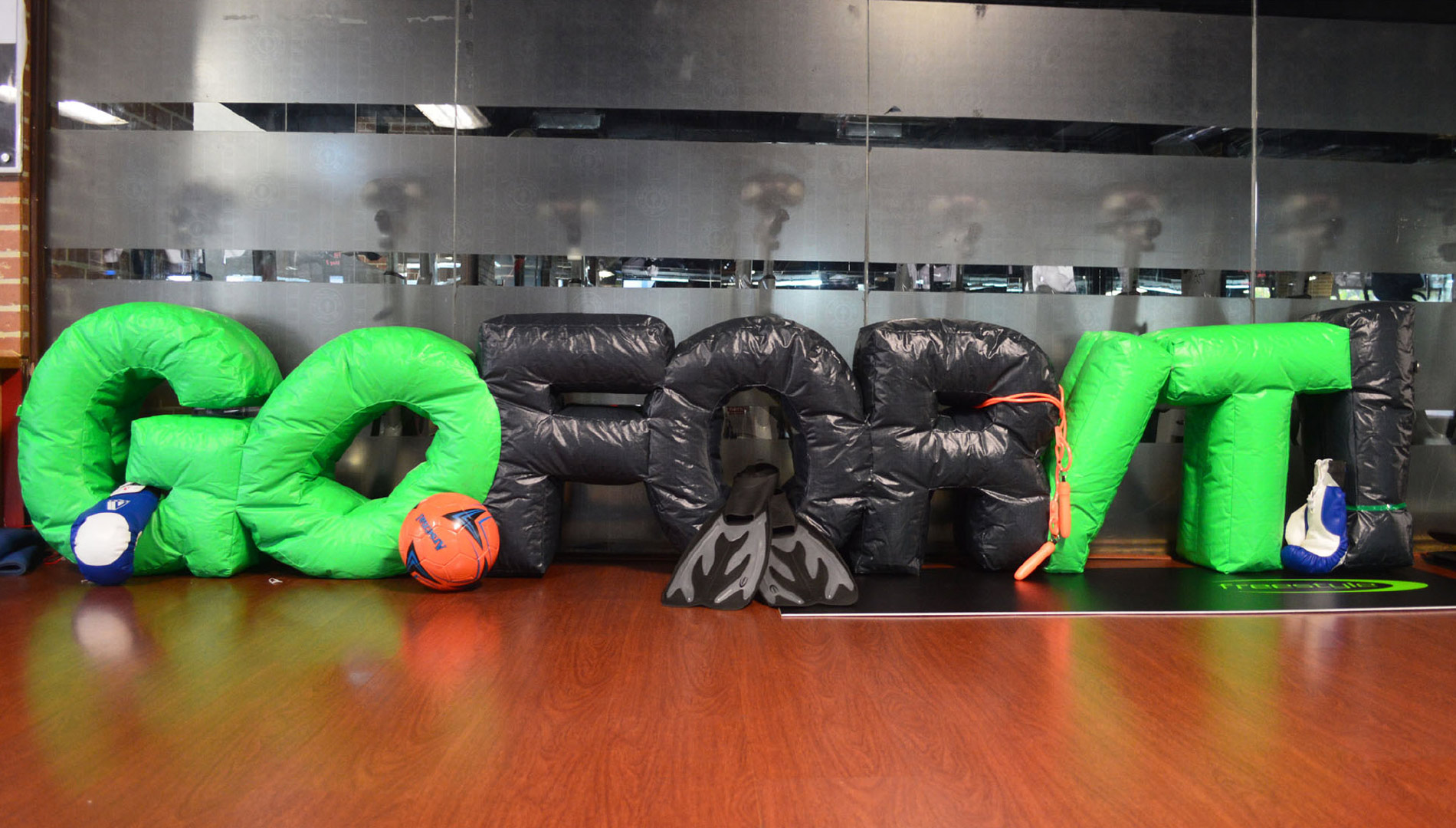
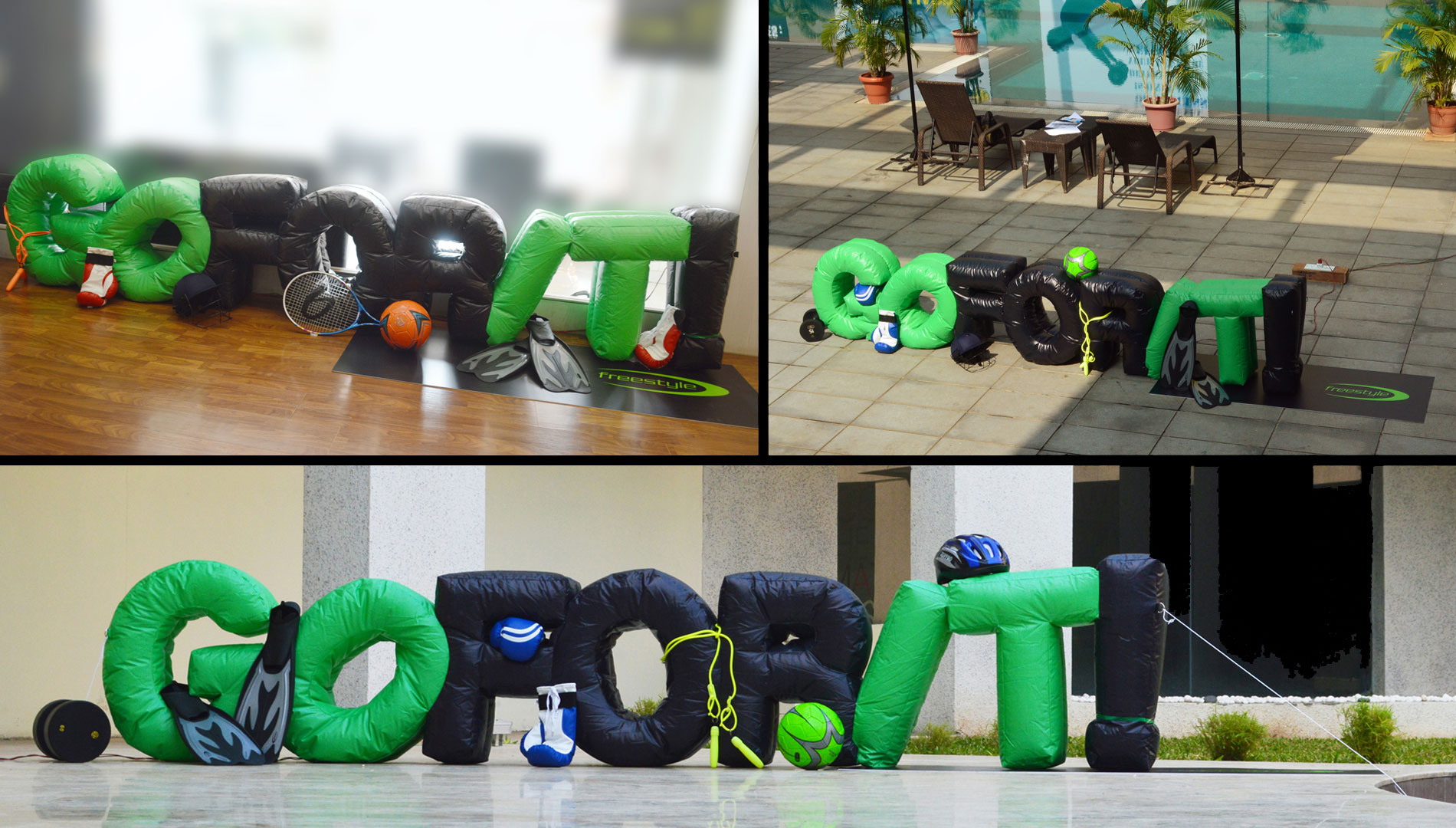
It’s not called freestyle for nothing, you know.


Among the four swimming strokes, the crawl is the fastest, and when asked to swim freestyle, a swimmer’s preference is obvious.

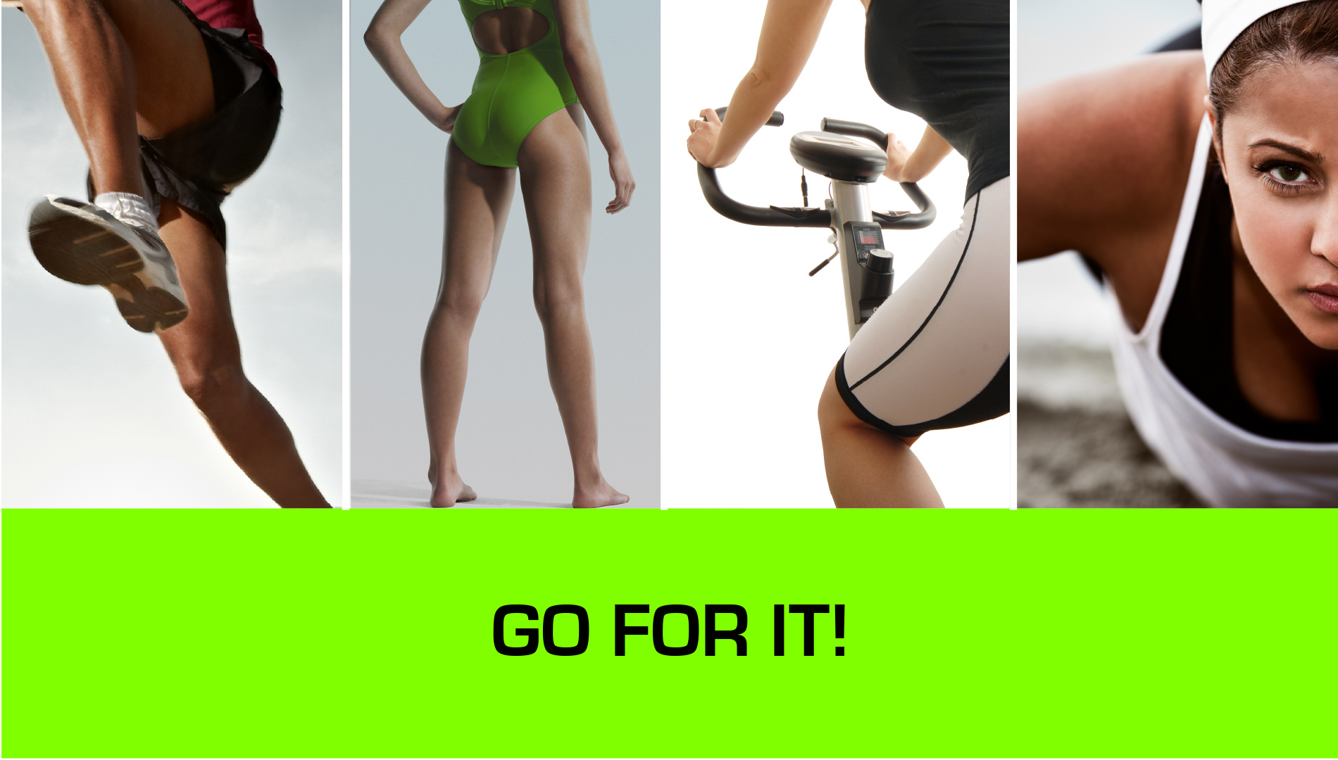
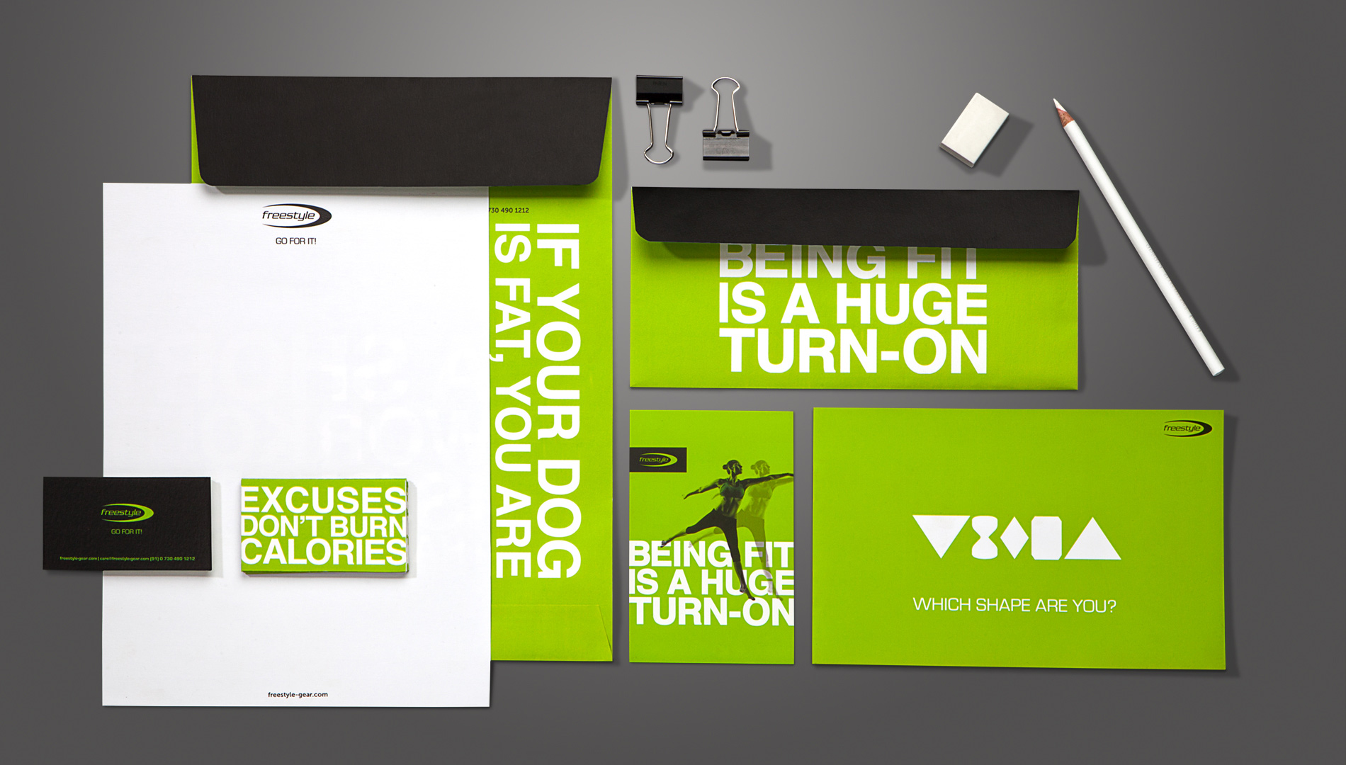
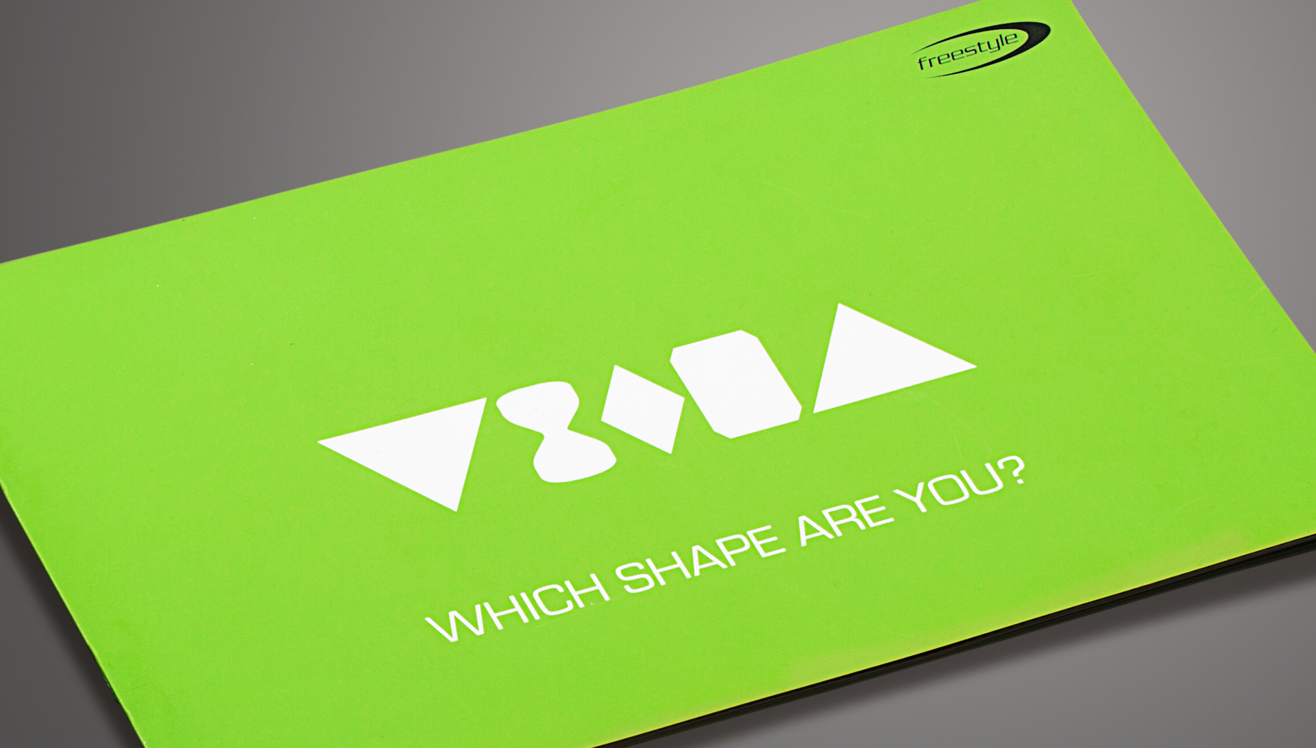
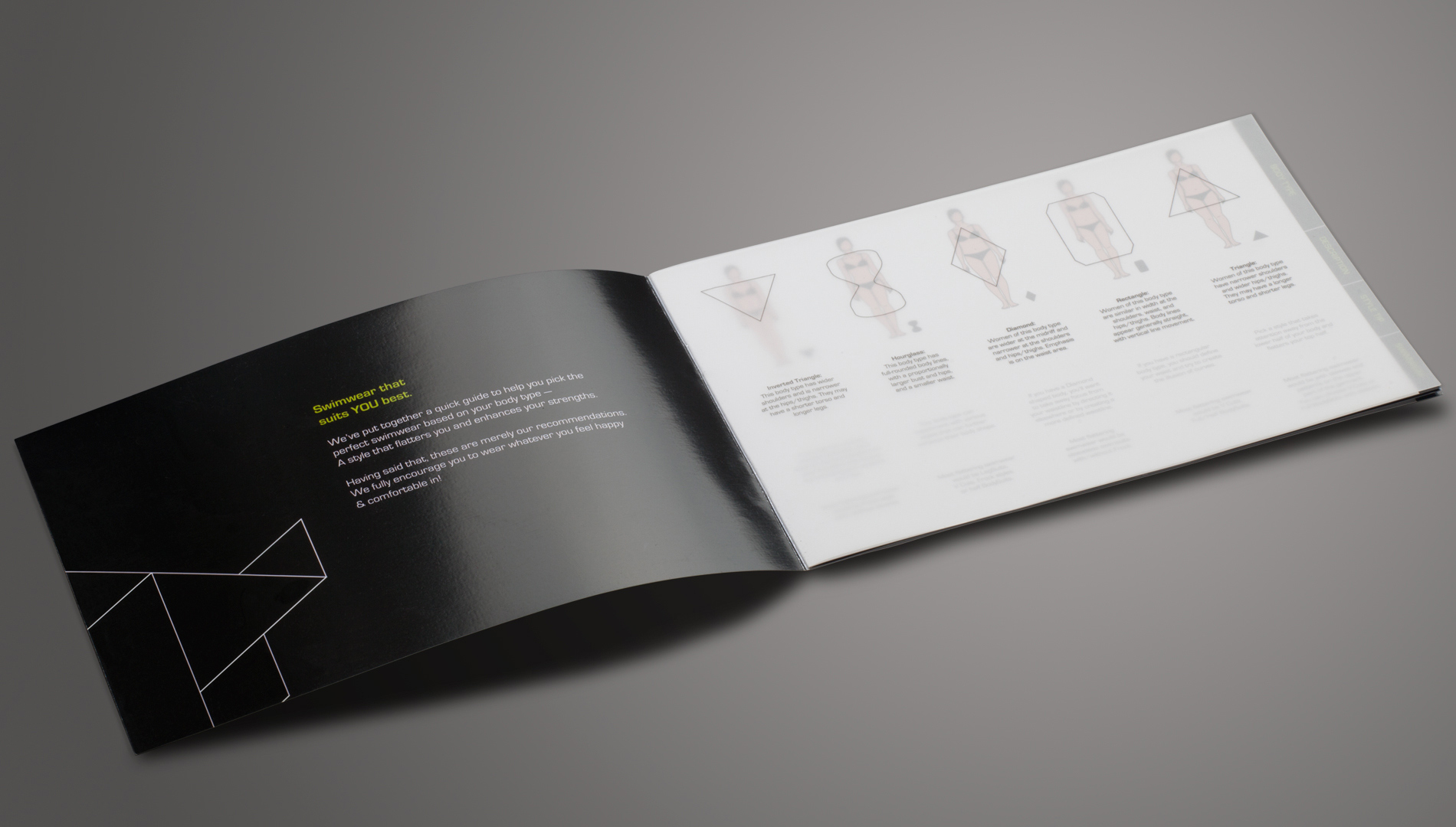
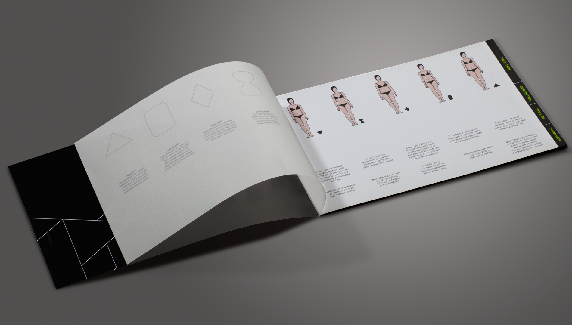
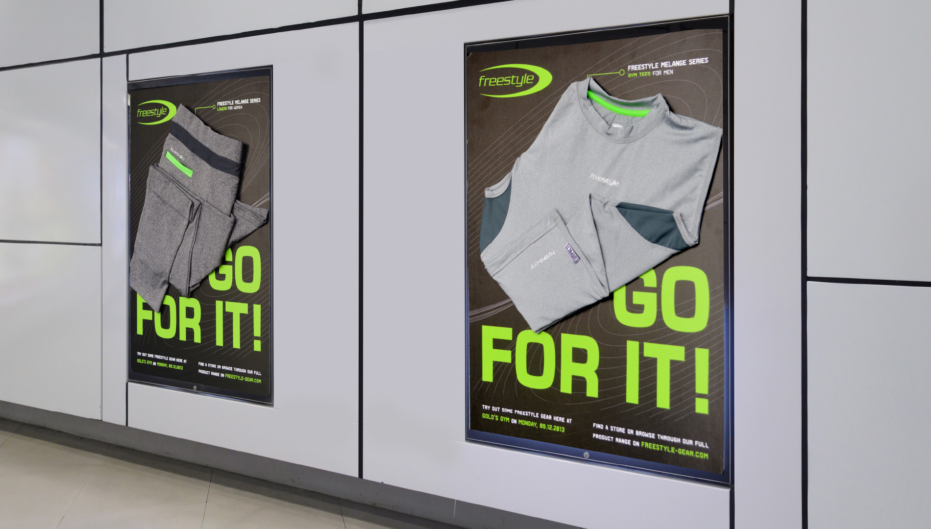
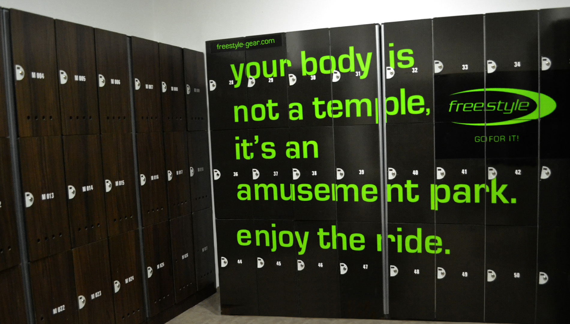
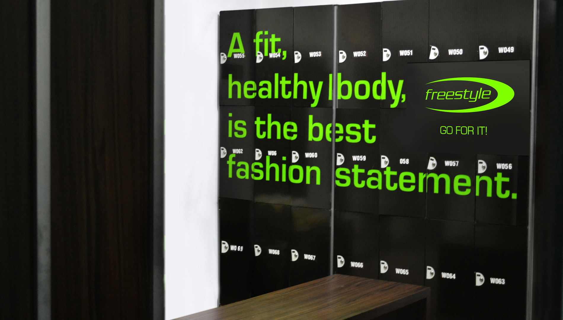
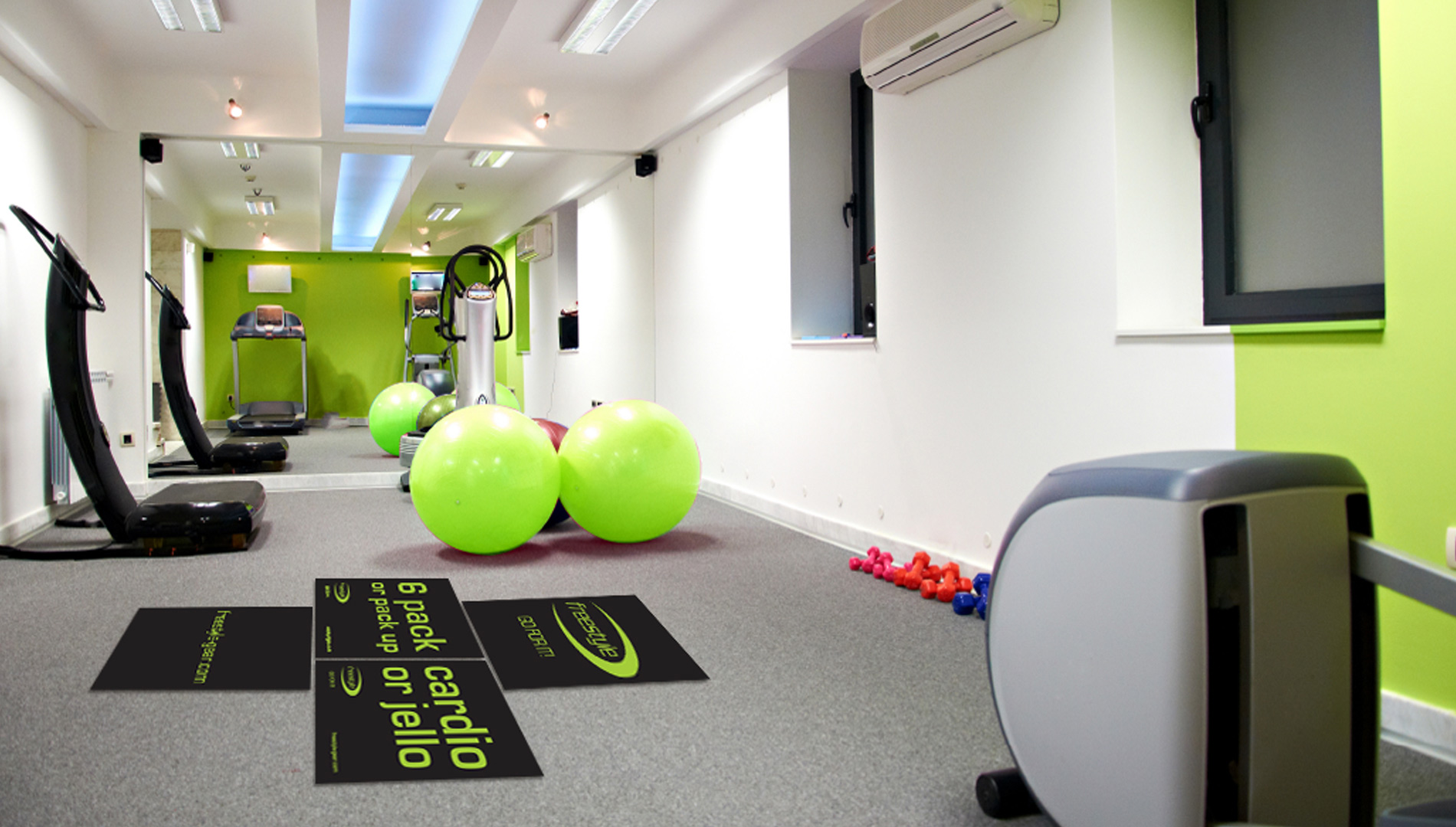
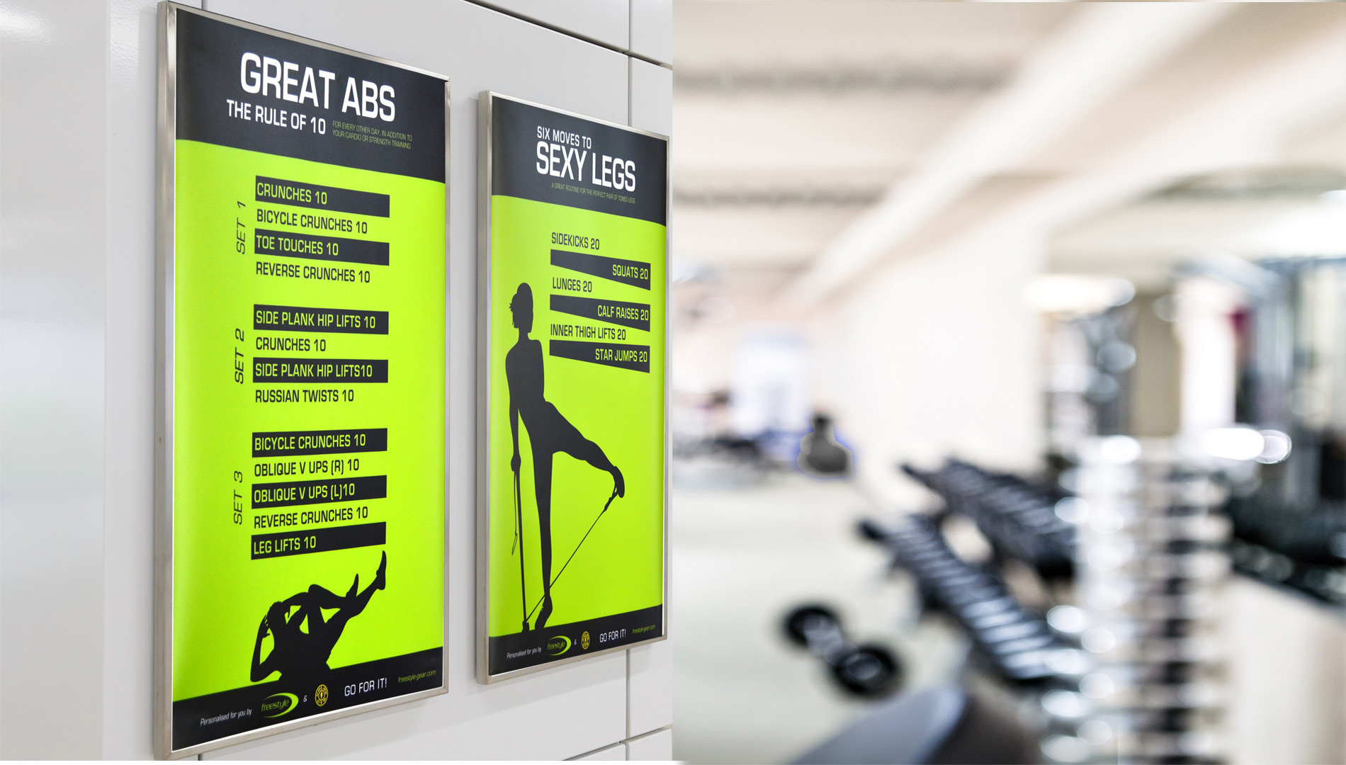
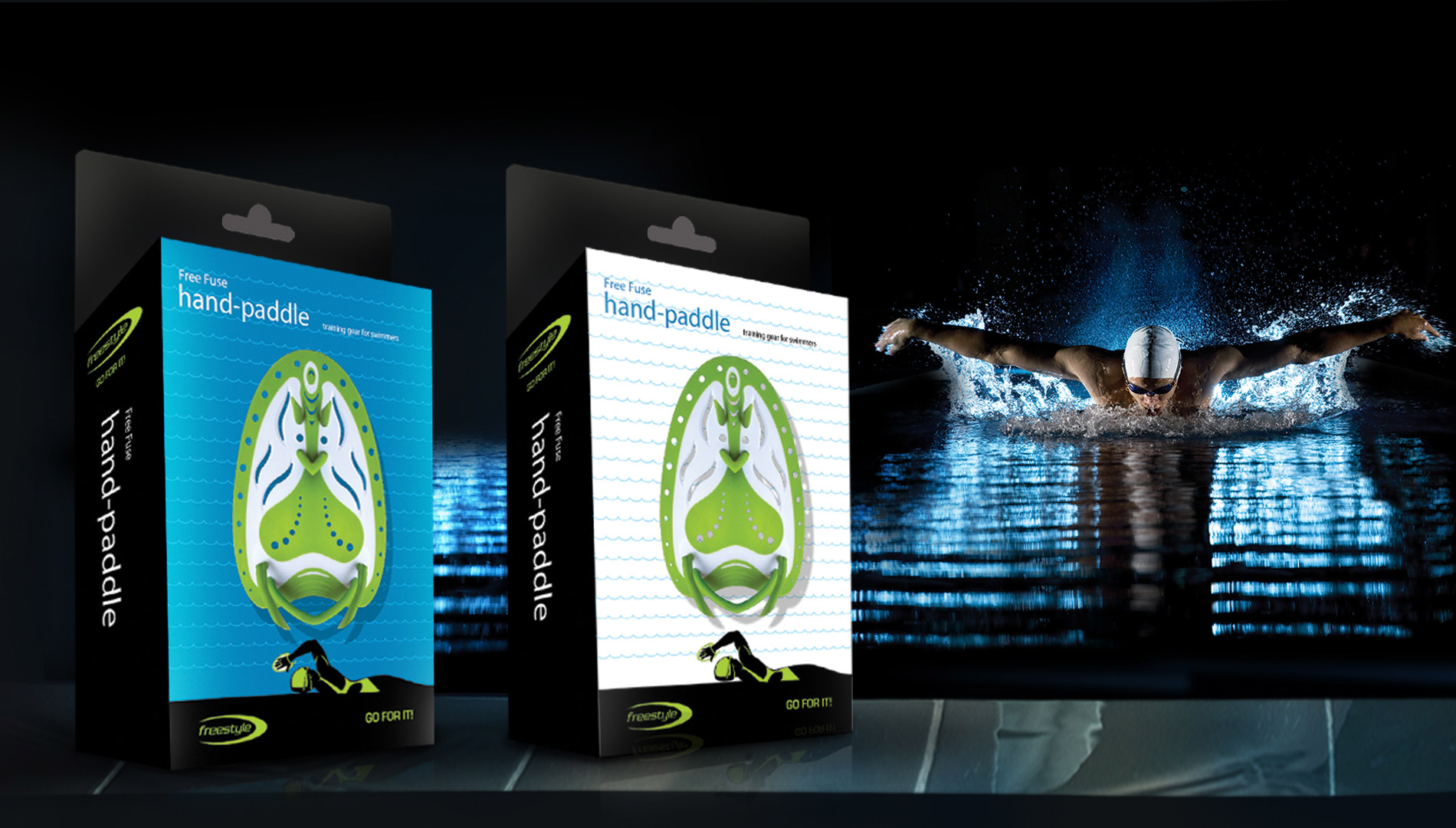
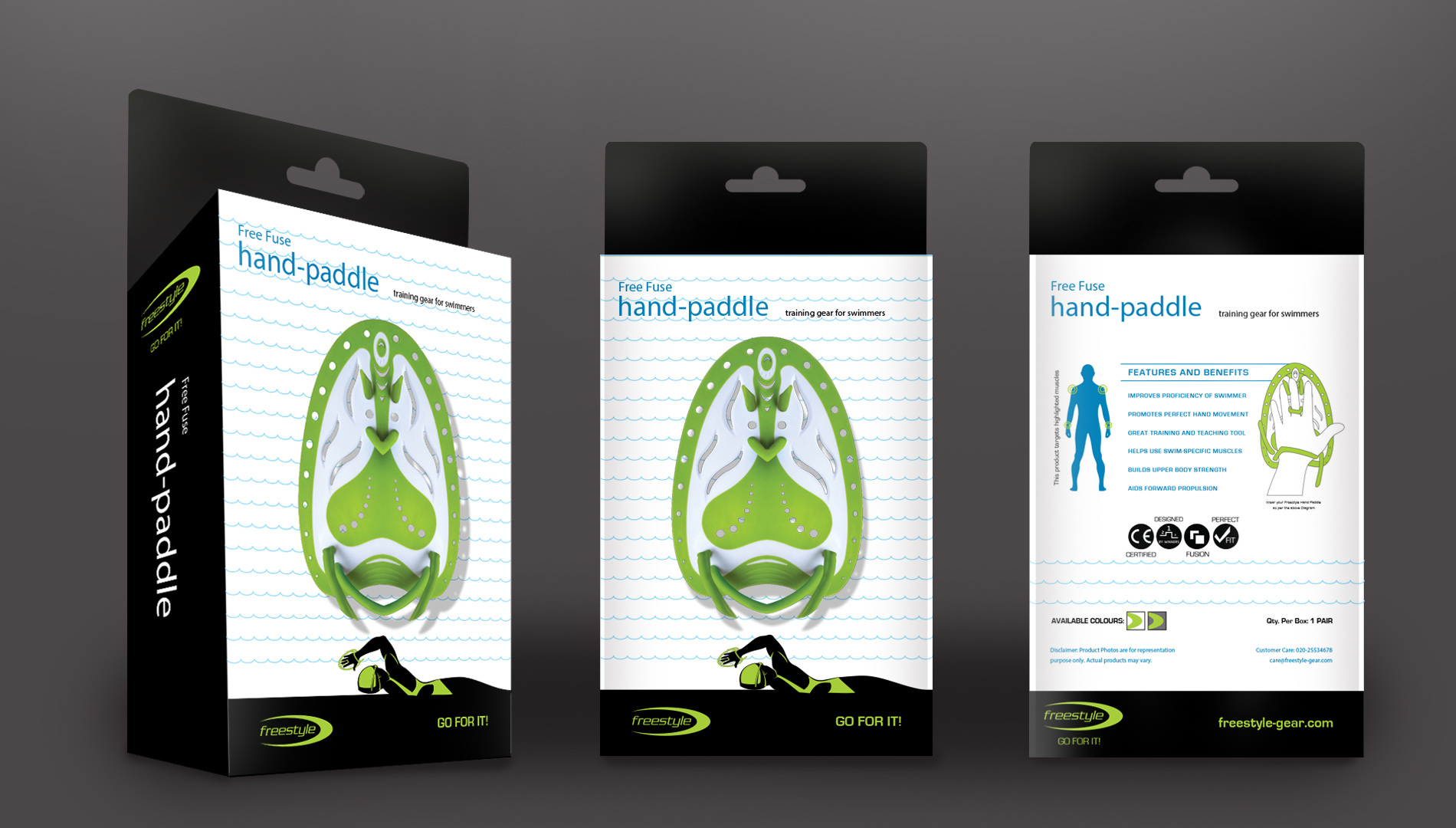
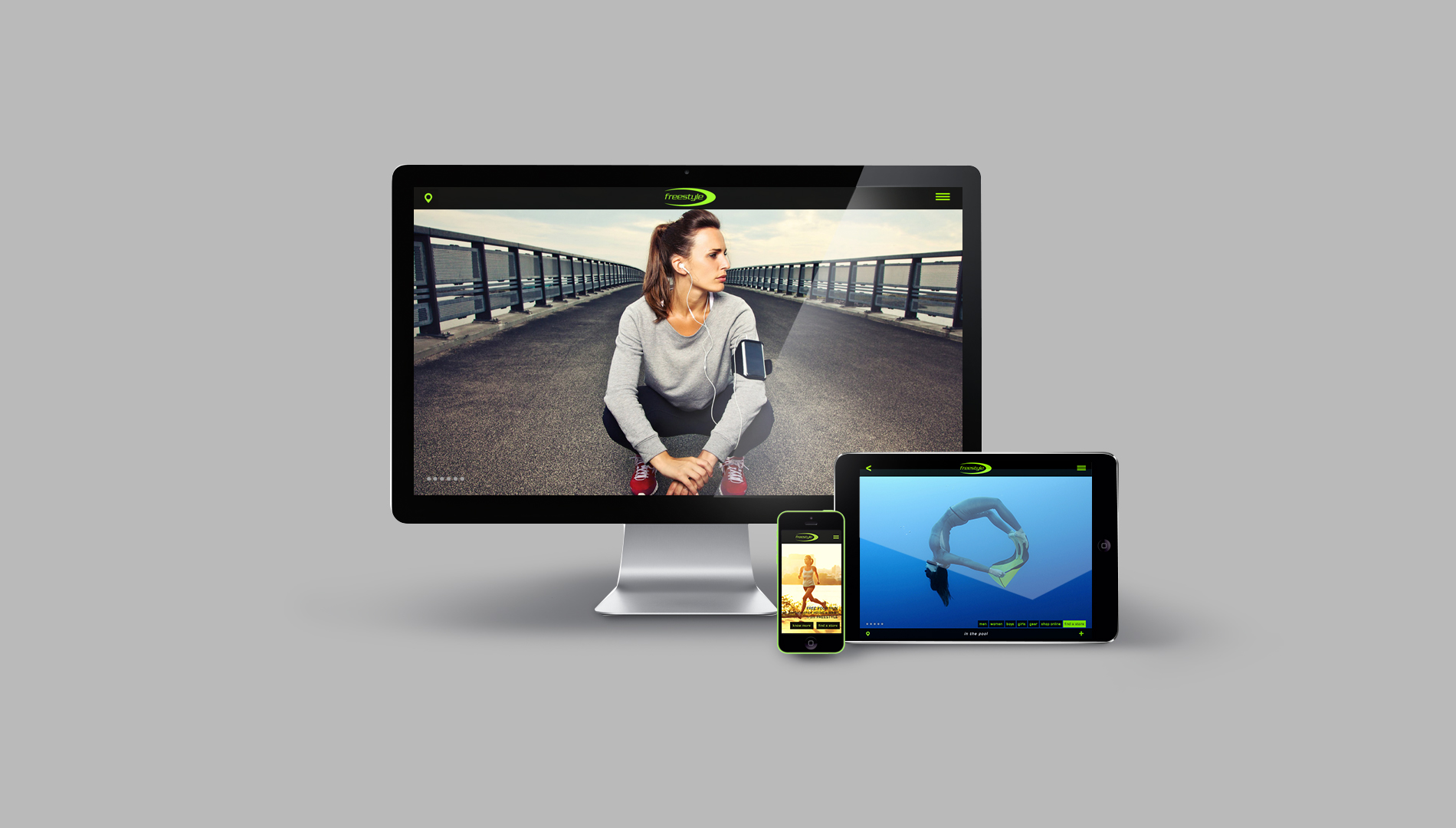
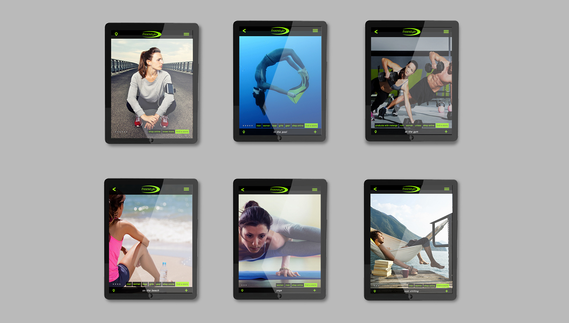
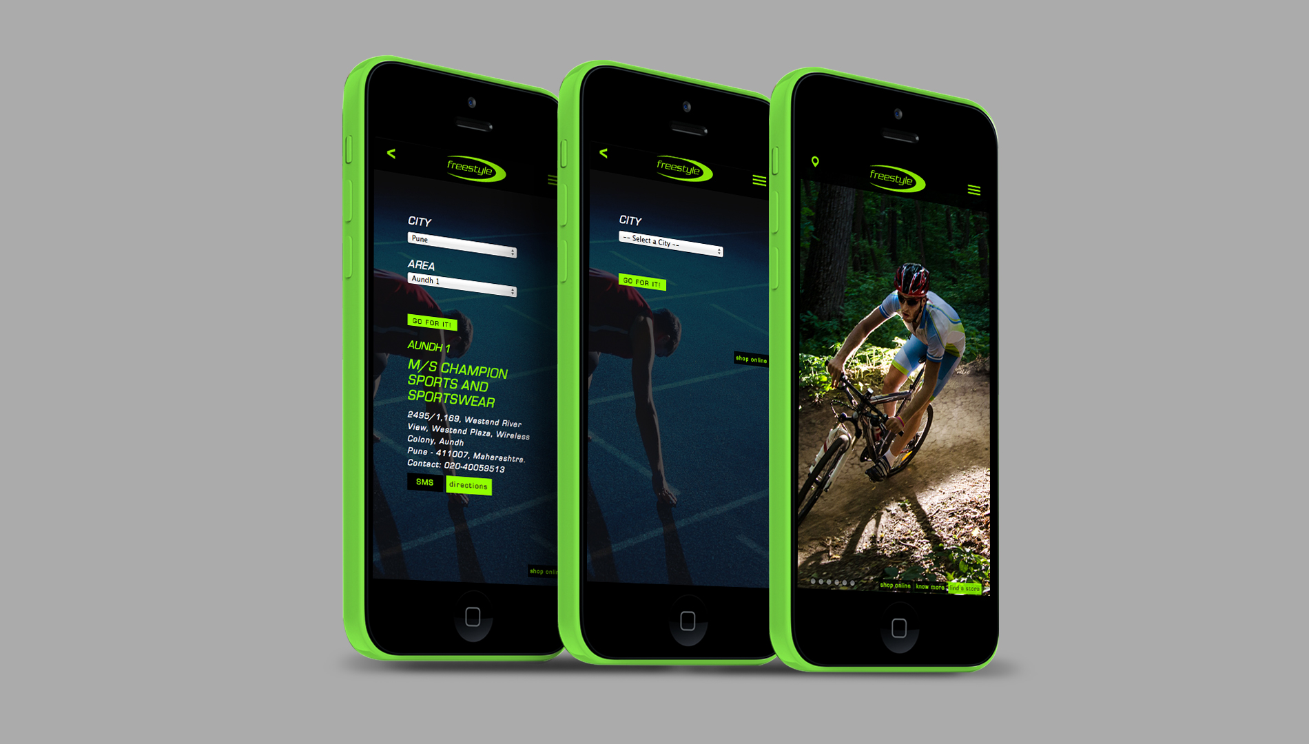
Freestyle, a swimwear brand, had chosen its name with the same thought in mind – to let the brand be about user preferences and not about the brand alone. Traditionally, in the sportswear sector, the industry norm is to club products according to the category and not according to how the products are used. We took this insight as an opportunity to position Freestyle as a brand that empathises with customers and converses with them as an equal. This approach bled into the company’s culture and communication both. Eventually, we helped Freestyle transition from swimwear to fitness apparel.

project_image
REBRAND
Freestyle had been going with the flow for a while, but now it wanted to move out of the pool and explore the rest of the sports arena. The brand wanted to jump from high-performance swimwear into the premium sportswear category. It wouldn’t be easy, it knew; all the bigger players were already there and competition would be tough. Freestyle had a good product to start with and a robust network of 200 retail outlets across the country. Getting to the target audience wasn’t going to be a problem; however, getting into their minds was.
project_image
The exercise started with the visual identity. The new look builds on the earlier imagery, with a dash of the spirit of fitness. Actually, more than a dash. Designed for the urban individual, the new Freestyle stands for an active lifestyle - vibrant, progressive and driven by performance. With the aim of creating better brand recall, we simplified the original logo and brought emphasis to the name.
project_image
Research showed that almost no one in the fitness segment was using green. In their products, yes, but not in their identity. This vibrant green was soon to become synonymous with Freestyle, finding its way in the products too.
project_image
It’s all about you and your style, so ‘go for it’. The brand encourages and motivates its users to own their style, to be loyal to it and to do exactly what they wanted. This attitude especially extends to what you wear and your approach to fitness – wear what you want, where you want; it’s Freestyle.
project_image
Logo : Tagline : Lockup
project_image
Hydro-dry > Perspiration and fatigue management technology : Compact > Sculpted products : EZE > Comfort products
project_image
Motivation : Reminder : Stationery that's more than just stationery
project_image
CAMPAIGN : Which shape are you?
There is a lot of body consciousness when it comes to swimwear. How can Freestyle break the communication barrier and address the issue, without awkwardness? This campaign started a conversation, and offered workable tips and suggestions on what works for each body type.
project_image
Revel in your body : Fitness is in your mind
project_image
Promote a healthy body image : Understand and work with your body
project_image
The many shapes of a woman : Inverted triangle : Hourglass : Diamond : Rectangle : Triangle
project_image
Tips : What's flattering : What's not
project_image
Your shape : Your style : Pick the right product
project_image
Three types of men : Rectangle : Diamond : Inverted triangle
project_image
Tips : What to wear : What to avoid
project_image
BRAND ACTIVATION
LAUNCH OF THE FREESTYLE GYM-WEAR LINE   If your audience is in the gym, it’s a no-brainer that that’s where you should be too. An international chain of gyms was chosen for this launch, one where the serious, fitness focussed customer would be found. The idea is to literally showcase the brand and its gym-wear line.
Freestyle is a fitness brand operating in the active lifestyle space. Its primary voice has to convey the sense of movement and personal achievement associated with fitness. In addition, to be positioned in the same space as international brands, it needs aspirational value. The tag line ‘Go For It’ sits well with the target audience as they were already using the phrase as social currency, and it was in tandem with ambitions for the brand.
project_image
Playful : Interactive : Tagline
project_image
Real product : Touch and feel
project_image
Mens : Locker room : Talk
project_image
Womens : Locker room : New mantra
project_image
Motivational : Floor Matts : Go big or go home
project_image
Tone up : Freestyle routine : No equipments : No weights
project_image
PACKAGING DESIGN
Freestyle introduced the market to a speciality product – swimming hand paddles. This product is used to train novices to better their technique and for pros to enhance their performance. The packaging creates awareness, encourages interaction and stands out among existing brands.
project_image
Hard-working design : Showcases features : Benefits : Technology : Product variants
project_image
BRAND DESTINATION WEBSITE
The Freestyle website is a complete brand ecosystem. It abandons the traditional way of categorising products and instead organises them in the context of their utility. Customers can explore the array of swimwear, sportswear and accessories – based on what they intend on using them for – and discover other uses that they may have overlooked. The website is also built to help customers find their way to the nearest outlets or book online.
project_image
What’s your fitness style?
project_image
Navigation : Home > Useage (in the pool) > Gender (men) > Category (trunks) > Range (variants) > Product
project_image
The website makes getting to a store real easy, anywhere in India. It leads you to a purchase point (online or offline) : Most effective on your handheld device : www.freestyle-gear.com/find-a-store/
project_image
www.freestyle-gear.com