Reconstruction.
Since 1985, Chordia Group has built a reputation of honesty and service. Their approach has been to focus on quality construction and a professional work ethic. Although their journey started with economy housing, they now primarily focus of premium spaces and have established a brand in this segment by the name of Solitaire. After 30 years of letting their work speak for itself, it was time that their corporate identity effectively represented the company.
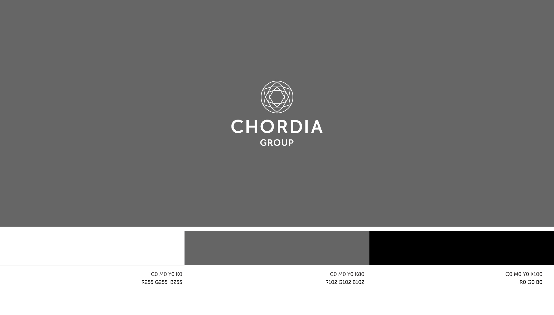
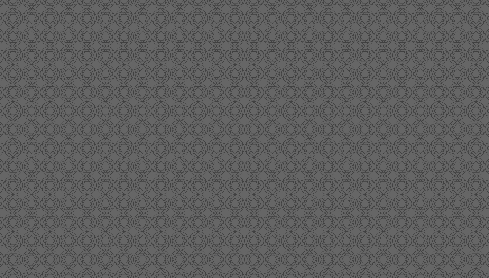
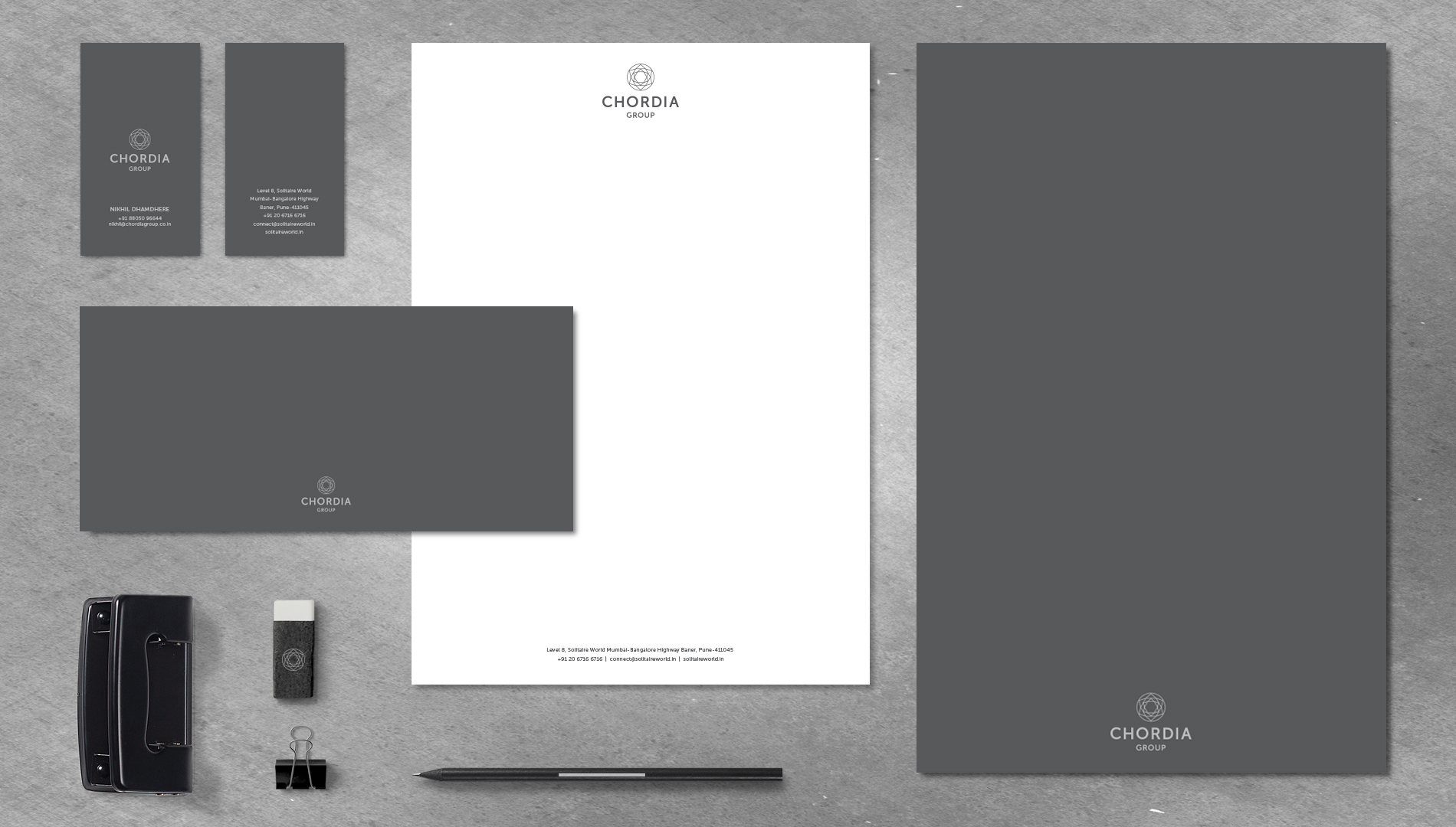
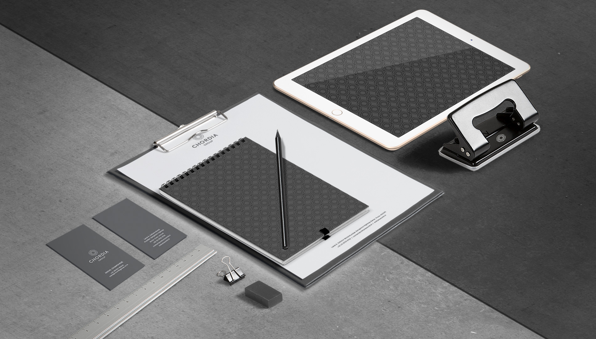
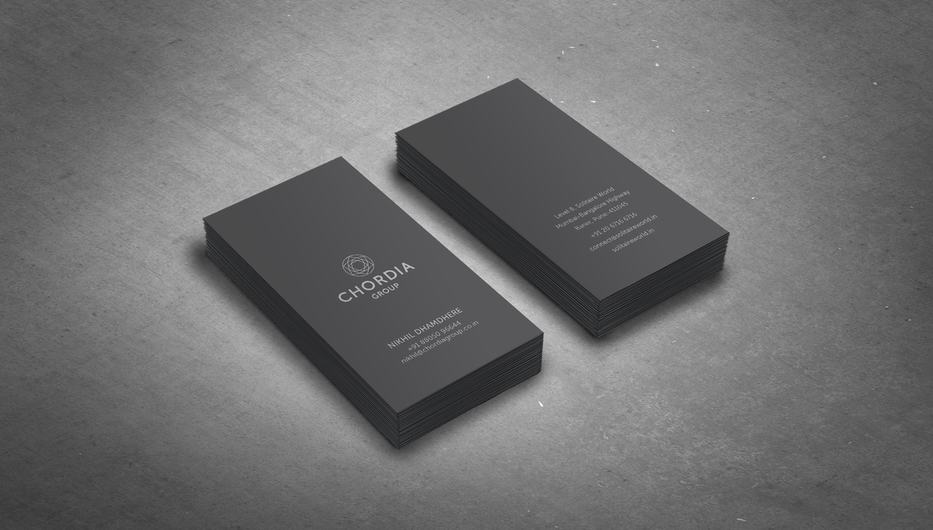
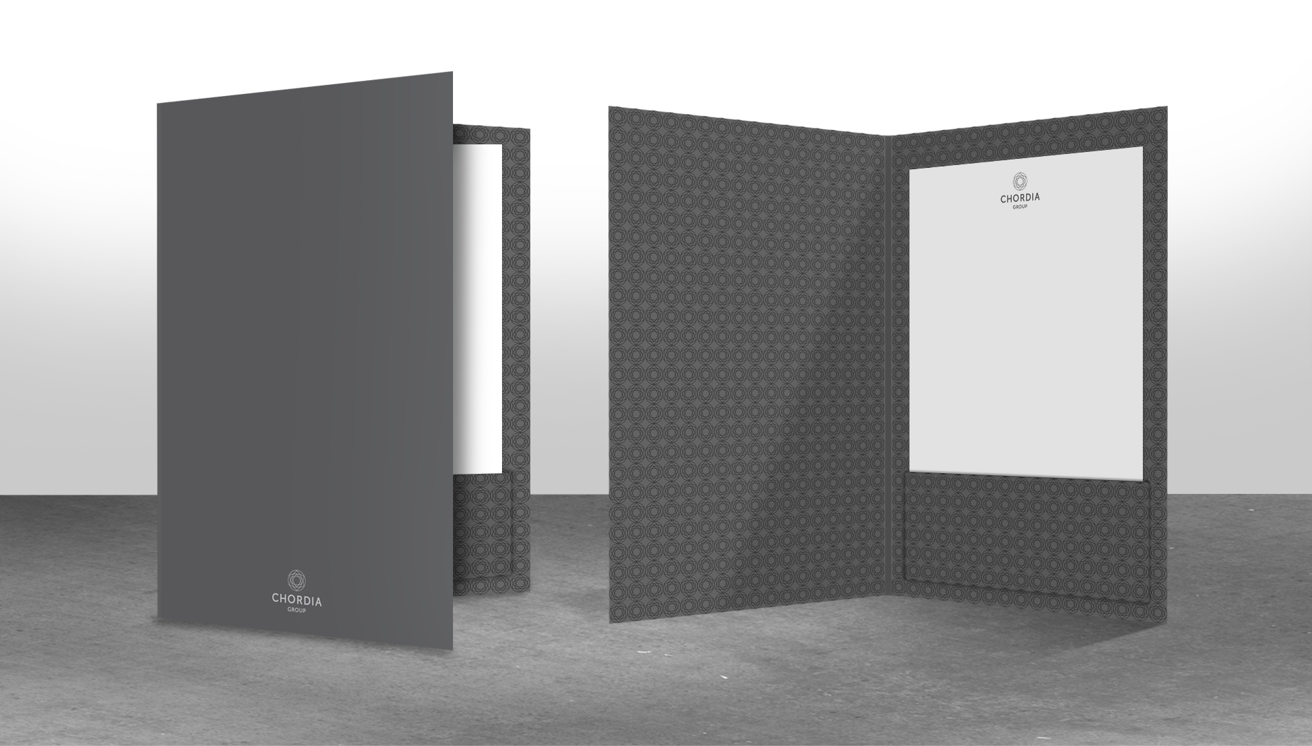
CORPORATE IDENTITY
In 2010, we created Chordia Group’s luxury housing brand called Solitaire, which was extensively promoted and became the company’s core offering. By 2015, Solitaire expanded it’s product portfolio across the premium real estate segment and is better known as compared to the parent company. Therefore, the rebrand’s challenge was to now connect the company to the brand.
Our solution is simple, make Solitaire’s symbol part of the company’s symbol. The company stands for more however, it stands for reliable construction, precision, trust and above all, customer-centricity and transparent transactions. The new identity embodies both the company’s core values and offering… subtly.
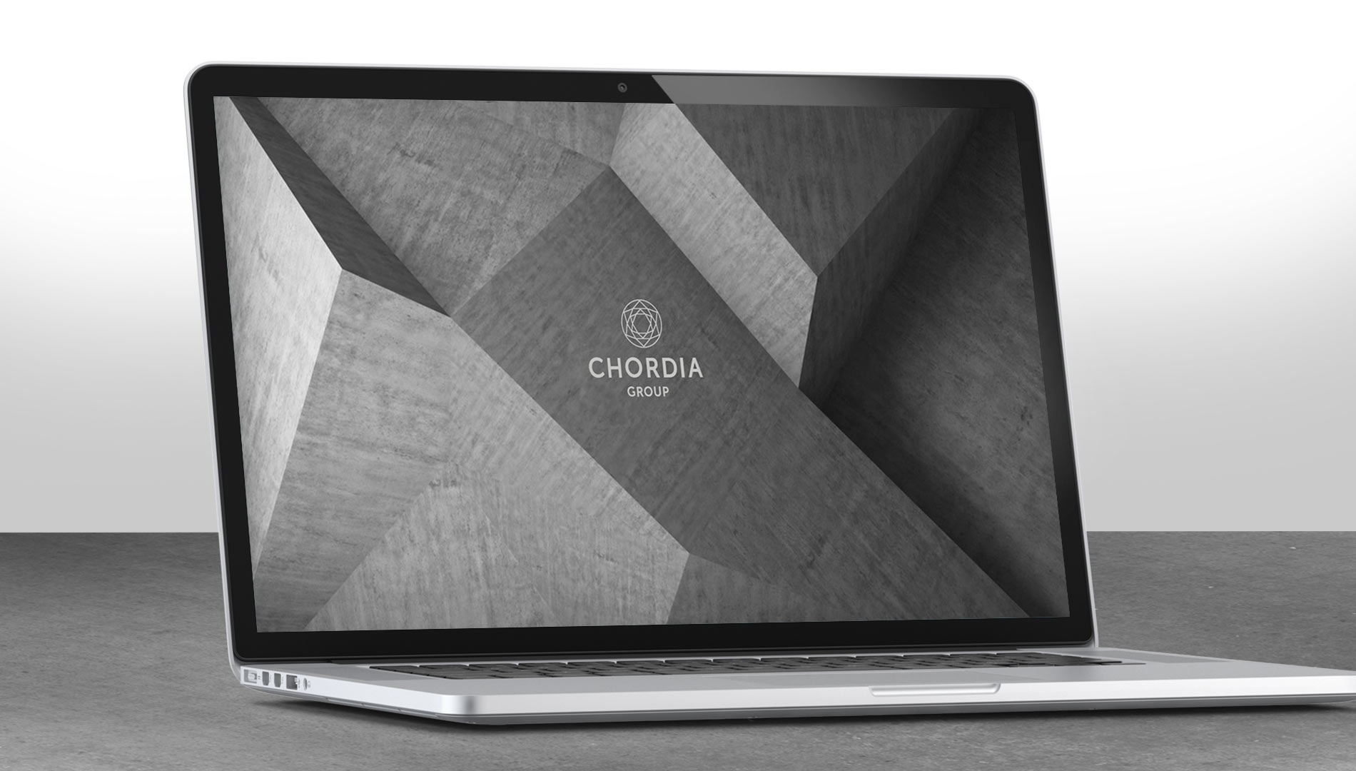
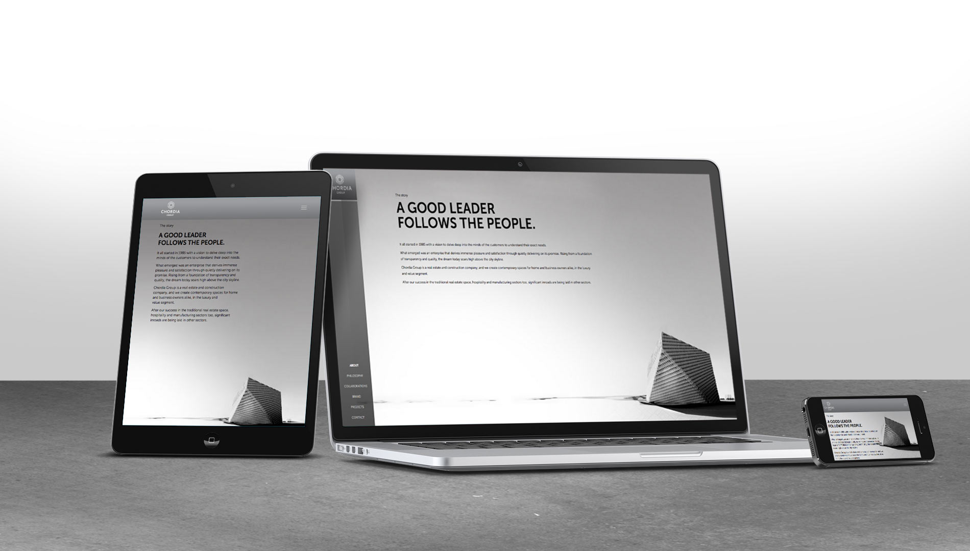
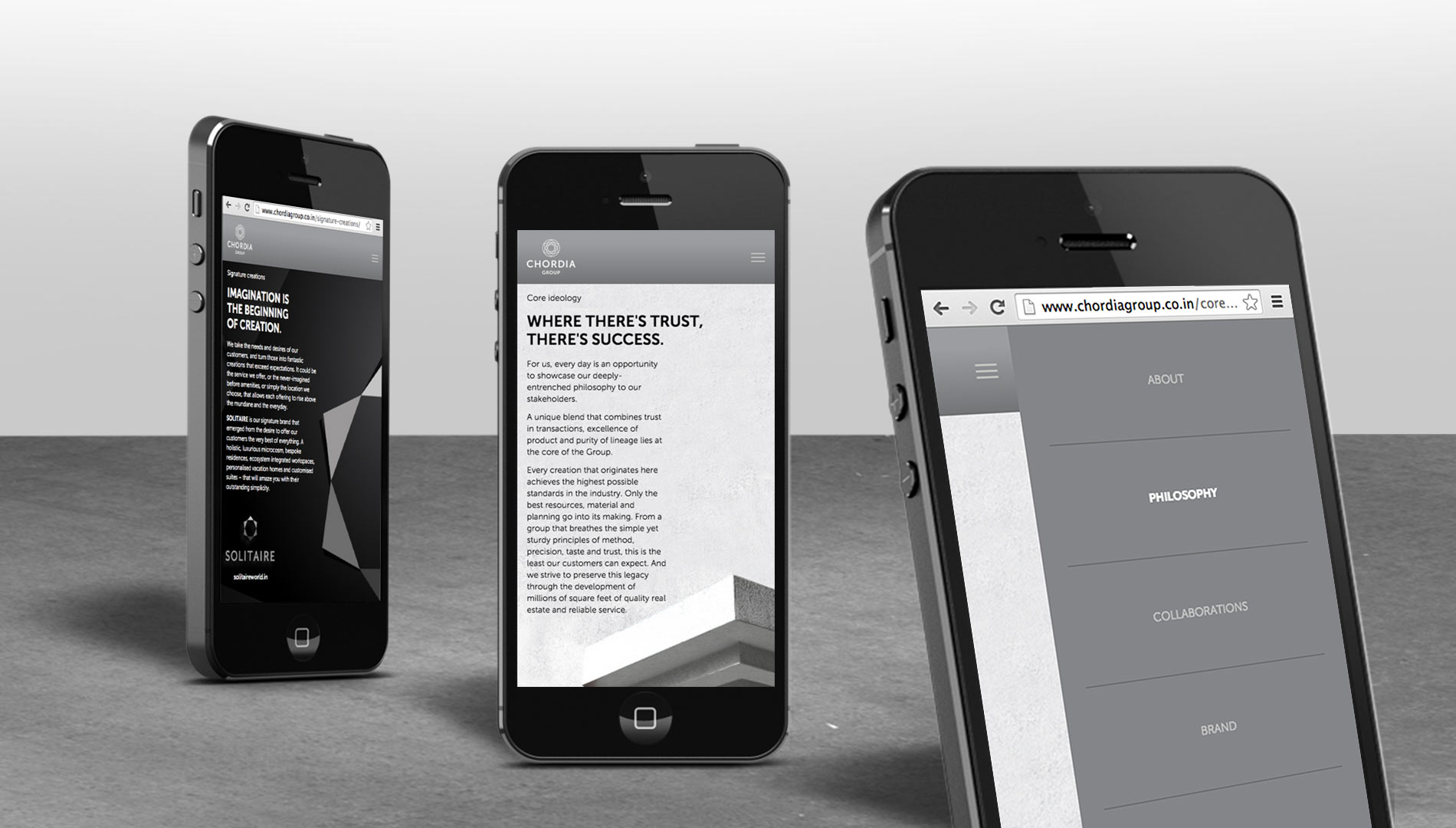
CORPORATE WEBSITE
Sincere, stable and trustworthy – is all that Chordia Group wanted their website to represent. The Group is a ‘say it as it is’ kind of organization, so that’s exactly what we did.
chordiagroup.co.in