

celebrating the spirit of champions
a legacy brand known for its products nationally, was keen to move to the next level. It was to bring in new enthusiasm into what was already a proven way of doing things. Time to be more relevant and reaffirm commitments made. To better performance and deliver promise.

REFRESHING THE BRAND
The core was always there, the fundamentals strong as ever but what was needed was a new interpretation. To add attractiveness to what was value and create a design language that leveraged on familiarity yet communicated a distinct brand personality.
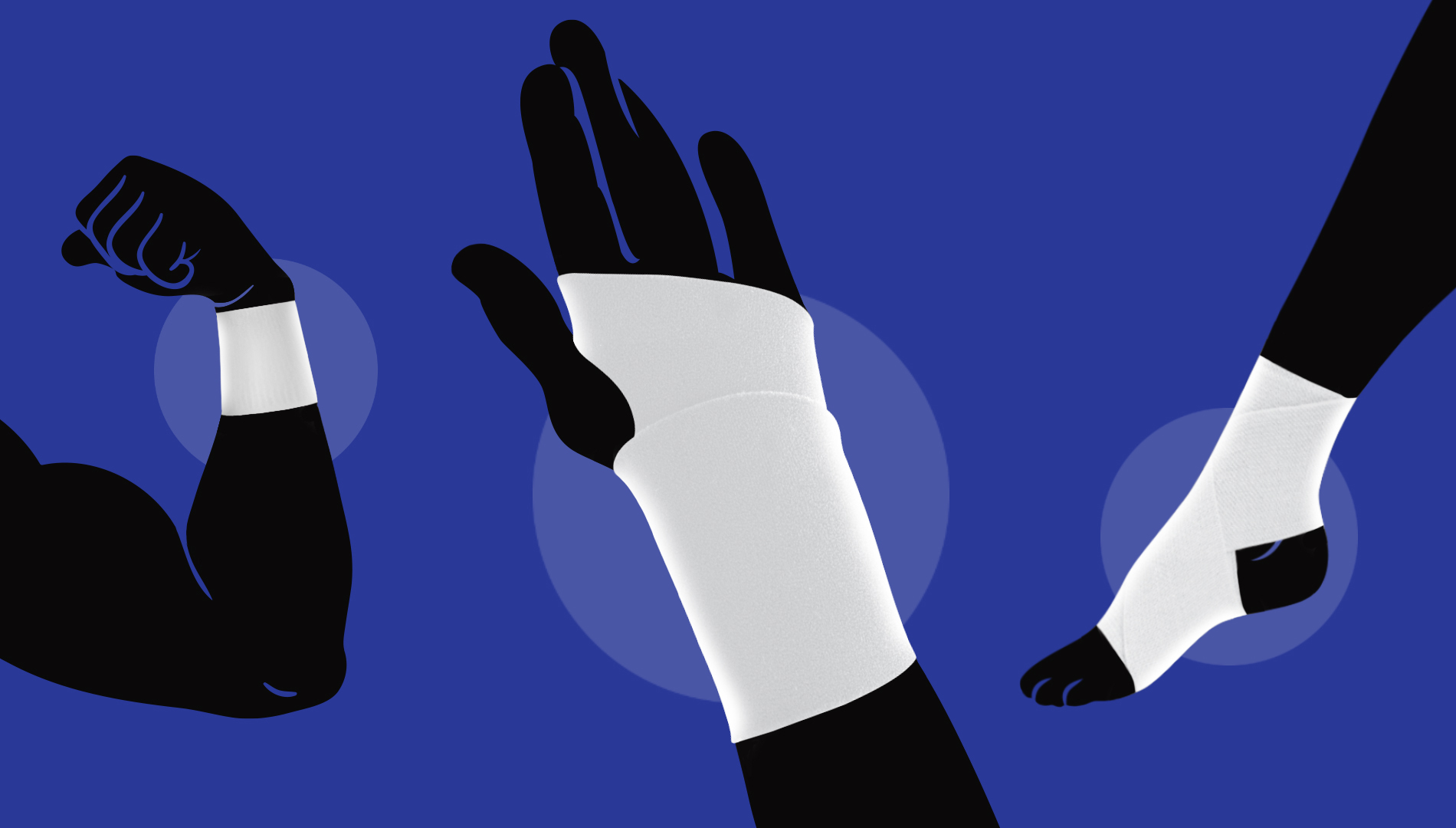
being a fitness brand, the primary design element needed energy and focus. Showing the product as part of the act and bringing in extendability by the use of graphical silhouettes was explored. The product undoubtedly being the hero, a subtle spotlight effect was added to ensure ease of comprehension.
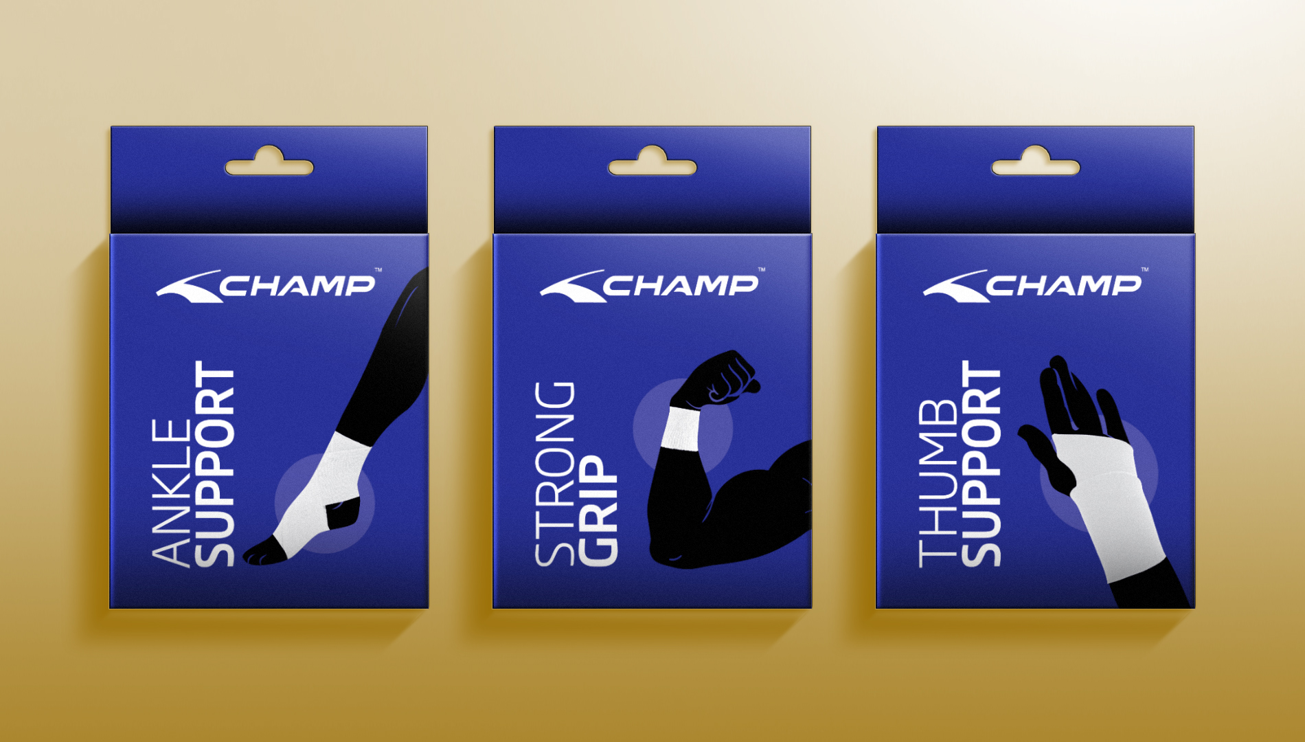
the refreshed packaging operates on the principle of minimalism, where less is more. It is direct and true to the purpose, yet afirmative in its persona.
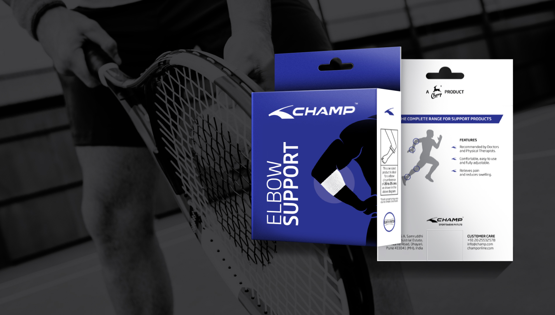
designed to build an impression without being too vocal